The quality of your sleep directly impacts your overall health and daily performance. While many factors contribute to restful slumber, bedroom wall color plays a surprisingly significant role. The colors surrounding you create a psychological and physiological environment that either promotes relaxation or stimulates alertness.
Interior designers and sleep scientists have long studied the connection between color psychology and sleep quality. Your bedroom should be a sanctuary designed specifically for rest and rejuvenation. The right color palette can lower your heart rate, reduce stress levels, and prepare your mind for deep, restorative sleep.
Choosing bedroom colors isn’t just about aesthetic preferences or following trends. It’s about understanding how different hues affect your circadian rhythm and nervous system. From calming blues to soothing greens, certain colors have been scientifically proven to enhance sleep quality. This article explores the best bedroom colors for optimal rest and explains why they work.

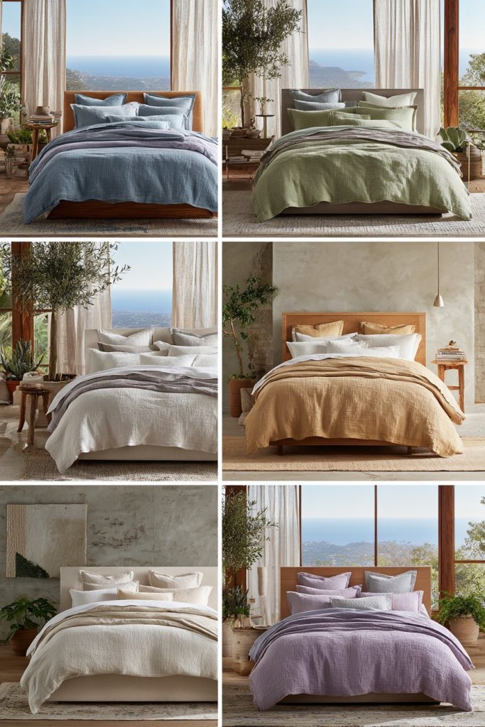
1. Blue – The Ultimate Sleep-Inducing Color
Blue consistently ranks as the most effective color for promoting quality sleep. Studies show that people sleeping in blue bedrooms average nearly eight hours of sleep per night. This color triggers calming receptors in your eyes, sending messages of tranquility to your brain.
The physiological response to blue is remarkable. This color can lower blood pressure and reduce heart rate naturally. Light to medium blue shades work particularly well, creating a serene atmosphere without feeling cold or uninviting. Navy or dark blues should be used sparingly as accents.
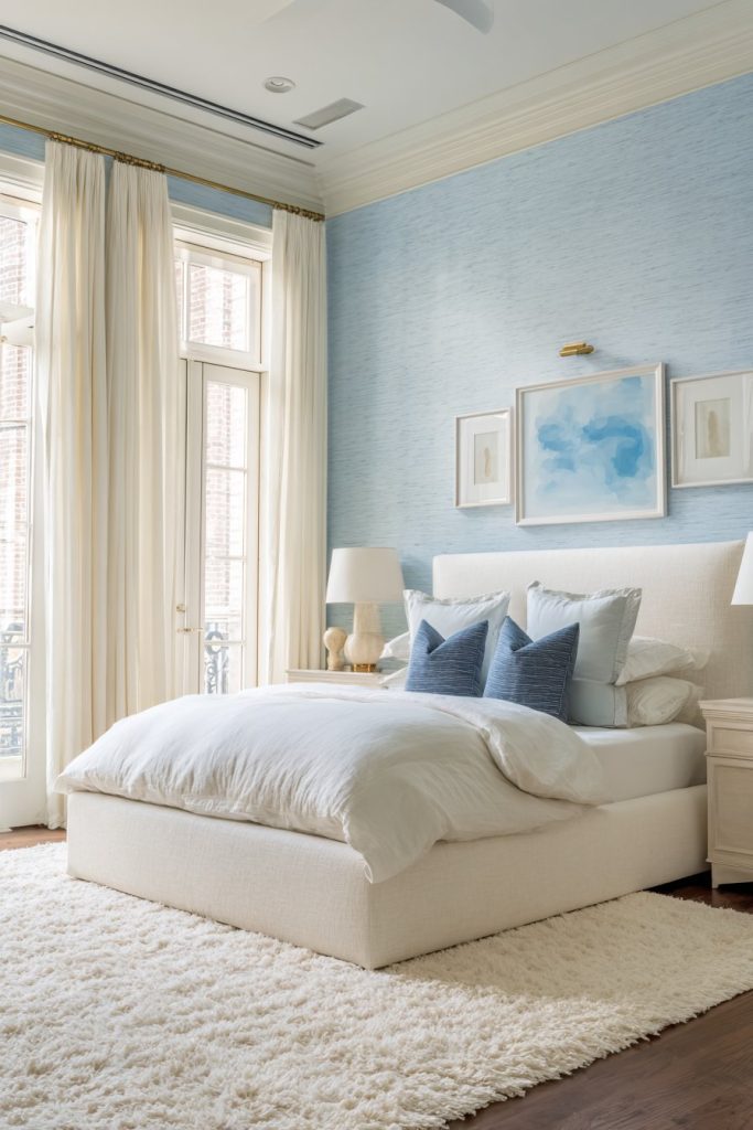
Soft powder blues and sky blue tones create an airy, peaceful environment ideal for relaxation. These shades mimic the tranquil colors of clear skies and calm waters. The association with nature helps your mind transition smoothly into sleep mode.
- Choose soft powder blue or sky blue for walls to maximize calming effects
- Pair blue walls with white or cream bedding for a fresh, clean look
- Add navy blue accents through pillows or artwork for depth
- Consider blue-gray tones for a more sophisticated, modern aesthetic
- Use warm lighting to prevent blue rooms from feeling too cold
- Test paint samples in different lighting conditions before committing
2. Soft Green – Nature’s Tranquility Indoors
Green brings the restorative power of nature directly into your sleeping space. This color represents growth, harmony, and renewal. Your eyes process green easily, making it one of the most restful colors for prolonged exposure during sleep.
Sage green and soft mint tones create a spa-like atmosphere that encourages deep relaxation. These shades reduce anxiety and promote feelings of safety and comfort. Green’s connection to nature taps into our innate need for natural environments, supporting better sleep quality.
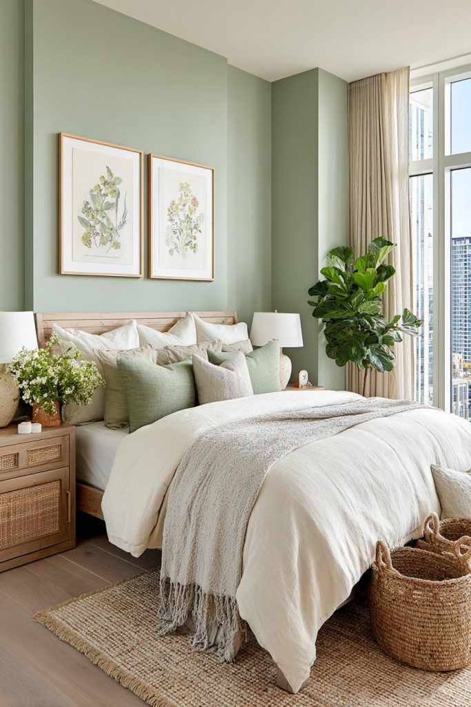
Lighter green shades work best for bedrooms, avoiding anything too vibrant or saturated. Muted eucalyptus and celadon create sophisticated spaces that feel both modern and timeless. These colors pair beautifully with natural wood furniture and organic textiles.
- Select sage green or eucalyptus tones for a calming effect
- Incorporate live plants to enhance the natural, peaceful atmosphere
- Balance green walls with neutral bedding in cream or beige
- Add wooden elements to strengthen the nature-inspired design
- Use green in various shades for a layered, cohesive look
- Consider green as an accent wall if full-room color feels overwhelming
3. Warm Neutrals – Cozy Comfort for Rest
Warm neutral colors create an inherently cozy environment perfect for unwinding. Beige, taupe, and warm gray tones provide a sophisticated backdrop that doesn’t stimulate the senses. These colors offer versatility and timelessness in bedroom design.
The beauty of neutral bedrooms lies in their calming simplicity. Without bold colors competing for attention, your mind can relax more easily. Warm neutrals create a cocoon-like feeling that signals safety and comfort, essential elements for quality sleep.
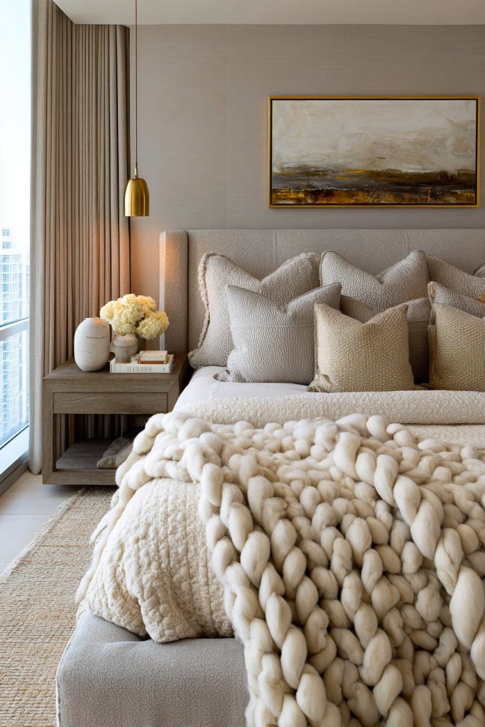
These shades also offer incredible flexibility for changing decor styles. You can easily update accessories and bedding without repainting. Warm neutrals reflect light beautifully, making smaller bedrooms feel more spacious and airy while maintaining their cozy appeal.
- Choose warm beige or greige over cool grays for better warmth
- Layer different neutral tones for depth and visual interest
- Add texture through linens, rugs, and curtains to prevent blandness
- Use warm-toned lighting to enhance the cozy atmosphere
- Incorporate natural materials like wood, cotton, and linen
- Consider slightly darker neutrals for larger rooms with ample natural light
4. Lavender and Soft Purple – Calming Elegance
Lavender offers unique sleep-promoting properties that combine blue’s tranquility with purple’s luxury. This delicate shade has been used for centuries to promote relaxation and reduce anxiety. The color and scent association creates powerful calming effects on the nervous system.
Soft purple tones in bedrooms create an elegant, serene sanctuary. These colors reduce stress and worry while adding a sophisticated touch. Very light lavender or lilac shades work best, avoiding deep purples that can feel too stimulating or dramatic.
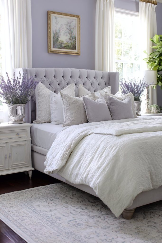
The psychological impact of lavender extends beyond color alone. This shade evokes feelings of peace and spiritual calm. When used in bedrooms, it creates an almost meditative space perfect for releasing daily tensions and preparing for restful sleep.
- Select very light lavender or pale lilac for maximum calming effect
- Pair with white or cream to prevent the room from feeling too feminine
- Use actual lavender plants or sachets to enhance relaxation
- Add silver or gray accents for a modern, sophisticated look
- Keep the shade very pale to avoid overstimulation
- Consider lavender for accent walls if hesitant about full-room color
5. Earthy Terracotta and Clay Tones – Grounded Warmth
Earthy terracotta and warm clay colors create grounding, nurturing environments ideal for sleep. These colors connect us to the earth, providing a sense of stability and security. Muted terracotta shades offer warmth without the stimulating effects of bright reds or oranges.
The rise of biophilic design has brought earth tones into modern bedrooms. These colors create cocoon-like spaces that feel protected and comfortable. Soft terracotta works particularly well in rooms with abundant natural light, adding warmth without overwhelming the space.
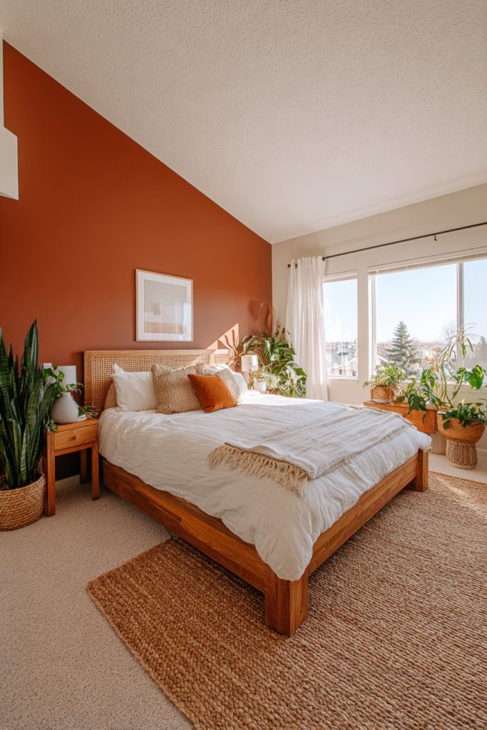
Clay-inspired colors pair beautifully with natural textures and materials. They complement wooden furniture, linen bedding, and woven accessories perfectly. These tones create sophisticated, organic spaces that promote relaxation and connection to nature’s calming influence.
- Choose muted, dusty terracotta rather than bright orange tones
- Balance warm earth tones with cool-toned bedding and accessories
- Incorporate natural materials like rattan, jute, and wood
- Use these colors in rooms with good natural light
- Add plants to enhance the earthy, organic atmosphere
- Consider terracotta as an accent wall paired with neutral walls

6. Colors to Avoid for Better Sleep
Understanding which colors to avoid is just as important as knowing the best choices. Bright red walls stimulate the nervous system and increase heart rate. This color creates alertness and energy, the opposite of what you need for restful sleep.
Purple in deep, saturated shades can be too stimulating mentally. While soft lavender promotes relaxation, royal purple or deep violet can trigger creativity and active thinking. Similarly, bright yellow and orange create energizing environments unsuitable for sleep spaces.
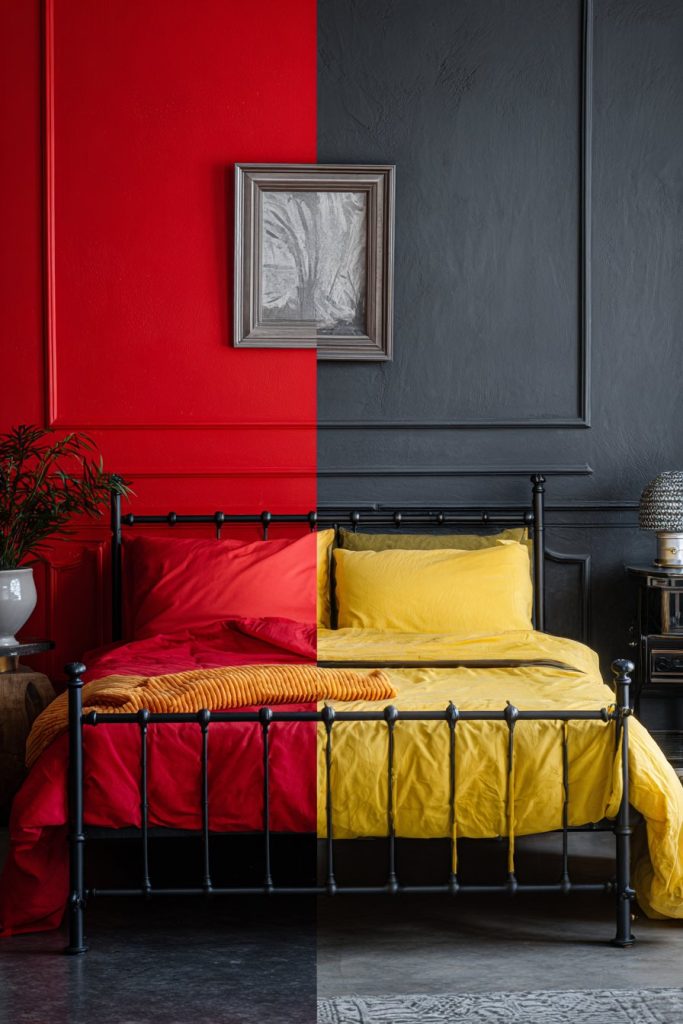
Dark colors like charcoal or black can feel oppressive and heavy in bedrooms. While some people enjoy dramatic dark walls, these shades can affect mood negatively. If you love dark colors, use them as accent walls rather than covering the entire room.
- Avoid bright reds, oranges, and vibrant yellows in sleeping areas
- Skip deep, saturated purples that stimulate rather than calm
- Use caution with very dark colors that may feel oppressive
- Limit pure white which can feel too stark and clinical
- Avoid bold, high-contrast color schemes that create visual stimulation
- Test any color choice before committing to ensure it promotes relaxation
Conclusion
The best bedroom color for sleep depends on creating a personally calming environment. Blue remains the scientifically proven champion, but soft greens, warm neutrals, and gentle lavenders offer excellent alternatives. Each color brings unique benefits while supporting the ultimate goal of restful, rejuvenating sleep.
Consider your personal preferences, existing furniture, and natural lighting when making your choice. Remember that quality sleep transforms your life, making this decision worthy of thoughtful consideration. Start with paint samples, observe how colors make you feel at different times of day, and create your perfect sleep sanctuary with confidence.