The dining room serves as more than just a place to eat. It’s a gathering space where memories are created and conversations flow freely. Choosing the right color scheme can transform this essential room into an inviting sanctuary that reflects your personal style while enhancing the dining experience.
Color psychology plays a crucial role in dining room design. The right palette can stimulate appetite, encourage conversation, and create the perfect ambiance for both casual family meals and formal entertaining. Whether you prefer timeless classics or bold contemporary statements, the color scheme you choose sets the foundation for your entire design vision.
From warm neutrals that evoke comfort to dramatic jewel tones that make bold statements, today’s dining room color schemes offer endless possibilities. This guide explores six exceptional color palettes that consistently deliver stunning results. Each scheme brings unique benefits and can be adapted to suit different architectural styles and personal preferences.

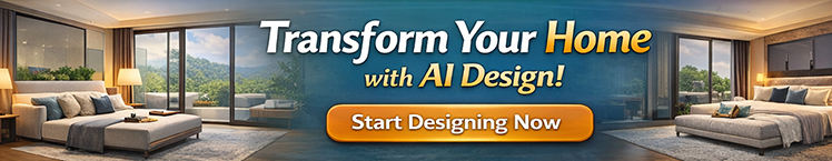
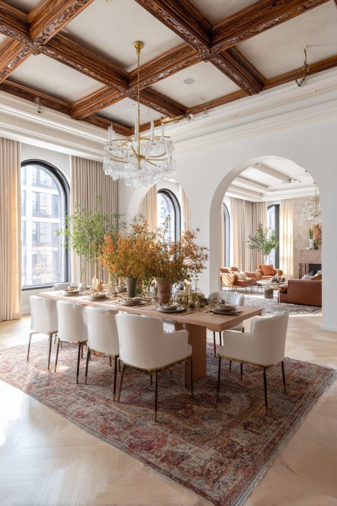
1. Warm Neutrals and Earthy Tones
Warm neutral color schemes create an instantly welcoming atmosphere in any dining room. Shades of beige, taupe, and warm gray provide a sophisticated backdrop that never goes out of style. These colors make spaces feel larger and more open while maintaining a cozy, intimate quality. The versatility of warm neutrals allows them to complement virtually any furniture style or décor accent.
These earthy palettes work exceptionally well in rooms with abundant natural light. They reflect sunlight beautifully throughout the day, creating different moods from morning through evening. Warm neutrals pair perfectly with natural wood tones, creating a harmonious connection between your furniture and walls. This color family also provides an excellent foundation for layering textures and patterns without overwhelming the space.
The beauty of warm neutral schemes lies in their timeless appeal and adaptability. You can easily update the room’s look by changing accessories, artwork, or textiles without repainting. These colors create a calming environment that encourages lingering conversations and relaxed dining experiences.
- Choose shades with slight yellow or brown undertones for maximum warmth
- Layer different neutral tones to create depth and visual interest
- Pair with natural materials like wood, rattan, and linen
- Add contrast through black or dark bronze hardware and fixtures
- Use textured wallpaper or wainscoting to prevent flatness
- Incorporate warm metallics like brass or copper for subtle elegance
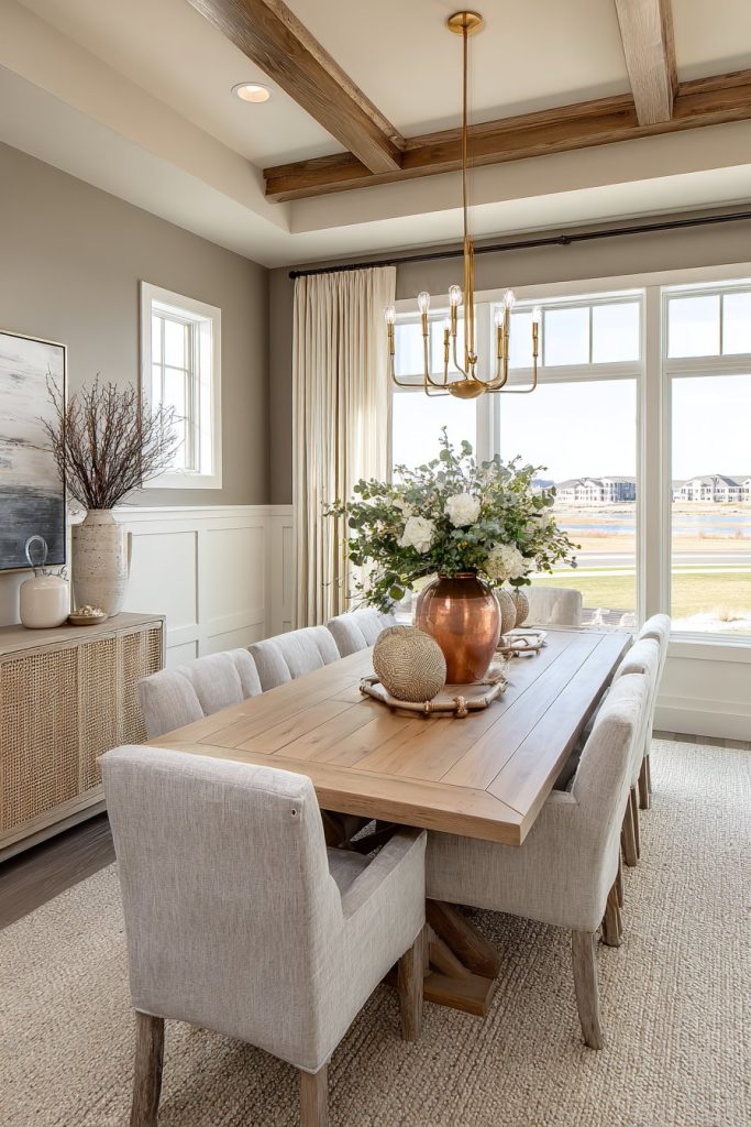
2. Bold Navy and Deep Blues
Navy blue has emerged as a modern classic for dining room color schemes. This rich, sophisticated hue creates drama without feeling overwhelming or dark. Deep blues evoke feelings of stability and confidence while maintaining an elegant, upscale appearance. They work beautifully in both traditional and contemporary settings, adapting to various design aesthetics with ease.
Dark blue dining rooms possess a restaurant-quality ambiance that elevates everyday meals into special occasions. The color provides excellent contrast for white or cream-colored dinnerware, making table settings pop visually. Navy walls also create a stunning backdrop for artwork, metallic accents, and crystal lighting fixtures. This shade is particularly effective in rooms with ample artificial lighting or large windows.
One remarkable advantage of navy is its forgiving nature regarding maintenance and wear. Unlike lighter colors, dark blues hide imperfections and resist showing dirt or scuffs. This practical aspect makes navy an excellent choice for high-traffic dining areas or homes with children.
- Balance dark walls with white trim and ceilings to prevent heaviness
- Incorporate brass, gold, or chrome fixtures for luxurious contrast
- Use lighter furniture pieces to create visual breathing room
- Add mirrors strategically to reflect light and expand the space
- Consider navy on an accent wall if full-room application feels too bold
- Pair with crisp white linens and natural wood for classic sophistication
3. Elegant Gray Palettes
Gray has revolutionized modern interior design as the ultimate neutral. This versatile color family ranges from soft dove gray to dramatic charcoal, offering options for every taste. Gray dining rooms exude contemporary sophistication while remaining warm and inviting when chosen correctly. The key lies in selecting grays with appropriate undertones that complement your space’s natural lighting.
The chameleon-like quality of gray makes it incredibly adaptable to different design styles. It works seamlessly with modern minimalist aesthetics, traditional elegance, or transitional spaces. Gray serves as an excellent backdrop for bold furniture choices, colorful artwork, or statement lighting fixtures. This neutral allows your décor elements to shine without competing for attention.
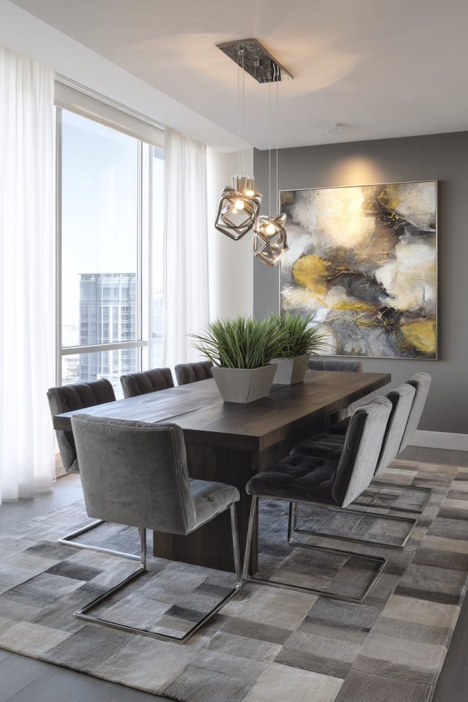
Gray color schemes offer exceptional flexibility for seasonal updates. You can easily shift the room’s mood by changing textiles, centerpieces, and accessories throughout the year. Cool grays create a crisp, formal atmosphere, while warmer grays with beige undertones feel more approachable and casual.
- Test gray samples in different lighting conditions before committing
- Choose warmer grays with beige or greige undertones for coziness
- Layer multiple gray shades for a sophisticated monochromatic look
- Add pops of color through artwork, rugs, or chair upholstery
- Incorporate varied textures to prevent the space from feeling flat
- Use strategic lighting to enhance the gray’s depth and warmth
4. Fresh White and Cream Combinations
White and cream color schemes create airy, spacious dining rooms that feel perpetually fresh. These light palettes maximize natural light and make even modest-sized rooms feel significantly larger. Pure whites offer crisp, clean elegance, while warmer creams provide a softer, more inviting atmosphere. This color family never goes out of style and adapts beautifully to evolving design trends.
Light-colored dining rooms possess a naturally uplifting quality that enhances mood and appetite. They provide the perfect canvas for showcasing beautiful furniture pieces, architectural details, or decorative collections. White and cream schemes also offer incredible versatility for hosting, as they complement any table setting or seasonal decoration you choose.
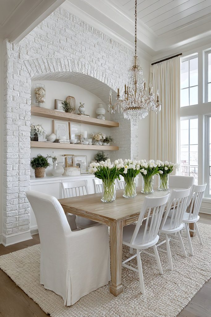
The practical benefits of light color schemes include their ability to reflect artificial light efficiently. This means you can create the perfect ambiance with fewer light fixtures, potentially reducing energy costs. These colors also make it easier to photograph your beautiful table settings for social media sharing.
- Use different shades of white to create subtle dimension
- Prevent sterility by incorporating warm wood tones and natural textures
- Add interest through architectural details like molding or paneling
- Include soft metallics and glass elements for elegant sparkle
- Layer ivory, cream, and white for a sophisticated tonal approach
- Maintain cleanliness with washable paint finishes and durable materials
5. Rich Jewel Tones
Jewel-tone color schemes bring opulent drama to dining spaces. Deep emeralds, sapphire blues, amethyst purples, and ruby reds create luxurious environments perfect for entertaining. These saturated colors make bold statements while maintaining sophistication and elegance. Jewel tones work particularly well in formal dining rooms or spaces used primarily for evening gatherings.
The psychological impact of jewel tones enhances the dining experience significantly. These rich colors stimulate conversation and create a sense of occasion. They provide stunning backdrops for candlelight and crystal, reflecting light in mesmerizing ways. Jewel-toned rooms feel intimate and cocooning, encouraging guests to settle in for extended meals.
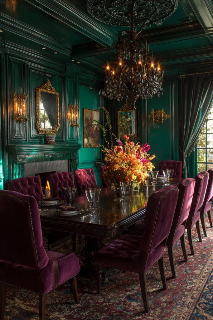
These colors demonstrate remarkable versatility in design periods. Jewel tones complement everything from Victorian elegance to modern glam aesthetics. They pair beautifully with metallic accents, velvet upholstery, and ornate lighting fixtures.
- Choose one dominant jewel tone rather than mixing multiple saturated colors
- Balance intensity with neutral furniture and light-colored floors
- Use metallic accents in gold or silver for added luxury
- Ensure adequate lighting to prevent the space from feeling cave-like
- Consider jewel tones on accent walls if hesitant about full commitment
- Pair with luxurious textures like velvet, silk, or satin for maximum impact

6. Nature-Inspired Greens
Green color schemes bring the outdoors inside, creating refreshing and rejuvenating dining spaces. From soft sage to deep forest green, this color family offers remarkable range. Green promotes feelings of balance, harmony, and tranquility while stimulating appetite naturally. These hues work beautifully in dining rooms that overlook gardens or natural settings.
The biophilic connection that green provides enhances wellbeing and reduces stress. This makes green dining rooms particularly appealing in our increasingly digital world. The color pairs exceptionally well with natural materials like wood, stone, and plants. Green rooms feel alive and dynamic, changing subtly with natural light throughout the day.
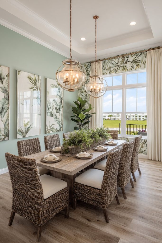
Nature-inspired greens offer surprising versatility across design styles. Soft sage suits farmhouse and cottage aesthetics, while deep hunter green complements traditional or preppy styles. Olive and eucalyptus greens work beautifully in contemporary and mid-century modern spaces.
- Select green shades that complement your dining room’s natural light quality
- Pair with white or cream trim for fresh, clean contrast
- Incorporate live plants to enhance the nature-inspired theme
- Use wood furniture in medium to dark tones for grounding
- Add brass or copper fixtures for warm, organic appeal
- Consider green wallpaper with botanical patterns for added interest
Conclusion
Selecting the perfect dining room color scheme transforms how you experience this important space. Each palette discussed offers unique benefits, from the timeless elegance of neutrals to the bold drama of jewel tones. Consider your room’s natural lighting, architectural features, and how you use the space when making your decision.
Don’t be afraid to experiment with color samples and live with them for several days before committing. The right color scheme will enhance your lifestyle and create a dining environment you’ll love for years to come. Trust your instincts, embrace your personal style, and create a dining room that truly reflects who you are.