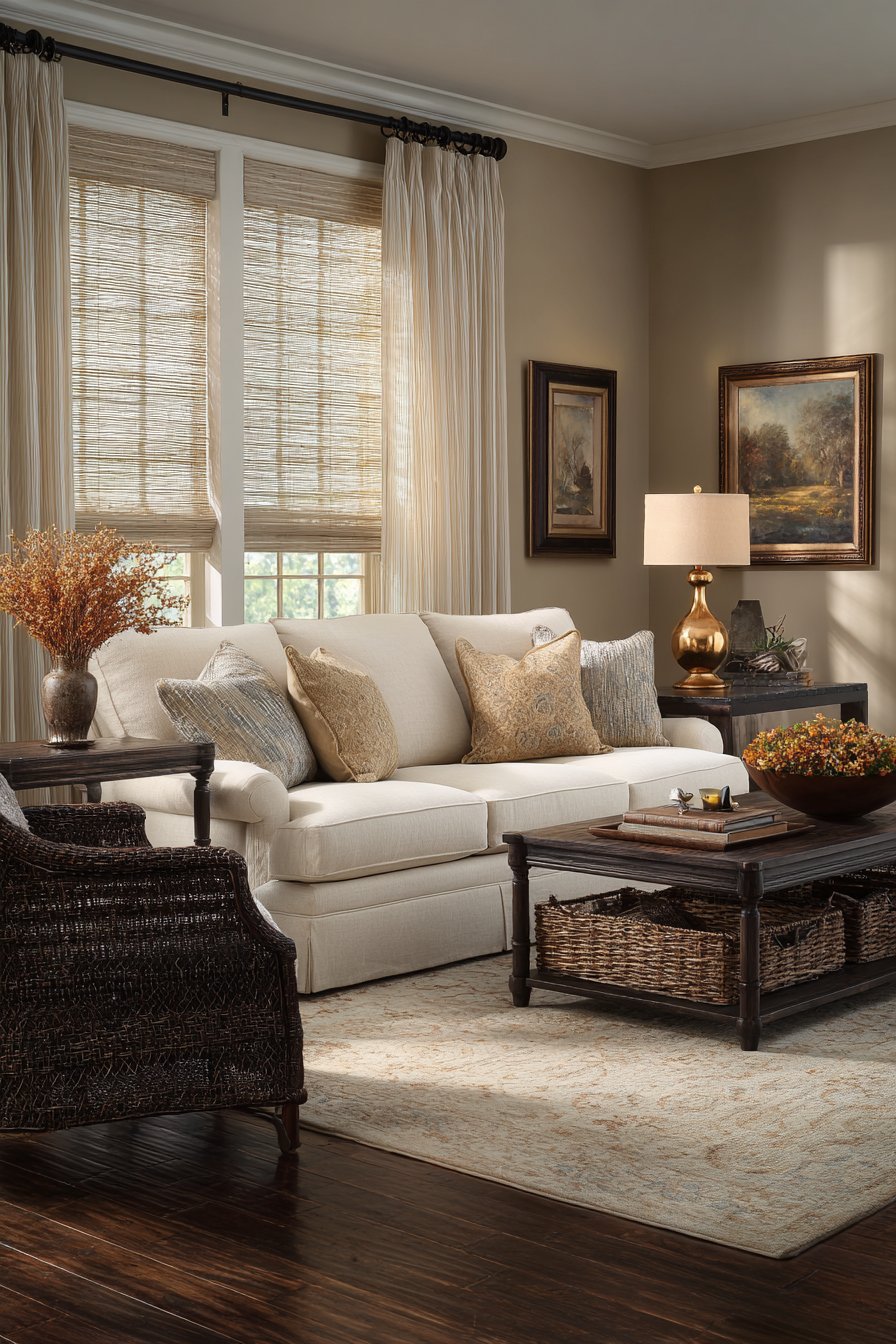
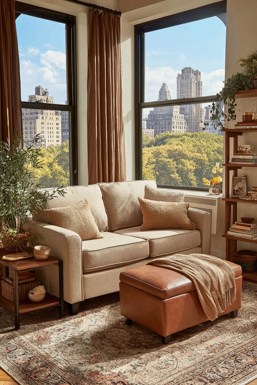
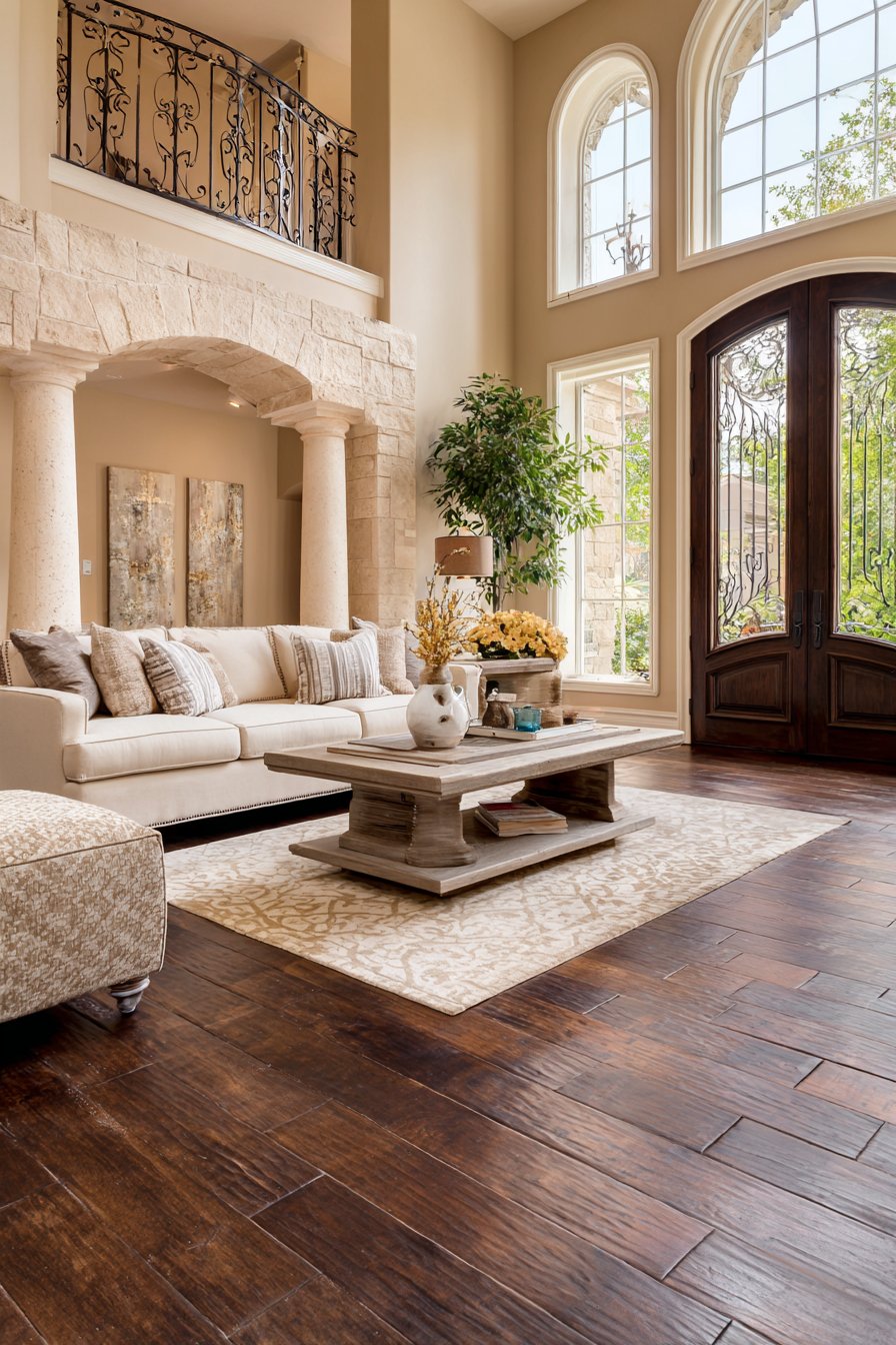
The living room serves as the heart of any home—a space where families gather, guests are entertained, and memories are created. When it comes to designing this essential area, few color combinations offer the versatility, warmth, and timeless elegance of brown and beige. These earth-toned hues create a foundation that is simultaneously sophisticated and approachable, allowing homeowners to craft spaces that feel both inviting and refined. The beauty of brown and beige lies in their inherent ability to work harmoniously with various design styles, from contemporary minimalism to classic traditional aesthetics, while maintaining a sense of calm and balance that other color schemes often struggle to achieve.
In today’s design landscape, the brown and beige palette has experienced a remarkable renaissance. No longer relegated to dated or uninspired interiors, these neutral tones have evolved into a sophisticated choice for homeowners seeking to create spaces with depth, texture, and visual interest. The key to mastering this color combination lies in understanding the nuances of each shade—from rich chocolate browns and warm cognacs to creamy beiges and sandy taupes—and how they interact with natural light, architectural elements, and carefully selected furnishings. By layering different tones and incorporating varied textures, designers can prevent these neutrals from appearing flat or monotonous, instead creating living rooms that feel dimensional and dynamic.
This comprehensive guide presents twenty-one carefully curated brown and beige living room ideas, each offering a unique approach to incorporating these timeless hues into your home. Whether you’re drawn to the luxurious appeal of leather and velvet, the organic warmth of natural wood and stone, or the clean lines of modern minimalism, you’ll discover inspiration for transforming your living space into a haven of comfort and style. From practical storage solutions and clever spatial arrangements to stunning focal points and thoughtful lighting schemes, these designs demonstrate the remarkable versatility of brown and beige when applied with intention and creativity.

1. Luxurious Layered Neutrals with Textural Richness
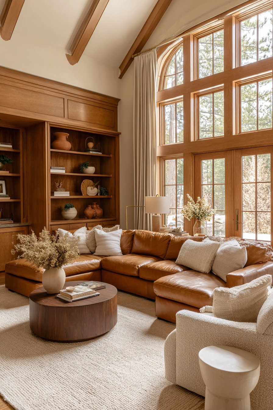
A sophisticated living room built upon the foundation of brown and beige achieves its greatest impact through the artful layering of varied textures and materials. Picture a generous sectional sofa upholstered in supple caramel leather, its rich patina catching the light and adding warmth to the space. Positioned alongside are accent chairs covered in natural linen in a soft beige tone, their slightly nubby texture providing visual contrast to the smooth leather. The juxtaposition of these materials creates immediate interest, preventing the neutral palette from feeling one-dimensional or predictable.
At the center of this arrangement sits a substantial walnut coffee table, its live edge and natural grain patterns serving as a sculptural element that grounds the seating area. Beneath, layered rugs in jute and cream wool add another dimension of texture while defining the conversation zone. The windows, dressed in floor-to-ceiling natural linen drapes in warm taupe, frame the view while allowing diffused light to filter through, creating a soft glow that enhances the earth-toned palette throughout the day.
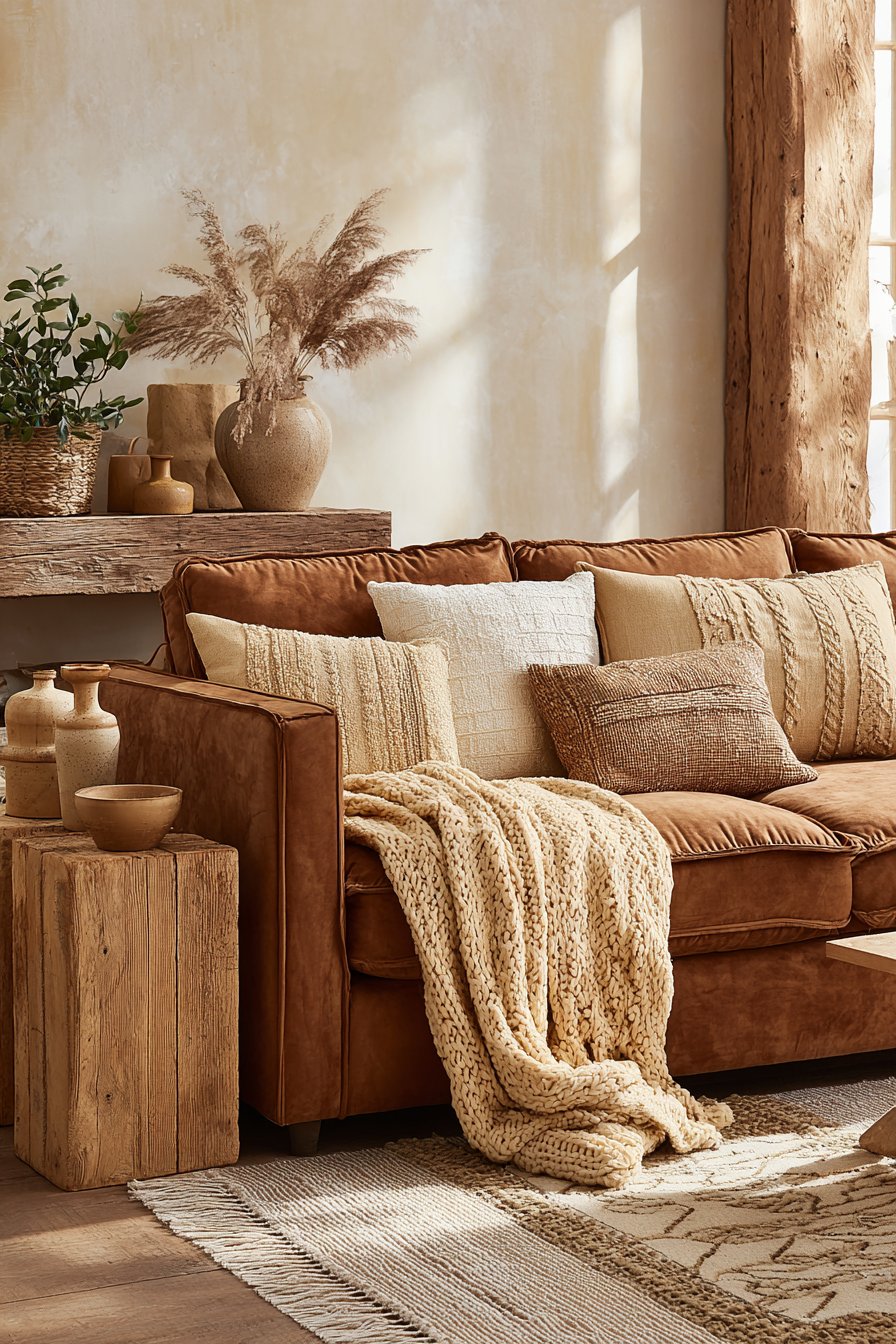
Accessorizing plays a crucial role in elevating this design from simple to spectacular. A brass floor lamp with a clean, architectural silhouette provides both task lighting and a metallic accent that catches the eye. Terracotta pottery in varying sizes, displayed on the coffee table and built-in shelving, introduces an organic element that bridges the brown and beige tones beautifully. The built-in shelving itself, constructed from deep chocolate brown wood, provides both practical storage and visual weight, anchoring one wall and creating a gallery-like backdrop for curated objects and books.
Key Design Tips: Choose leather furniture in caramel or cognac tones for a luxurious foundation that ages beautifully. Layer multiple textures such as linen, jute, wool, and wood to create visual depth and prevent the neutral palette from appearing flat. Incorporate metallic accents in brass or bronze to add warmth and subtle glamour. Use varying shades from deep chocolate to sandy beige throughout the space to create tonal interest. Position furniture to maximize natural light, which enhances the warm undertones in brown and beige hues. Display organic elements like terracotta pottery or natural wood objects to reinforce the earthy, grounded aesthetic.
2. Plush Comfort with Cognac and Oatmeal Accents
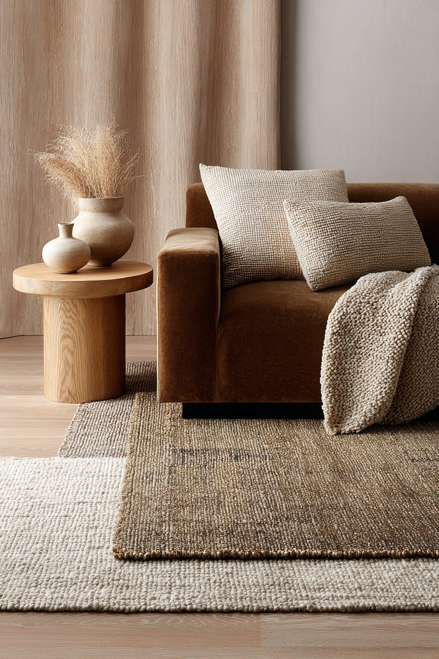
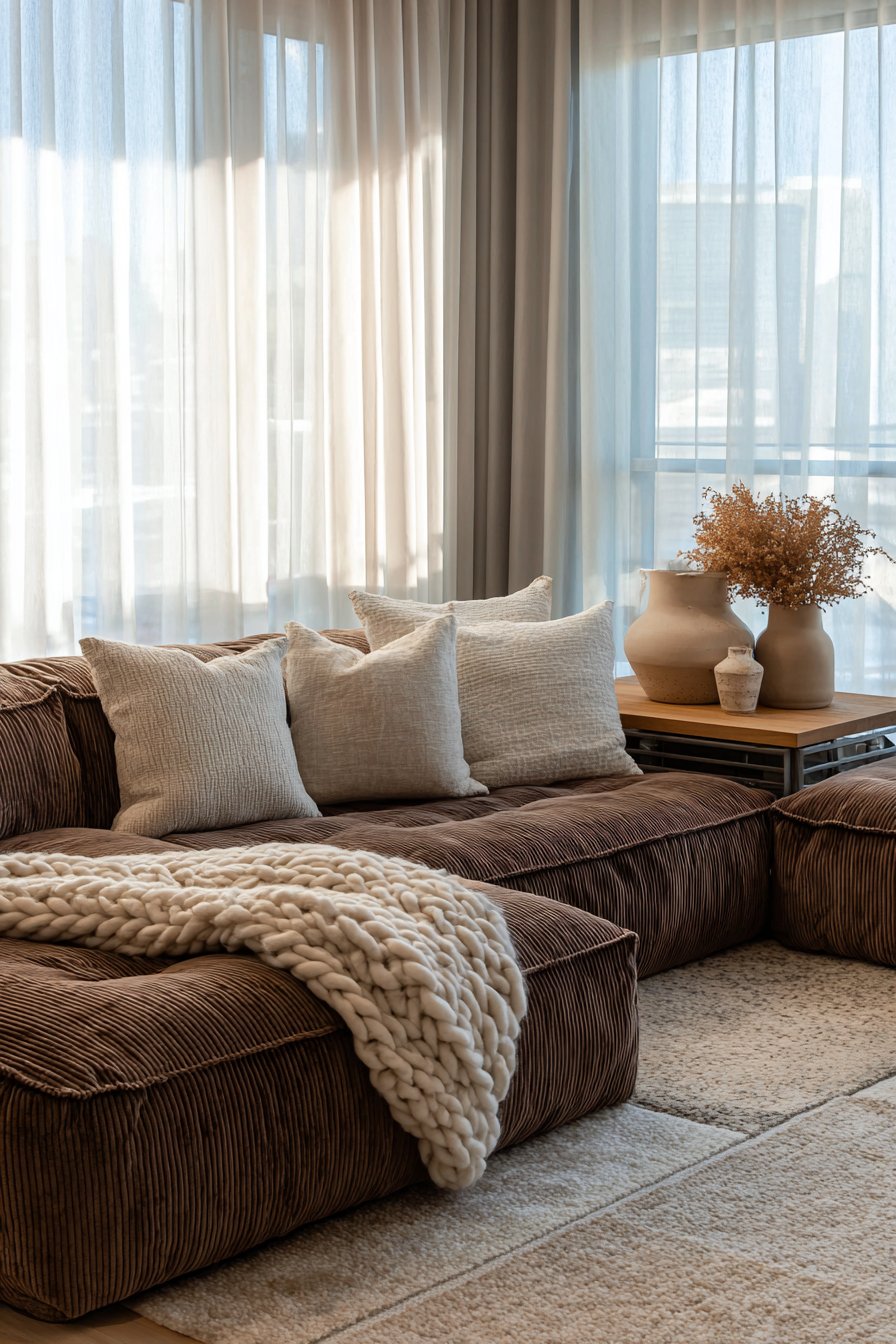
The foundation of this inviting living room centers on a plush velvet sofa in a rich cognac brown that immediately establishes a sense of luxury and comfort. The deep pile of the velvet catches light in varying ways throughout the day, creating subtle shifts in color intensity that keep the eye engaged. Oversized beige linen cushions in generous proportions provide both comfort and visual balance, their matte finish contrasting beautifully with the sheen of the velvet. A chunky knit throw in oatmeal drapes casually over one arm, its handcrafted texture adding an element of coziness that invites you to curl up and relax.
Adjacent to the sofa, a natural oak side table with clean, simple lines provides a surface for practical items while its honey-toned wood adds another layer to the brown and beige story. Upon this table sits a carefully curated collection of ceramic vessels in earth tones—from deep terracotta to pale sand—each piece chosen for its organic form and handmade quality. These sculptural objects serve as functional art, their irregular shapes and natural glazes adding interest without introducing competing colors.
The flooring treatment in this space deserves particular attention, featuring layered area rugs in complementary beige and taupe tones. The bottom layer, a substantial jute rug, provides texture and defines the full seating area, while a smaller, softer wool rug in taupe sits atop it, positioned directly beneath the coffee table and extending to where feet naturally rest. This layering technique not only adds visual interest but also creates zones within the larger space, making the room feel more intimate and purposefully arranged.
Key Design Tips: Invest in velvet upholstery in rich cognac or caramel tones for a luxurious tactile experience that adds depth to your brown palette. Use oversized cushions in beige linen to create comfortable, inviting seating while maintaining the neutral color scheme. Layer area rugs in different textures—start with jute for foundation, then add wool or cotton in complementary beiges and taupes. Display handmade ceramic vessels in earth tones as sculptural elements that add personality without color distraction. Choose natural oak furniture for its warm honey tones that bridge brown and beige beautifully. Incorporate chunky knit throws in oatmeal or cream for textural interest and cozy comfort.
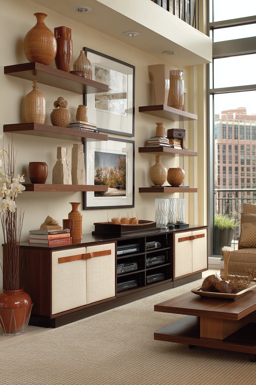
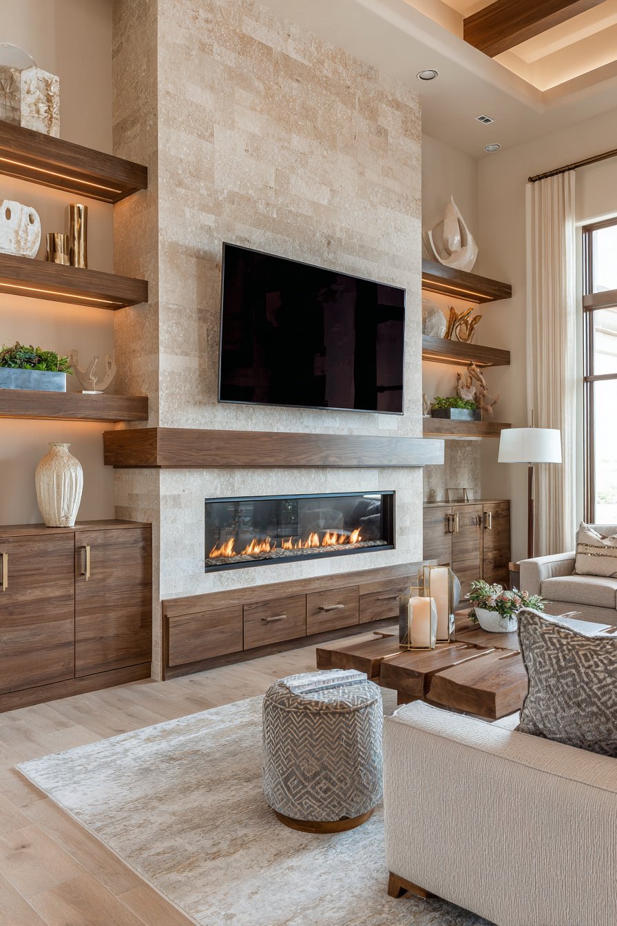
3. Contemporary Entertainment Wall in Walnut and Cream
Modern living demands thoughtful integration of technology without sacrificing aesthetic appeal, and this contemporary entertainment center demonstrates how brown and beige can create a sophisticated media wall. The custom cabinetry, constructed from rich walnut wood with its characteristic dark grain patterns and slightly reddish undertones, provides ample concealed storage for electronics, games, and media while maintaining clean lines and a streamlined appearance. The walnut’s natural variations in color—from medium brown to darker chocolate tones—create visual interest across the expanse of the wall unit.
Floating shelves in the same walnut finish break up the solid cabinetry, providing display opportunities for curated decor in cream and terracotta tones. These open shelves create breathing room in the design, preventing the entertainment wall from feeling heavy or imposing. Carefully selected objects—a cream ceramic vase, terracotta bowls, art books with neutral spines, and small sculptural pieces—occupy the shelves with intentional spacing that feels curated rather than cluttered. The surrounding walls, painted in a warm beige with subtle undertones, provide a neutral backdrop that allows the rich wood tones to take center stage.
The low-profile media console features distinctive leather drawer pulls in tan, a detail that might seem minor but adds a layer of sophistication and tactile interest. These leather accents echo traditional equestrian influences while maintaining a contemporary feel. Natural light from adjacent windows streams across the wall during daytime hours, creating gentle shadows that emphasize the dimensional quality of the shelving and highlight the wood grain. As evening approaches and the space transitions to entertainment mode, integrated LED lighting within the shelving provides subtle illumination that showcases displayed objects without glare.
Key Design Tips: Choose walnut cabinetry for its rich brown tones and natural grain variations that add character to modern designs. Paint surrounding walls in warm beige to create contrast while maintaining the neutral palette. Incorporate floating shelves between solid cabinetry to create visual breathing room and display opportunities. Select leather hardware in tan or caramel tones as a luxurious detail that connects to the brown color story. Use integrated LED lighting within shelving to highlight displayed objects and create ambiance during evening hours. Display cream and terracotta ceramics to add warmth and organic shapes against the geometric cabinetry.
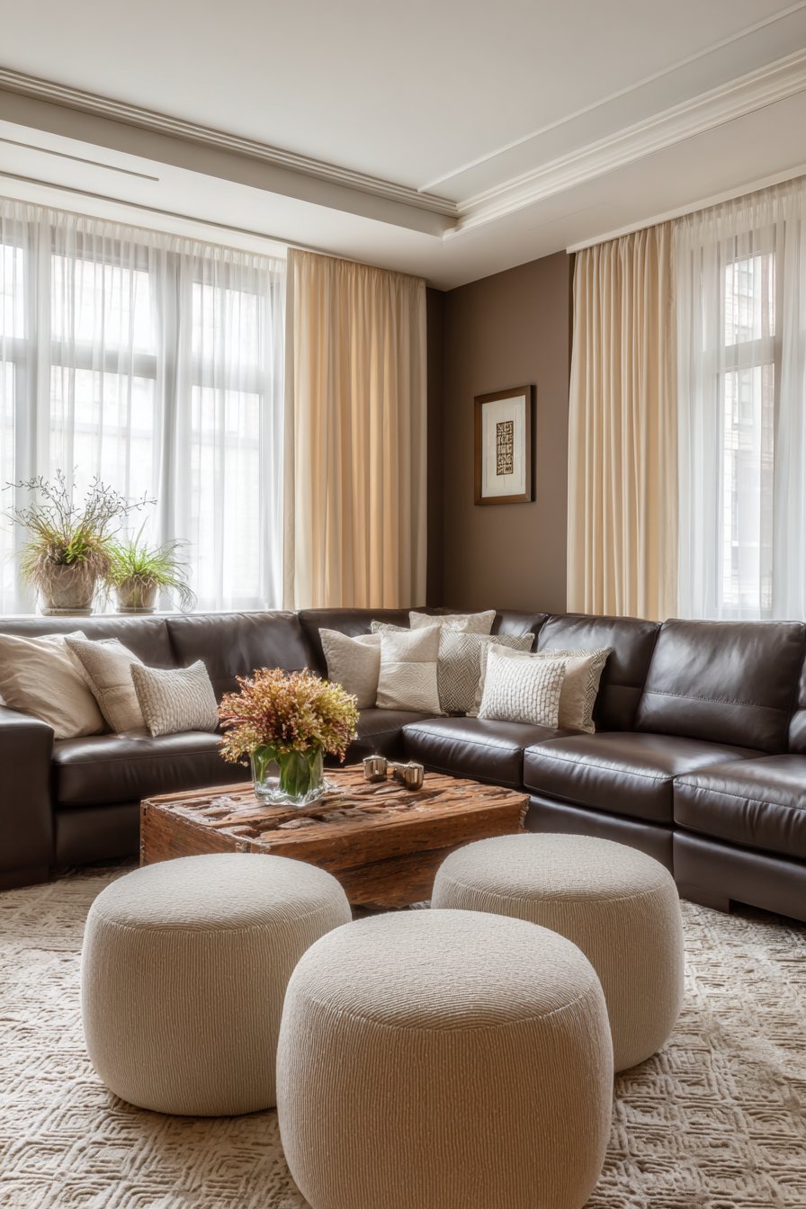
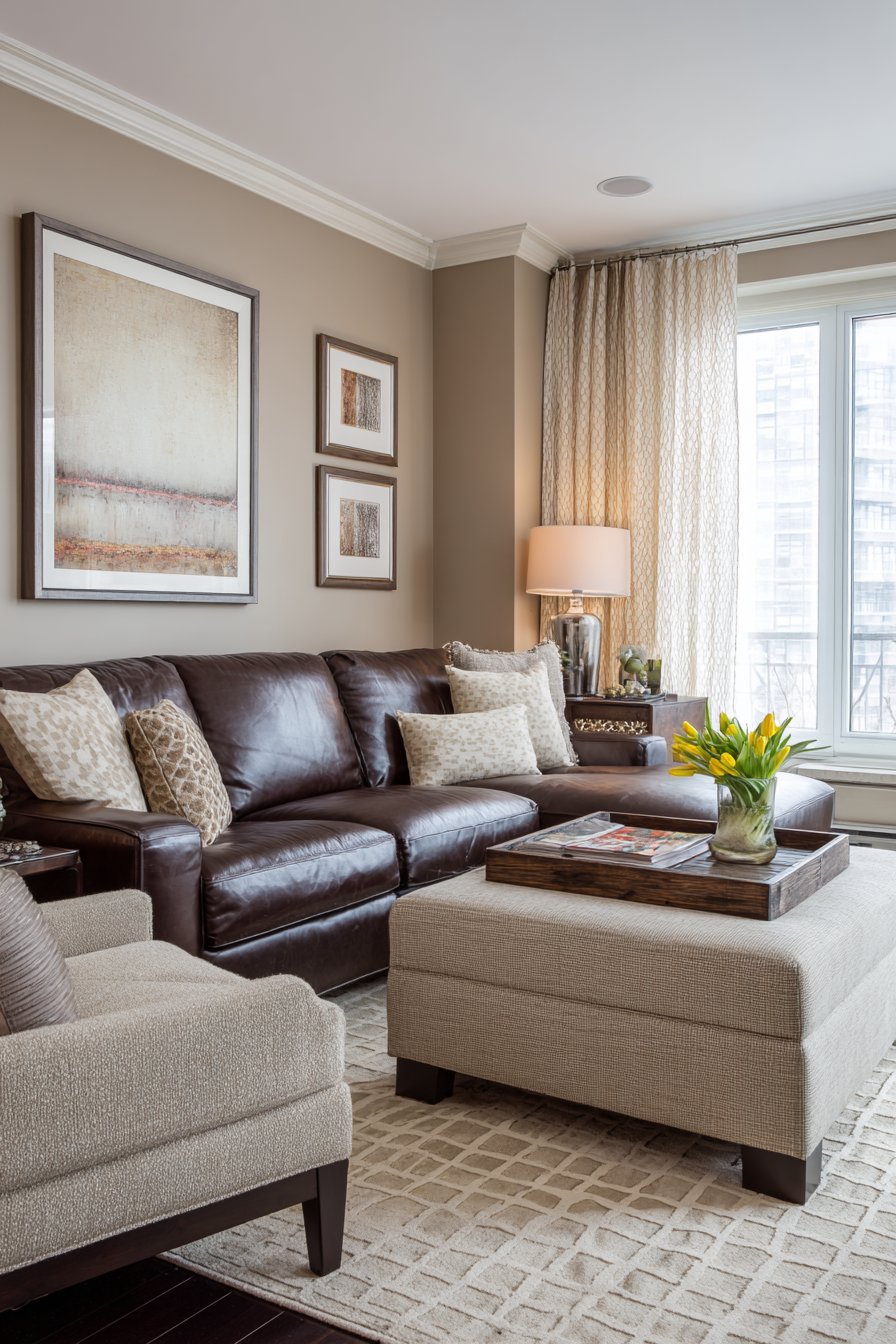
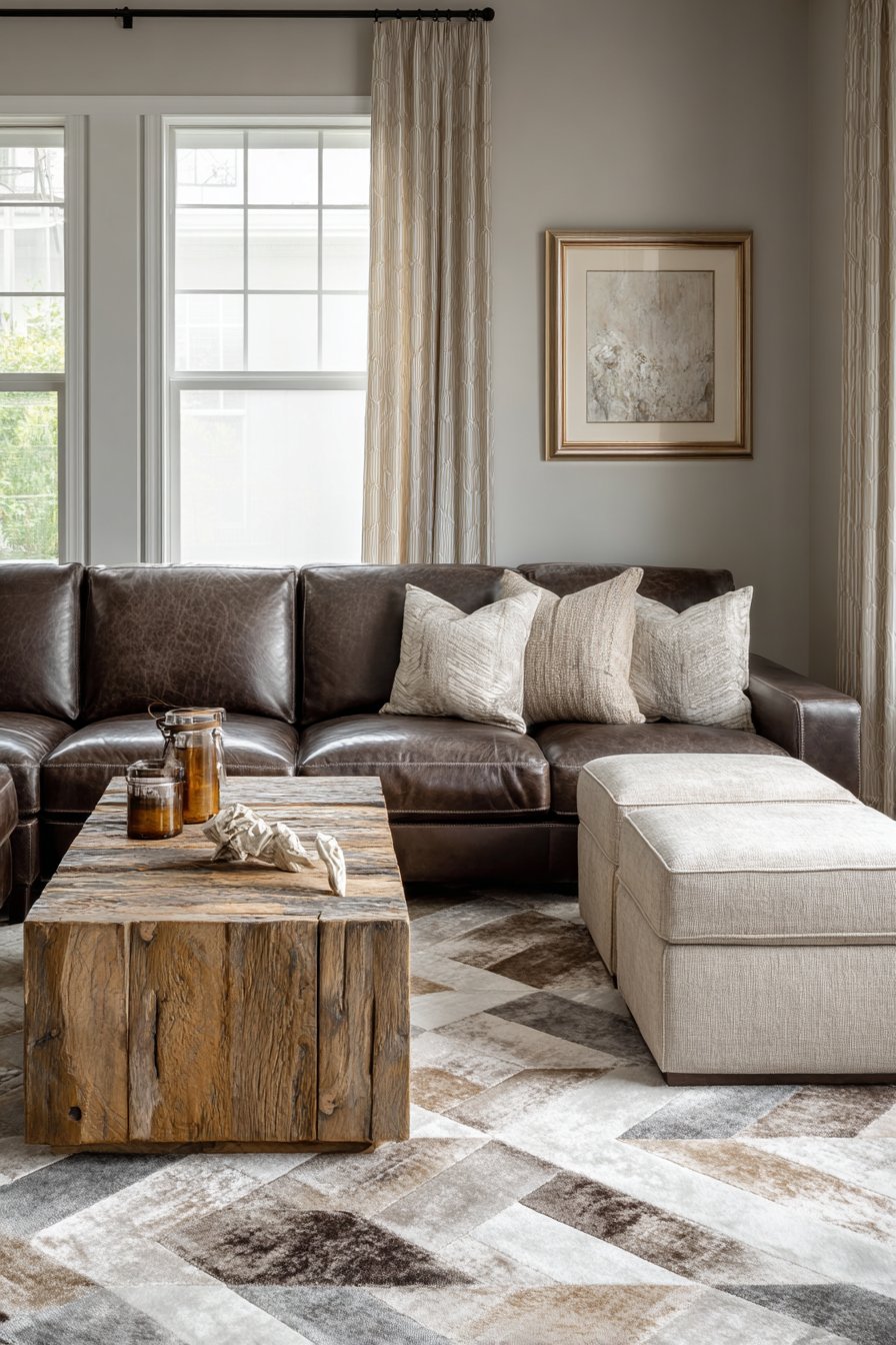
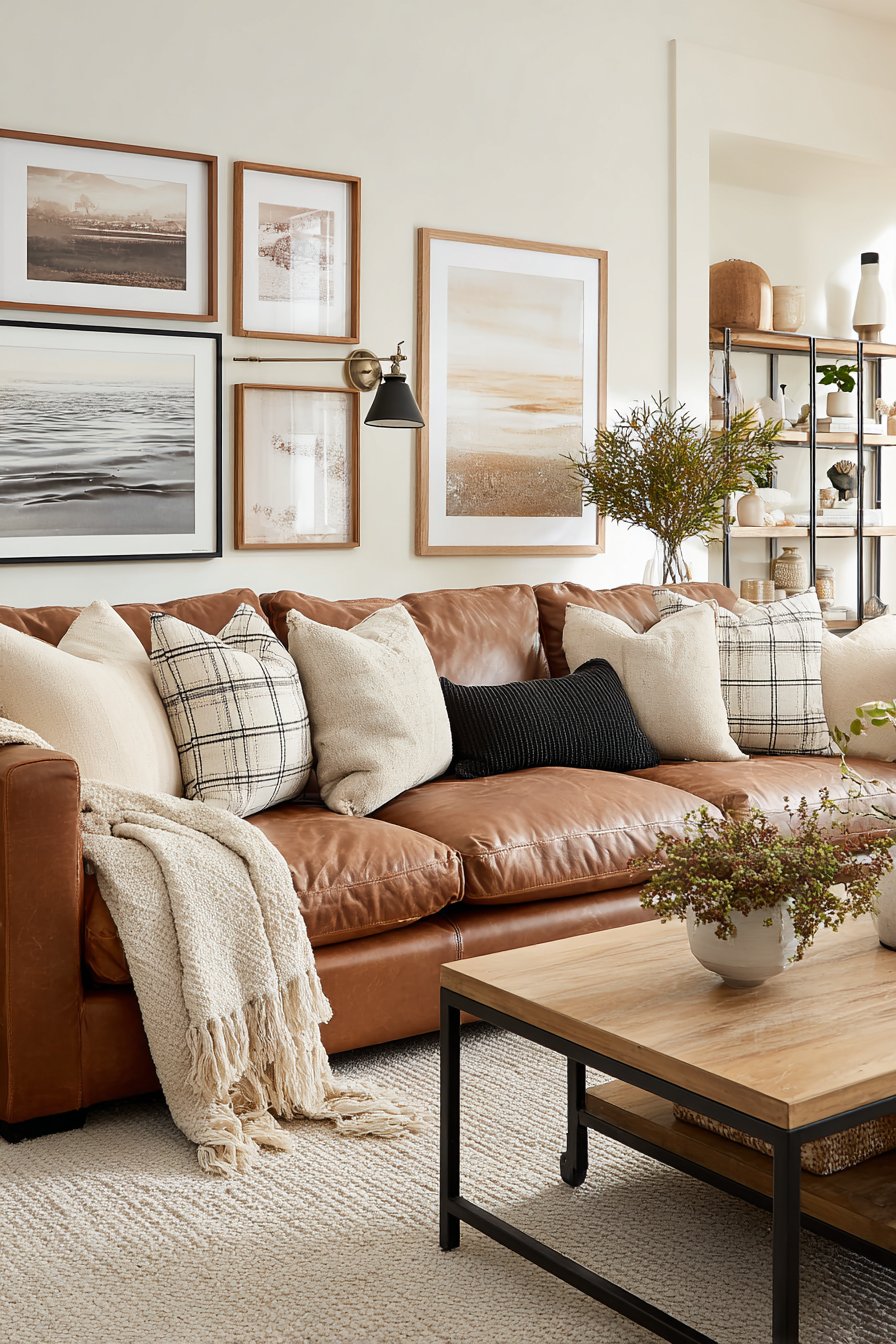
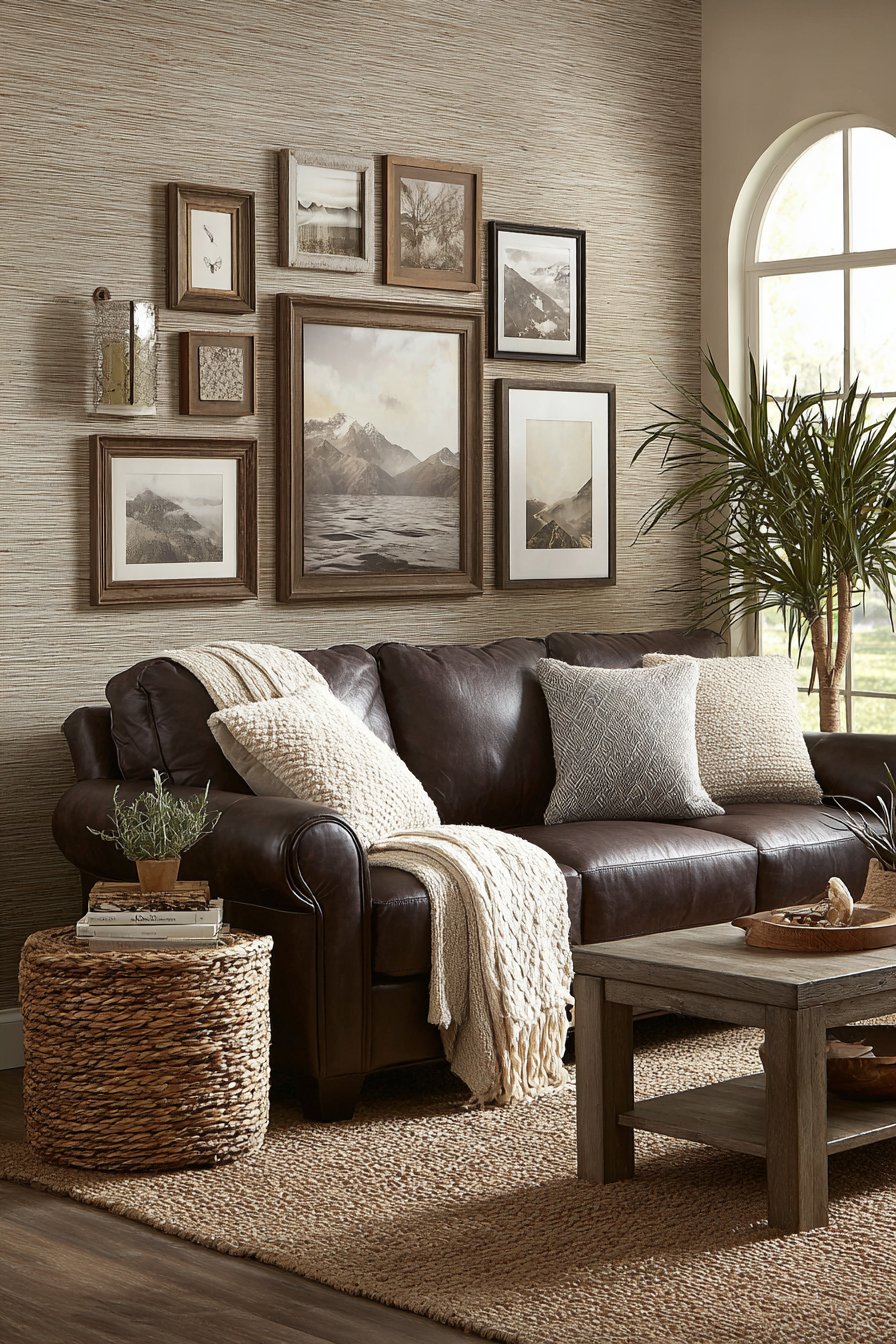
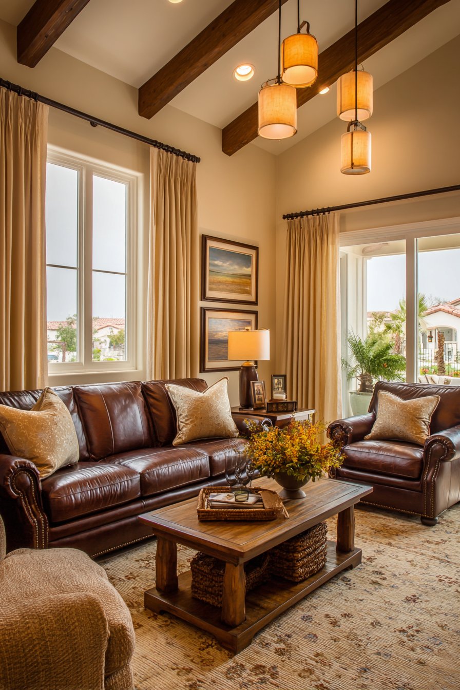
4. Chocolate Leather Sectional with Earthy Foundations
The commanding presence of a chocolate brown leather sectional defines this living room’s layout and establishes its sophisticated, masculine tone. Full-grain leather in this deep, rich brown develops character over time, with natural variations in color and subtle patina that make each piece unique. The sectional’s generous proportions provide ample seating for family and guests while its low-profile design maintains visual openness, preventing the substantial piece from overwhelming the space. Beige performance fabric ottomans serve multiple functions—as footrests, additional seating, and even impromptu coffee tables—while their lighter tone prevents the seating area from feeling too dark.
Anchoring this arrangement is a reclaimed wood coffee table that serves as both functional surface and artistic centerpiece. The table’s natural grain variations, visible knots, and slight imperfections tell a story of the wood’s previous life, adding depth and authenticity to the space. Its substantial presence and organic edge create a beautiful contrast with the refined leather upholstery. The surface shows honest wear and natural color variations from pale honey to deeper brown, making each angle visually interesting.
Underfoot, a geometric patterned rug in sand and taupe tones grounds the entire seating arrangement while introducing subtle pattern without competing with the room’s primary materials. The rug’s design features abstract shapes or simplified geometric forms that add contemporary flair while the neutral colorway ensures it complements rather than dominates. Wide windows dressed in sheer beige curtains allow natural daylight to stream through, the filtered light creating a soft glow that enhances the warmth of the leather and brings out the golden undertones in the reclaimed wood.
Key Design Tips: Invest in full-grain chocolate brown leather for sectional seating that develops beautiful patina and character over time. Choose reclaimed wood furniture to add authenticity, texture, and environmental consciousness to your design. Incorporate beige performance fabric ottomans for versatile functionality and lighter tonal balance. Select geometric rugs in sand and taupe tones to add subtle pattern while maintaining the neutral palette. Use sheer beige window treatments to filter natural light softly while preserving privacy. Position the sectional to maximize natural light exposure, which enhances leather’s rich tones and highlights wood grain.
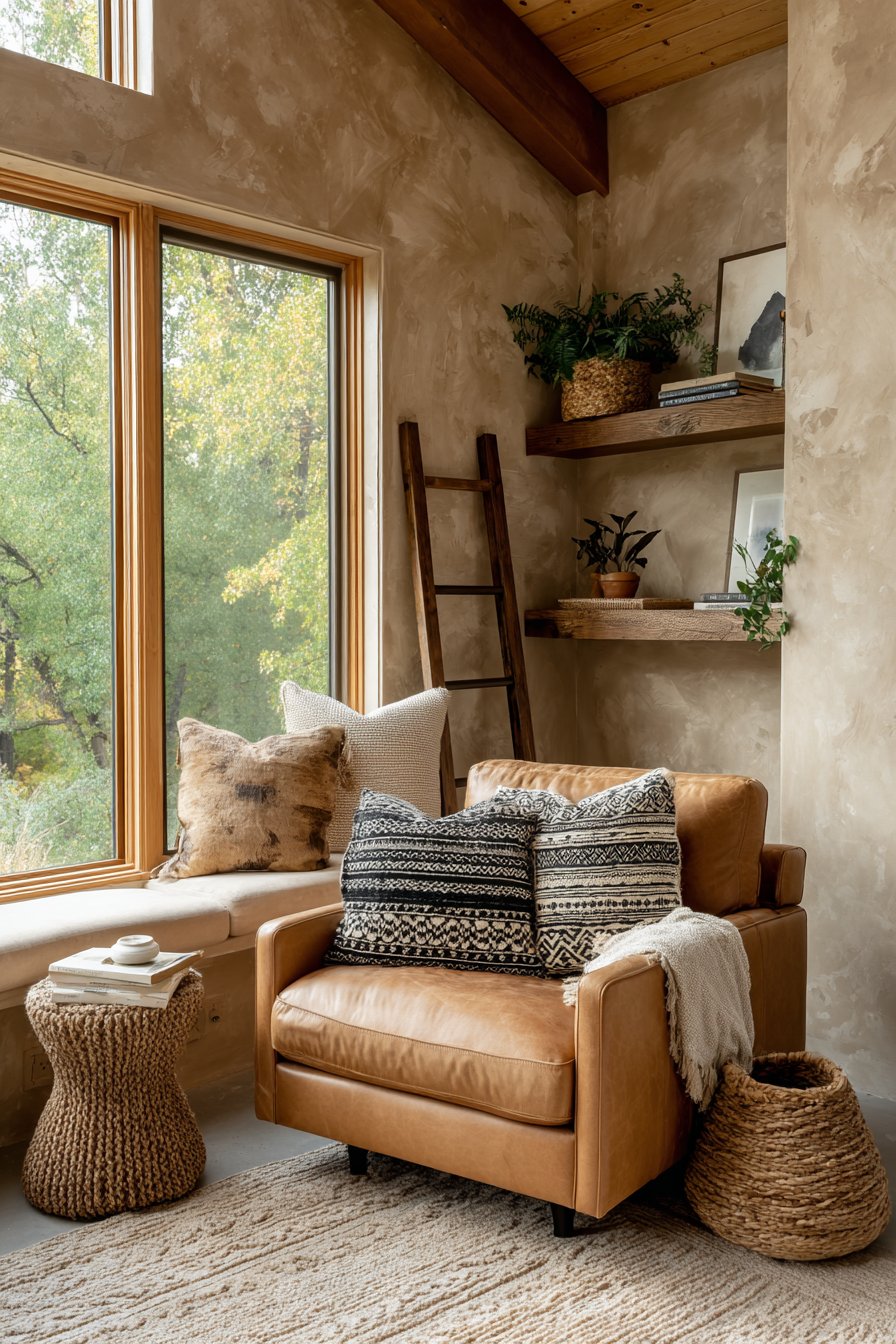
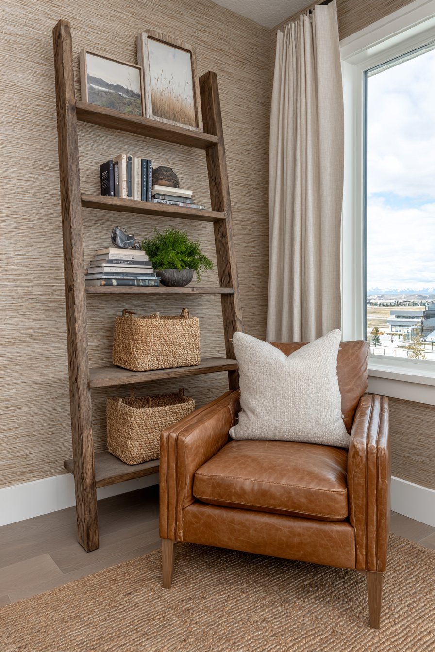
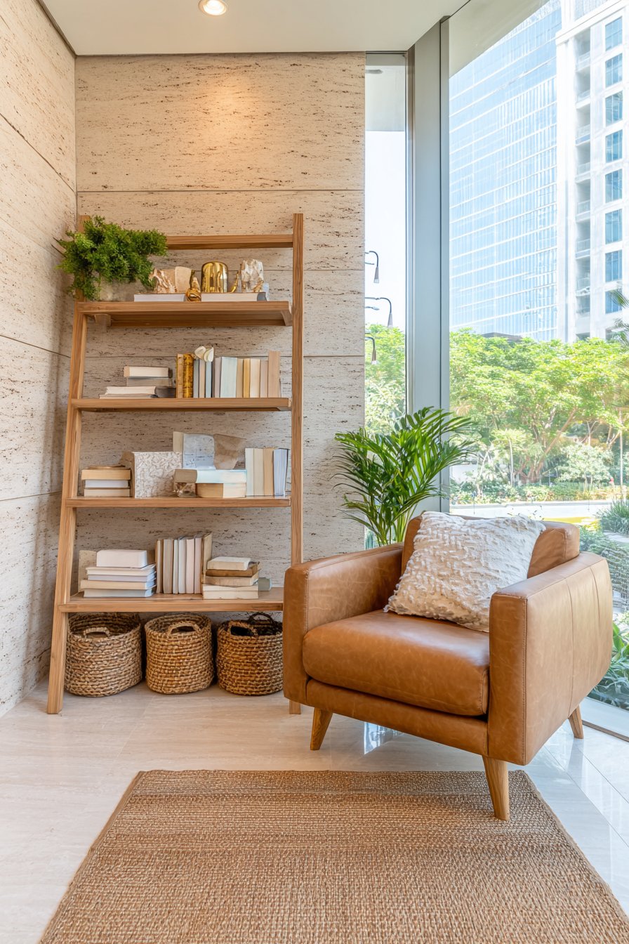
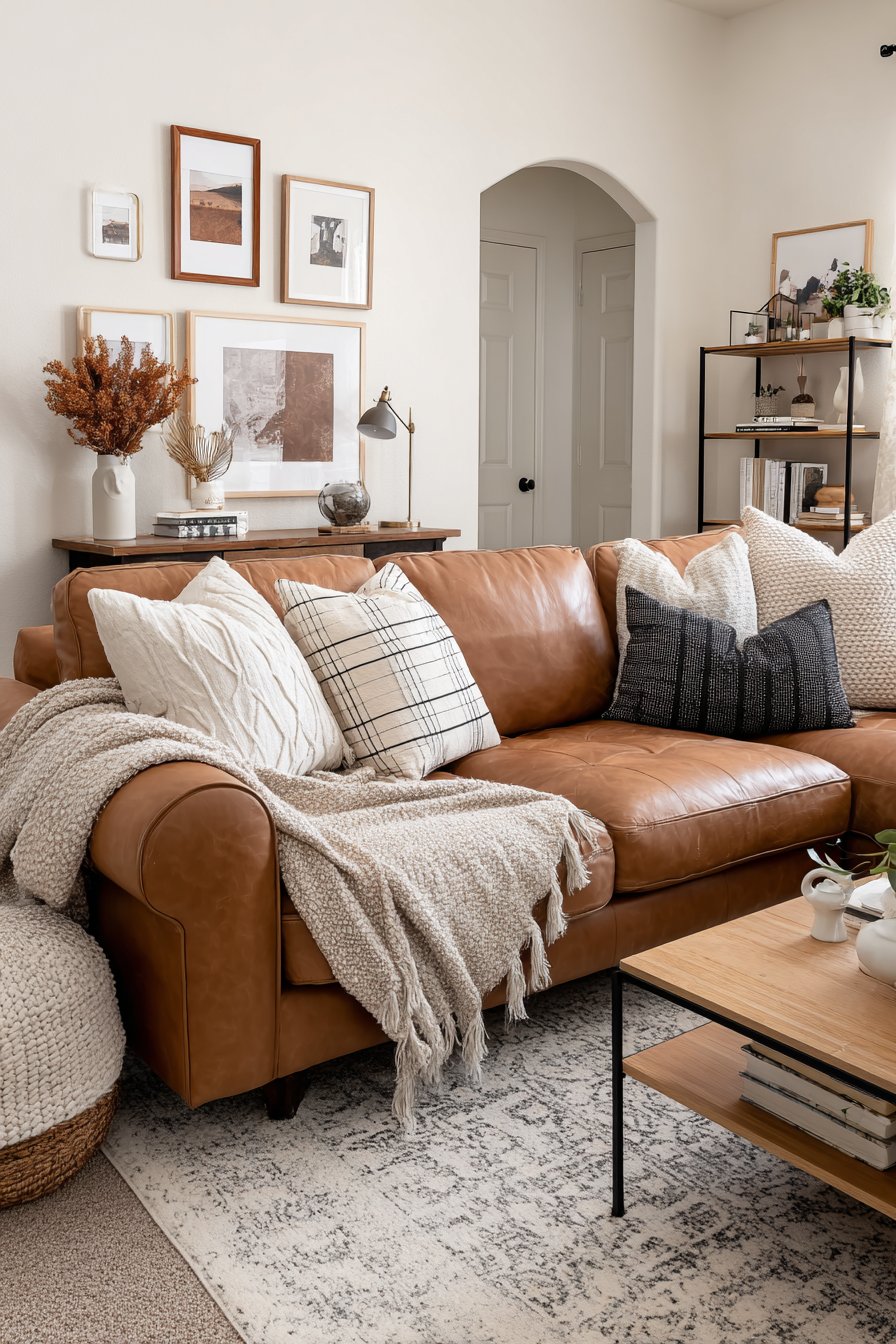
5. Cozy Reading Retreat with Camel Leather and Natural Light
Creating a dedicated reading nook within a larger living room adds both functionality and charm, and this camel-colored leather armchair positioned strategically near floor-to-ceiling windows exemplifies thoughtful space planning. The chair itself, upholstered in buttery soft leather in a warm camel tone, sits at the perfect intersection of comfort and style. Its traditional silhouette features a high back for head support, rolled arms for elbow rest, and deep seating that encourages settling in with a good book for extended periods. The leather’s medium brown tone with golden undertones catches natural light beautifully, appearing to glow when the afternoon sun streams through the windows.
The wall treatment behind this reading nook deserves special attention, featuring a textured beige finish that adds dimensional interest without pattern or color distraction. This might be achieved through techniques like Venetian plaster, textured wallpaper, or even carefully applied paint with subtle glazing. The texture catches light at different angles throughout the day, creating subtle shadows and highlights that make the wall surface feel alive and dynamic rather than flat. This backdrop provides enough visual interest to define the nook as its own special zone while maintaining the serene, neutral palette.
A wooden ladder shelf in medium brown creates vertical storage and display without the visual weight of traditional bookcases. Leaning at a slight angle, the ladder shelf holds carefully arranged books with spines in neutral tones, along with woven baskets in natural brown fibers that provide closed storage for reading glasses, bookmarks, and other small necessities. A natural jute rug defines the footprint of the reading area, its organic texture and warm tan color grounding the intimate space. The placement near the windows ensures ample natural light for reading during daylight hours, with the soft morning light being particularly magical.
Key Design Tips: Position reading chairs near windows to maximize natural light for comfortable daytime reading. Choose camel or tan leather for armchairs to add warmth and luxury while maintaining the brown and beige palette. Install textured wall treatments in beige tones to add visual interest and define the reading zone. Use ladder shelving in medium brown wood tones for space-efficient storage with architectural interest. Incorporate jute rugs to define intimate zones within larger spaces while adding natural texture. Fill woven baskets with reading accessories for organized, accessible storage that maintains the aesthetic. Select chairs with high backs and deep seating for comfortable extended reading sessions.

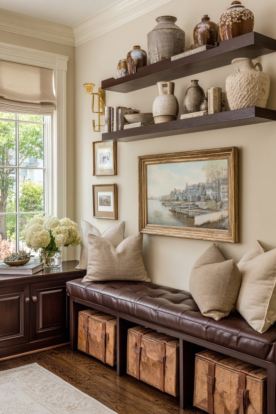
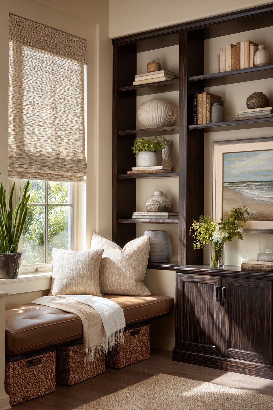
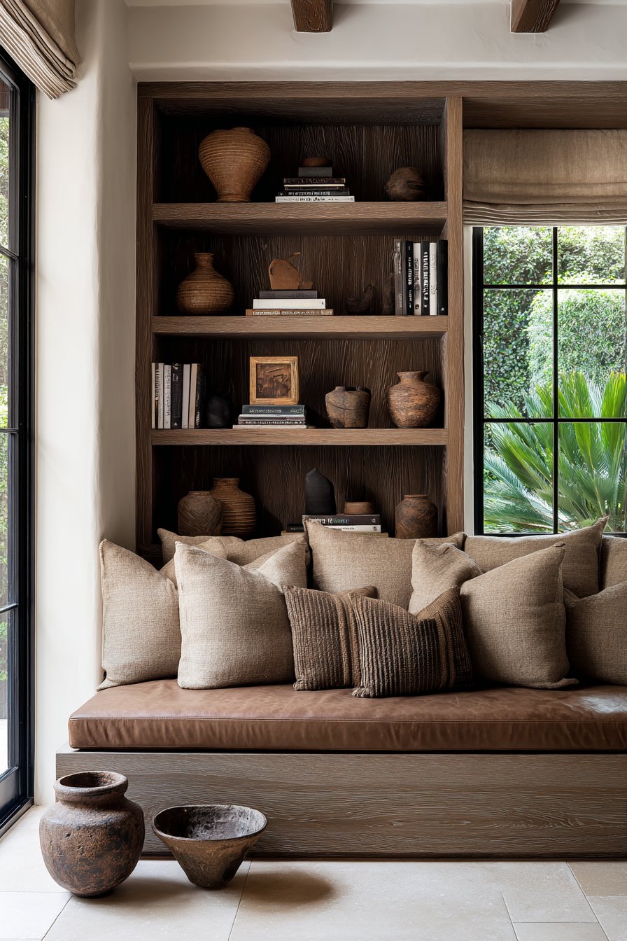
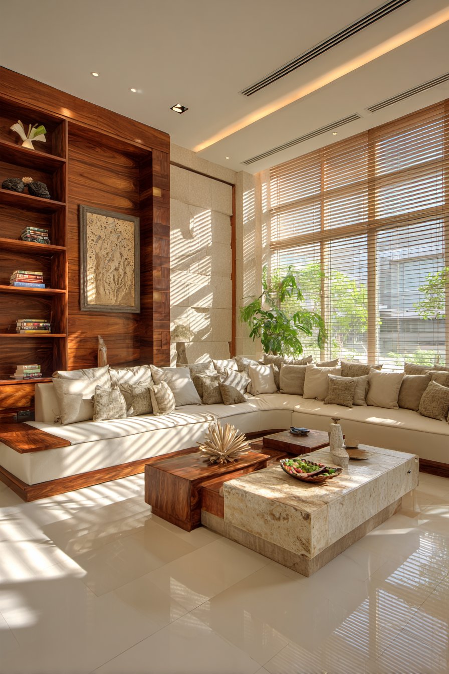
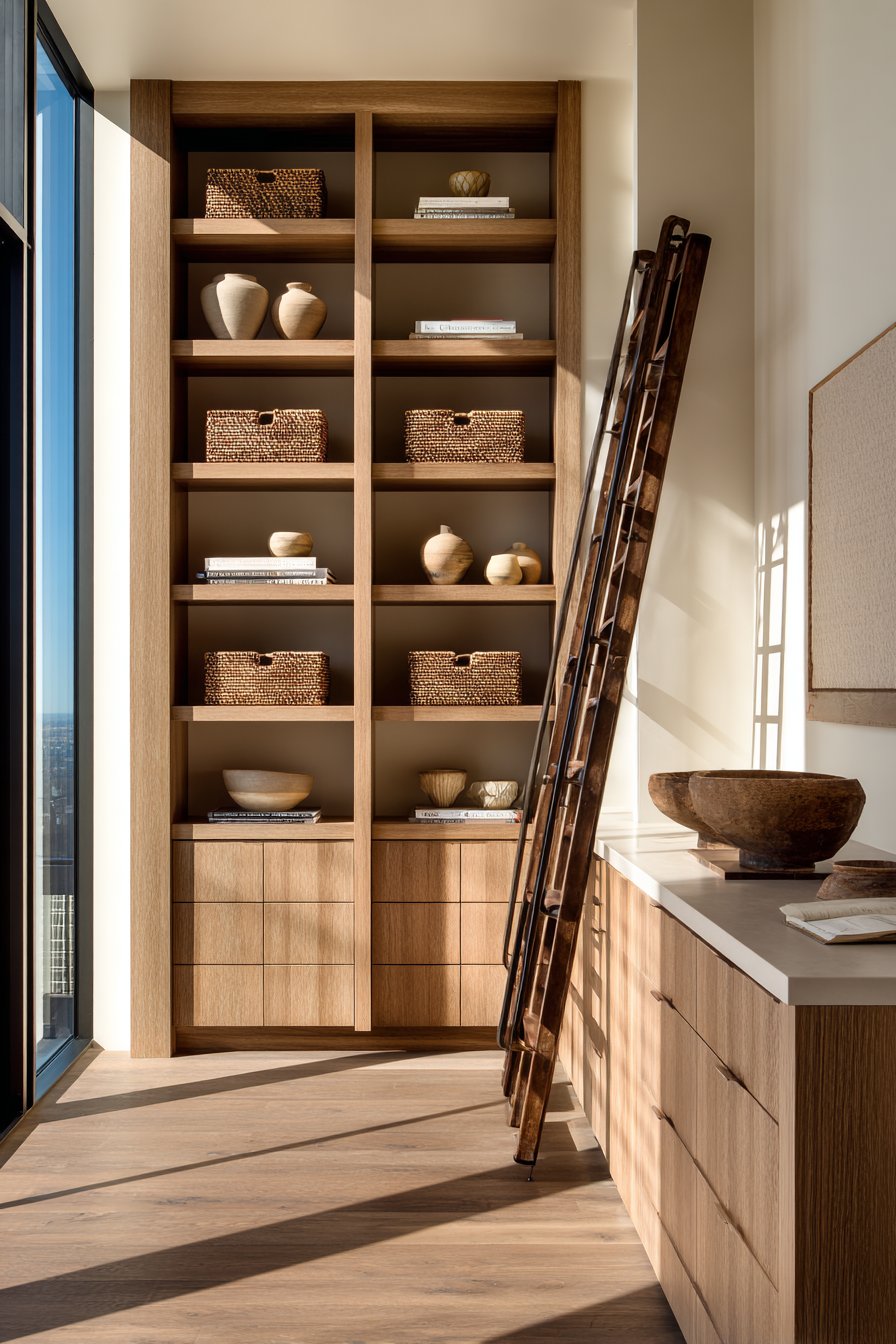
6. Espresso Built-Ins with Linen Softness
Built-in shelving represents one of the most valuable additions to any living room, providing extensive storage and display opportunities while appearing to be integral to the architecture itself. This floor-to-ceiling shelving system, constructed from oak with a rich espresso stain, creates dramatic visual impact along an entire wall. The deep, dark brown finish adds sophistication and weight to the space while its custom-fitted design maximizes every inch of available vertical space. The shelving features adjustable positioning, allowing for accommodation of various object sizes from tall vases to small ceramic pieces.
The shelves themselves serve as a carefully curated gallery, displaying ceramic vessels in cream, beige, and white tones that stand out beautifully against the dark wood backing. Art books with neutral-toned spines rest horizontally in organized stacks, their varied heights creating visual rhythm across the shelving. Family photos in simple brown wooden frames add personal touches without cluttering the overall aesthetic. The key to successful styling lies in thoughtful editing—leaving enough negative space around displayed objects allows each piece to breathe and be appreciated individually.
Natural light control becomes particularly important when working with dark wood tones, and this space features beige linen Roman shades that offer both privacy and light filtration. During bright midday hours, the shades can be lowered to prevent harsh glare while still allowing soft, diffused light to enter. When raised, they disappear almost entirely, maximizing window views and natural illumination. Below the window sits a brown leather bench with simple lines and firm cushioning, providing seating for putting on shoes or simply admiring the view while also serving as additional storage with a lift-up seat.
Key Design Tips: Install floor-to-ceiling built-in shelving to maximize vertical storage and create architectural impact. Choose espresso or dark brown stained oak for dramatic contrast against beige walls. Display ceramic vessels in cream and white tones to create visual focus against dark shelving. Arrange books with neutral spines in organized stacks to maintain the color scheme and create rhythm. Incorporate Roman shades in beige linen for light control that complements rather than competes with the color palette. Add a leather bench below windows for multi-functional seating and storage. Leave adequate negative space when styling shelves to prevent visual clutter and allow objects to be appreciated. Use adjustable shelving to accommodate various object heights and allow for future flexibility.
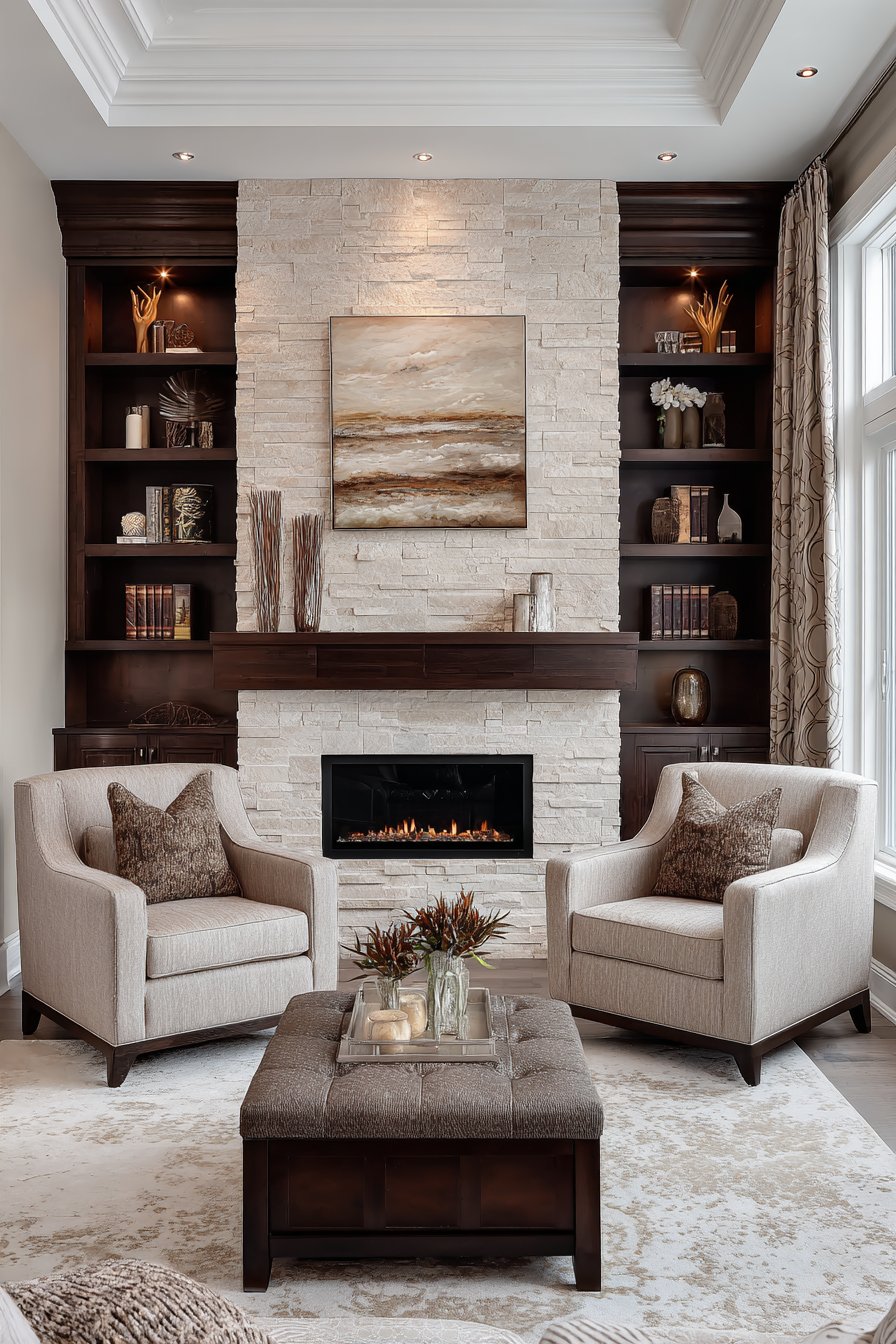
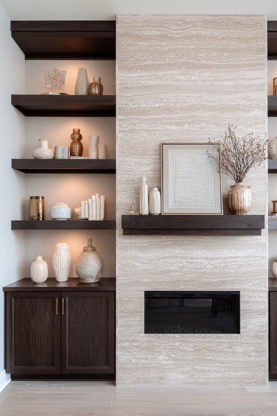
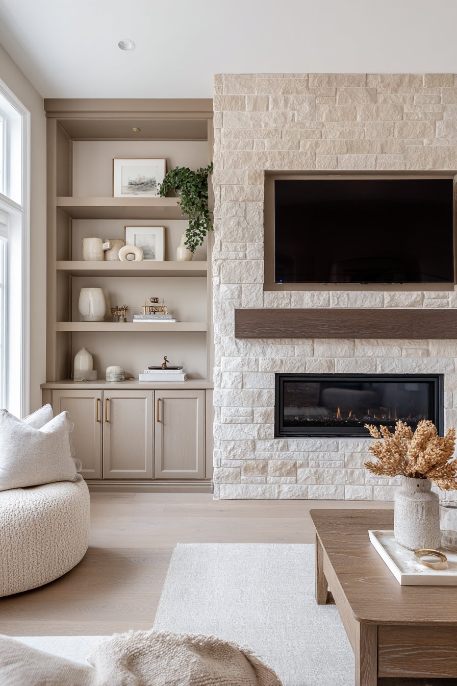
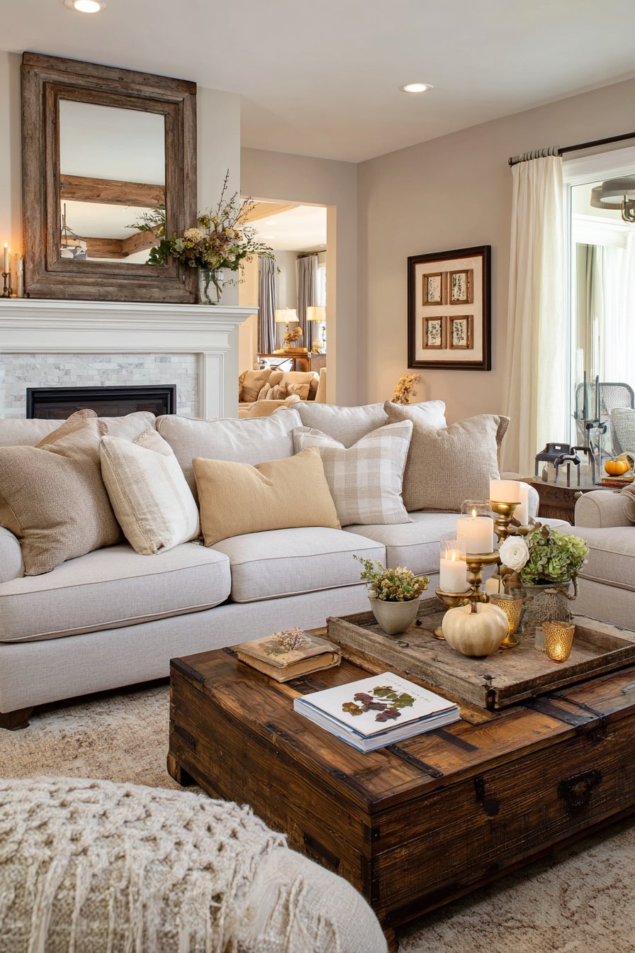
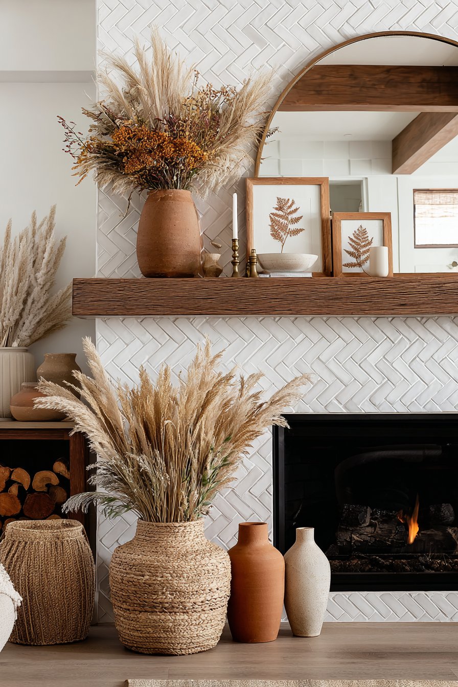
7. Natural Stone Fireplace as Focal Point
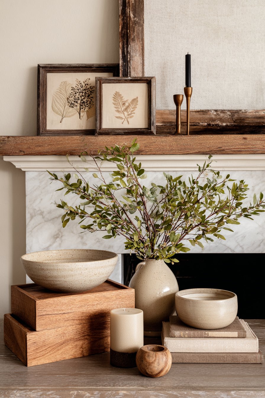
A fireplace naturally commands attention in any living room, and when clad in natural stone featuring warm beige and tan hues, it becomes an architectural masterpiece that anchors the entire space. The stone selection for this fireplace wall showcases beautiful variations in color—from pale cream to rich tan to hints of subtle brown—creating a textured surface that appears different at various times of day as light shifts across its irregular face. The stones themselves might be stacked ledgestone, tumbled travertine, or cut limestone, each offering distinct textural qualities while maintaining the warm neutral palette.
The dark brown wooden mantel provides both practical display space and visual contrast against the lighter stone. Constructed from solid wood with a deep chestnut or walnut finish, the mantel’s substantial thickness and clean lines complement both traditional and contemporary design schemes. Upon this mantel rests a carefully edited selection of minimalist decor in cream and bronze tones—perhaps a simple ceramic vessel, a bronze candleholder, and a small sculptural object—arranged with generous spacing that feels intentional rather than sparse.
Flanking the fireplace, built-in cabinets in matching chestnut brown provide essential storage while creating a cohesive built-in appearance. These cabinets feature simple panel doors with minimal hardware, allowing the beautiful wood grain to be the focal point. The symmetry of the flanking cabinets creates a sense of balance and formality that elevates the entire room. Recessed lighting within the ceiling or integrated into the built-ins casts gentle illumination across the stone surface, highlighting its texture and creating dramatic shadows that emphasize the dimensional quality of the installation.
Key Design Tips: Select natural stone in beige and tan tones to create a focal fireplace wall with organic texture and warmth. Choose a dark brown wooden mantel for contrast and practical display space. Keep mantel styling minimal with carefully selected objects in cream and bronze tones. Install flanking built-in cabinets in matching wood tones to create symmetry and provide storage. Use recessed or integrated lighting to highlight stone texture and create dramatic evening ambiance. Ensure stone selection shows natural color variation for dimensional interest. Consider the room’s scale when determining mantel thickness and stone installation height. Position seating to take advantage of the fireplace focal point while maintaining conversation-friendly arrangement.
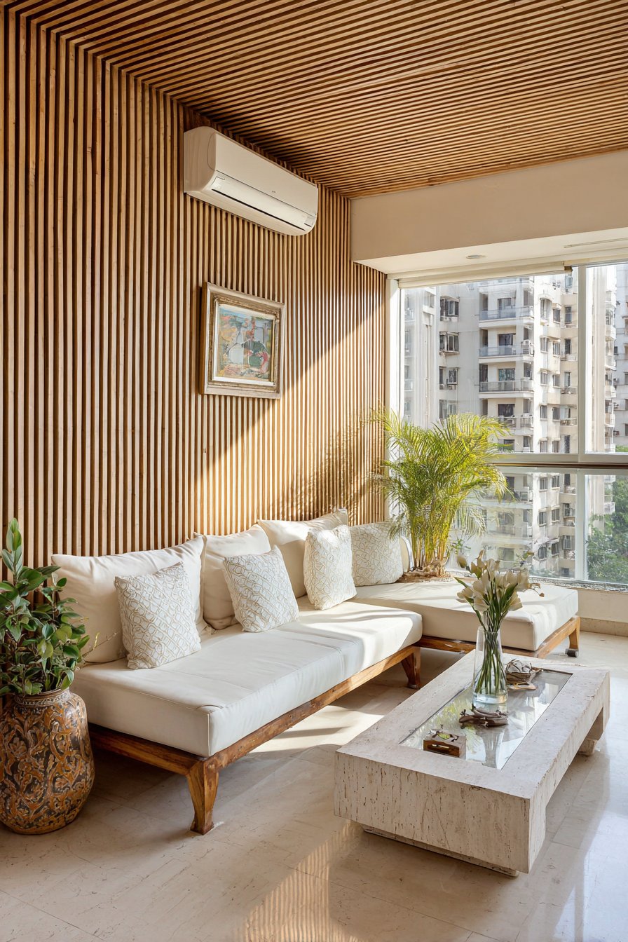
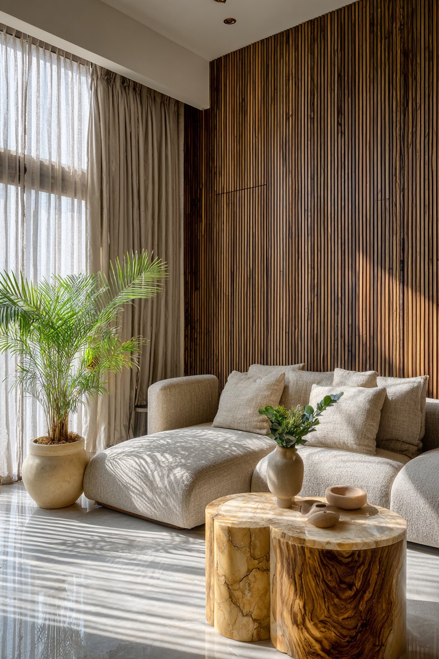
8. Horizontal Wood Slat Feature Wall with Modern Flair
Modern design often celebrates materials in their purest form, and this horizontal wood slat accent wall exemplifies this principle beautifully. The slats, crafted from medium walnut with its characteristic brown tones and subtle grain patterns, are mounted horizontally with consistent spacing that creates a rhythmic pattern across the wall. The three-dimensional quality of the slats introduces shadow lines that shift throughout the day as natural light moves across the room, making the wall feel dynamic and alive. This architectural element adds significant visual interest while maintaining the brown and beige color story.
Positioned opposite this striking feature wall sits a beige modular sofa system with deep, generous cushions that invite relaxation. The sofa’s neutral tone allows the wood slat wall to remain the focal point while its substantial comfort ensures the room remains functional and inviting. The modular nature of the seating allows for configuration flexibility—sections can be arranged in various formations to suit different occasions, from intimate conversations to large gatherings. The performance fabric upholstery in a warm beige tone resists staining and wear while maintaining a sophisticated appearance.
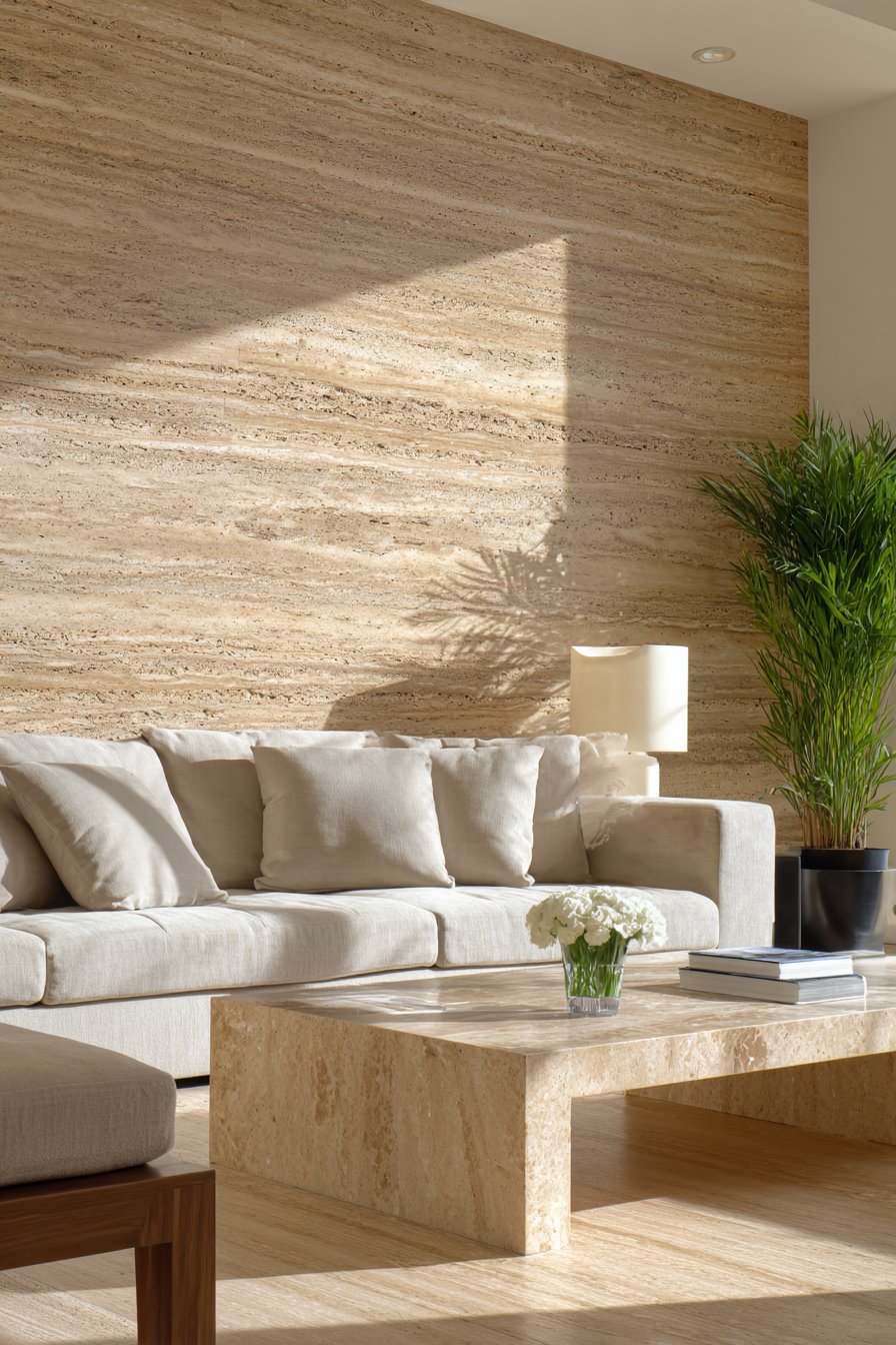
A travertine coffee table introduces organic texture and natural stone beauty to the center of the arrangement. Travertine’s porous surface, filled voids, and subtle color variations from cream to light tan create visual interest while its substantial weight and cool surface provide practical functionality. The stone’s earthy quality connects perfectly with the wood slat wall and beige upholstery, reinforcing the natural material story. As natural light enters from adjacent windows, it creates linear shadow patterns across the slats—an ever-changing display that serves as living artwork.
Key Design Tips: Install horizontal wood slats in walnut or medium brown tones to create an architectural feature wall with dimensional interest. Space slats consistently to create rhythm and allow for shadow play as light moves throughout the day. Choose beige modular seating to maintain focus on the feature wall while providing comfortable, flexible seating. Incorporate travertine or other natural stone for coffee tables to add organic texture and cool contrast. Position the feature wall opposite primary seating for maximum visual impact. Use LED strip lighting behind slats for dramatic evening effect and to emphasize the three-dimensional quality. Ensure proper installation with wall anchors capable of supporting the slat weight. Consider acoustic benefits of the slat wall in reducing echo in large, hard-surfaced rooms.
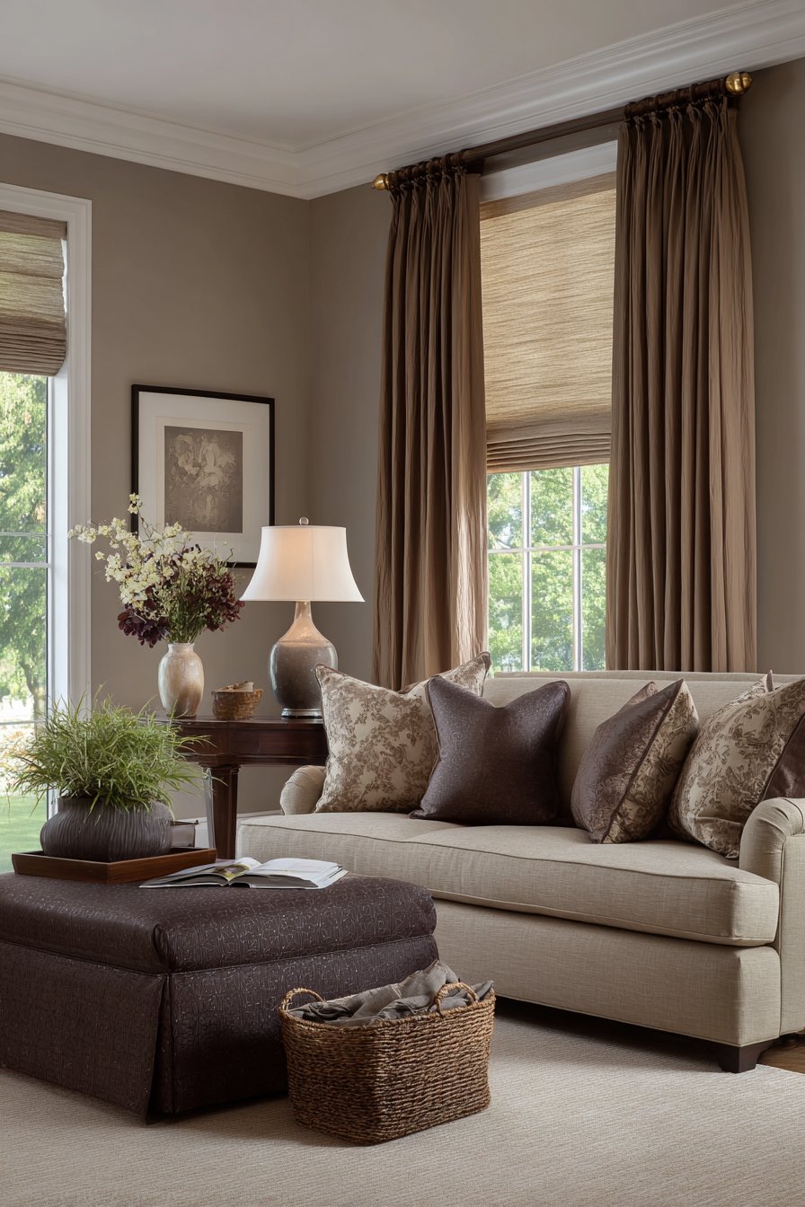
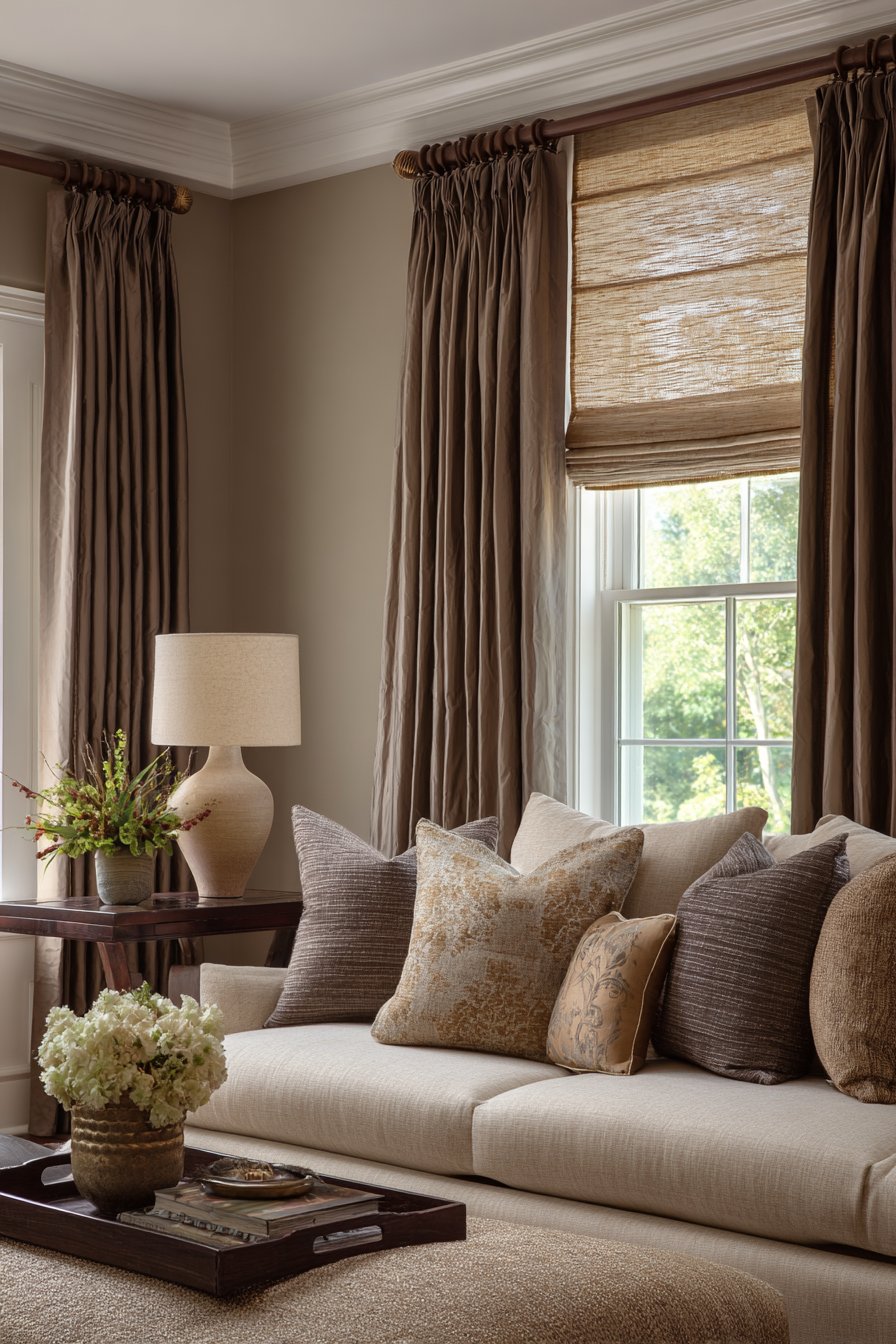
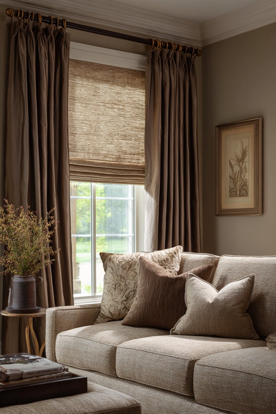
9. Layered Window Treatments in Natural Linen Tones
Windows serve as the eyes of a room, and their treatment significantly impacts both aesthetics and functionality. This sophisticated approach features layered window dressing that combines Roman shades in natural linen beige with flowing curtain panels in warm taupe. The Roman shades, mounted inside the window frame, provide privacy and light control with clean, tailored lines that suit both modern and traditional interiors. When lowered, the natural linen allows filtered light to enter, creating a soft, diffused glow throughout the space. When raised, they disappear almost entirely, maximizing views and natural illumination.
The outer layer consists of floor-to-ceiling curtain panels in a slightly deeper warm taupe tone, hung from dark brown wooden curtain rods with substantial brass finials. These panels frame the windows beautifully when drawn to the sides, adding softness and vertical emphasis that makes ceilings appear higher. The substantial weight of the taupe fabric allows panels to drape gracefully with natural folds, creating sculptural elements that add visual interest even when not in use. During evening hours, these panels can be drawn closed to provide privacy and insulation while their warm tone contributes to the cozy ambiance.
The hardware selection deserves particular attention—dark brown wooden rods with a smooth finish complement the room’s brown tones while brass finials add a touch of traditional elegance and metallic warmth. The finials’ design might feature classic ball shapes, simple cylinders, or more decorative scrollwork depending on the room’s overall style. The rods are mounted several inches above the window frame and extend beyond the frame width, creating the illusion of larger windows while allowing maximum light penetration when panels are open. This layered approach to window treatment provides ultimate flexibility in light control, privacy, and aesthetic impact.
Key Design Tips: Layer Roman shades in natural linen beige with curtain panels in warm taupe for maximum flexibility in light and privacy control. Mount curtain rods several inches above window frames and extend beyond frame width to create the illusion of larger windows. Choose dark brown wooden rods with brass finials to complement the brown and beige palette while adding traditional elegance. Select natural linen for shades to filter light softly while maintaining a natural, organic aesthetic. Ensure curtain panels reach the floor for visual height and proper proportion. Use panels in a slightly heavier weight for beautiful draping and improved insulation. Consider motorization for Roman shades to enhance convenience while protecting the delicate fabric from handling. Install on a layered track system or dual rods to allow independent operation of shades and panels.
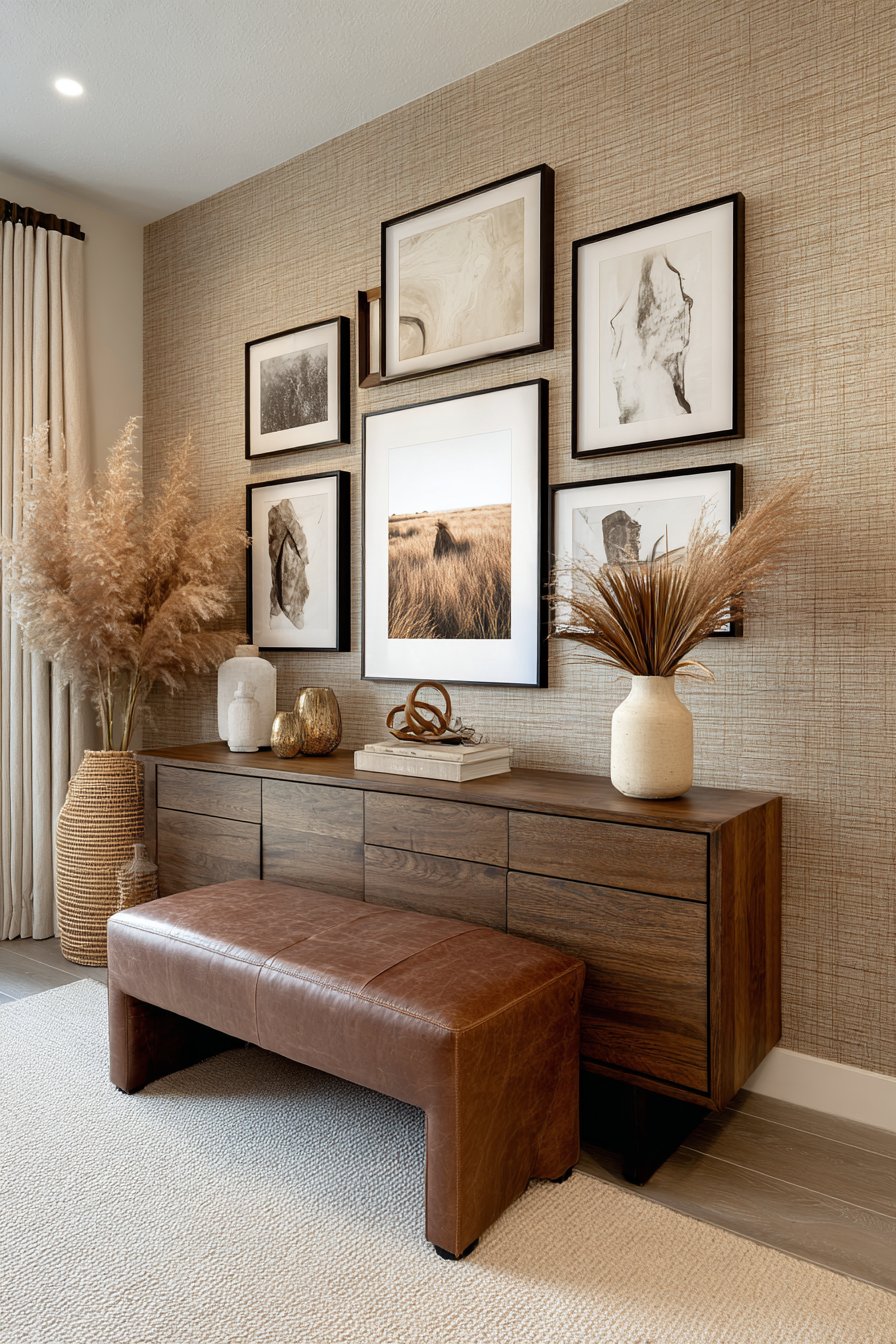
10. Curated Gallery Wall with Mixed Wood Frames
A thoughtfully composed gallery wall transforms a blank expanse into a personal museum that tells your story while reinforcing the room’s design narrative. This collection features frames in varying brown wood tones—from light oak and honey maple to medium walnut and dark mahogany—creating a cohesive yet varied presentation. The frames themselves become part of the artwork, with their different widths, profiles, and finishes adding textural interest. Against beige grasscloth wallpaper, these frames create beautiful dimensional shadows and highlight the natural texture of the wall covering.
The artwork selection maintains the brown and beige palette through careful curation. Neutral abstracts featuring creamy whites, various beiges, and touches of brown create visual interest without introducing competing colors. Sepia-toned photography adds nostalgic warmth and often provides personal connection through family portraits or meaningful places. The mix of abstract and representational imagery, combined with varied sizes and orientations, creates dynamic visual flow that draws the eye across the wall. The arrangement follows a loose grid that feels organized without being rigid, allowing for slight variations in spacing that make the display feel organic rather than overly calculated.
Below this gallery wall sits a brown leather console table with clean lines and minimal ornamentation. The table’s surface provides additional display opportunity for three-dimensional objects that complement the wall above—perhaps a bronze sculpture, a stack of art books with beautiful neutral covers, or a ceramic bowl in cream. The console’s placement creates a complete vignette that grounds the gallery wall and provides functional surface space for keys, mail, or decorative objects. Together, the console and gallery wall create a memorable first impression in an entryway or add personality to a living room wall.
Key Design Tips: Mix frame woods in varying brown tones from light to dark to create cohesive variety in gallery wall presentations. Choose grasscloth wallpaper in beige tones to add subtle texture and warm backdrop for artwork. Curate artwork in neutral tones—sepia photography, beige abstracts, and cream-toned pieces—to maintain the color palette. Arrange frames following a loose grid with slight spacing variations for organic feel. Include varied sizes and orientations (vertical and horizontal) to create visual interest. Position a leather console below the gallery wall to ground the display and provide functional surface. Maintain consistent mat colors in cream or beige to unify diverse artwork. Use picture hanging systems that allow for easy adjustment and future changes without new wall holes.
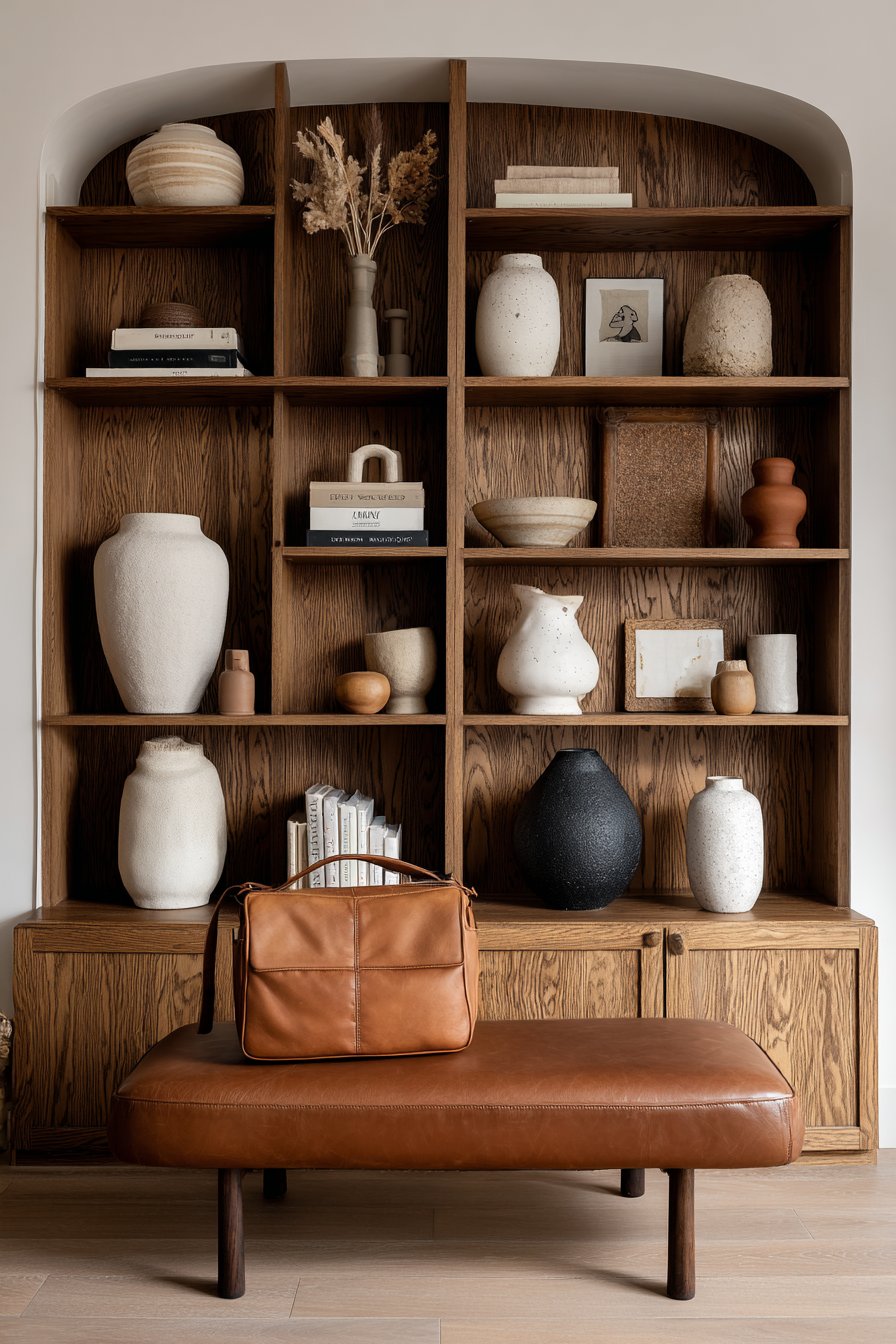
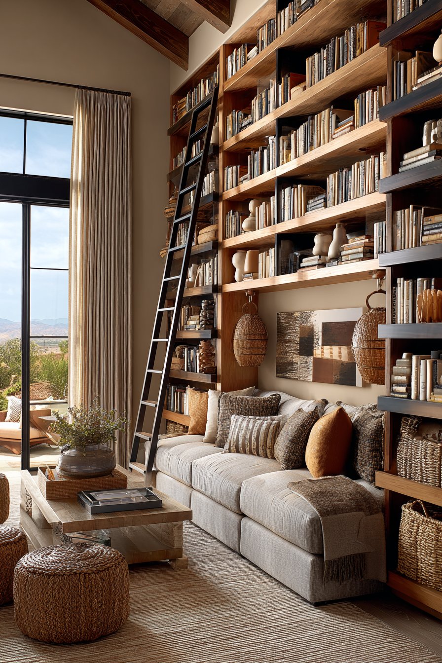
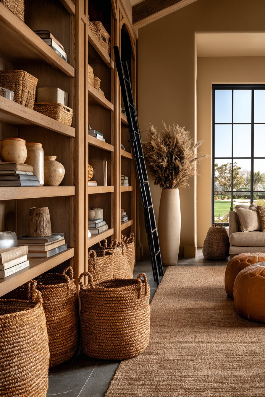
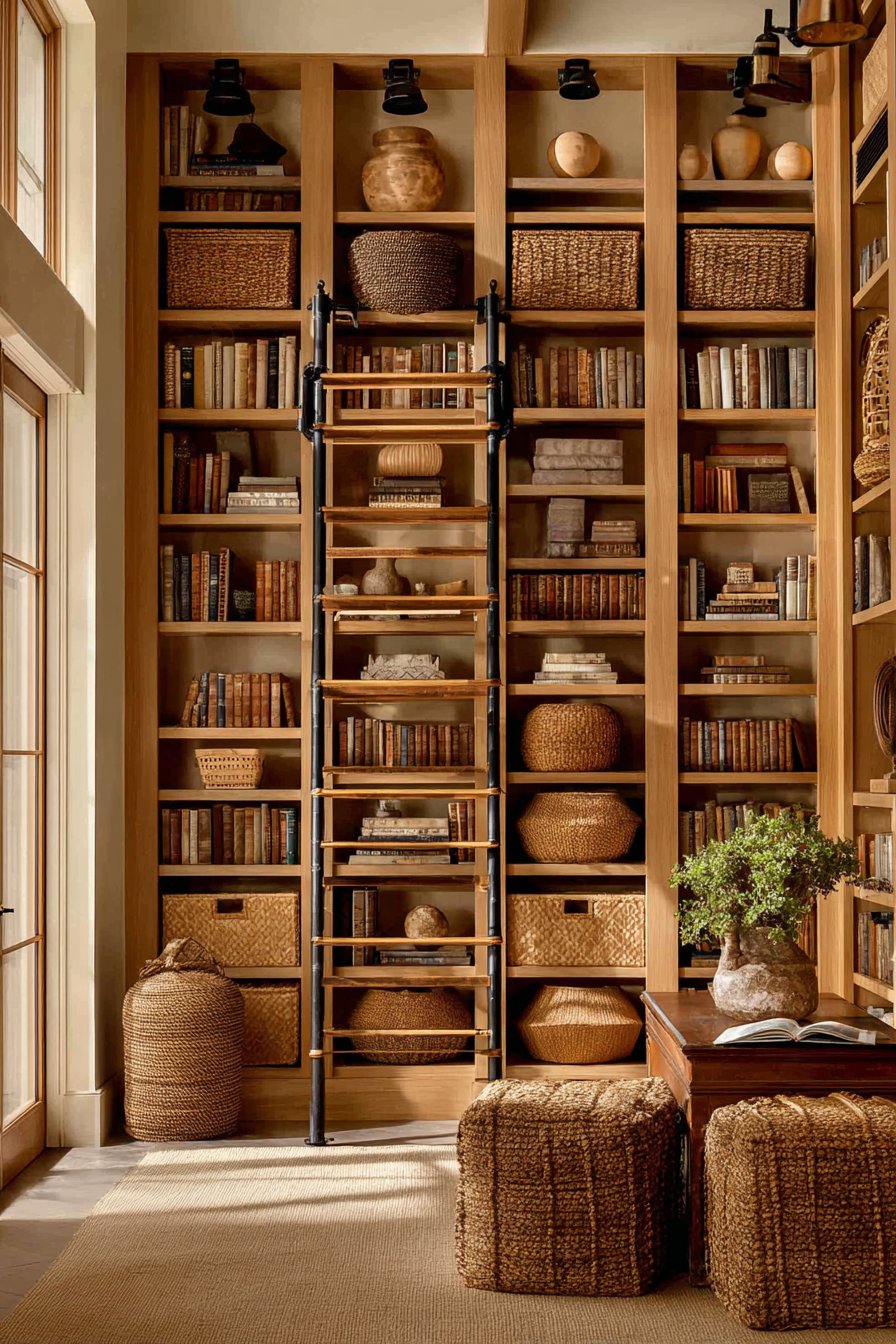
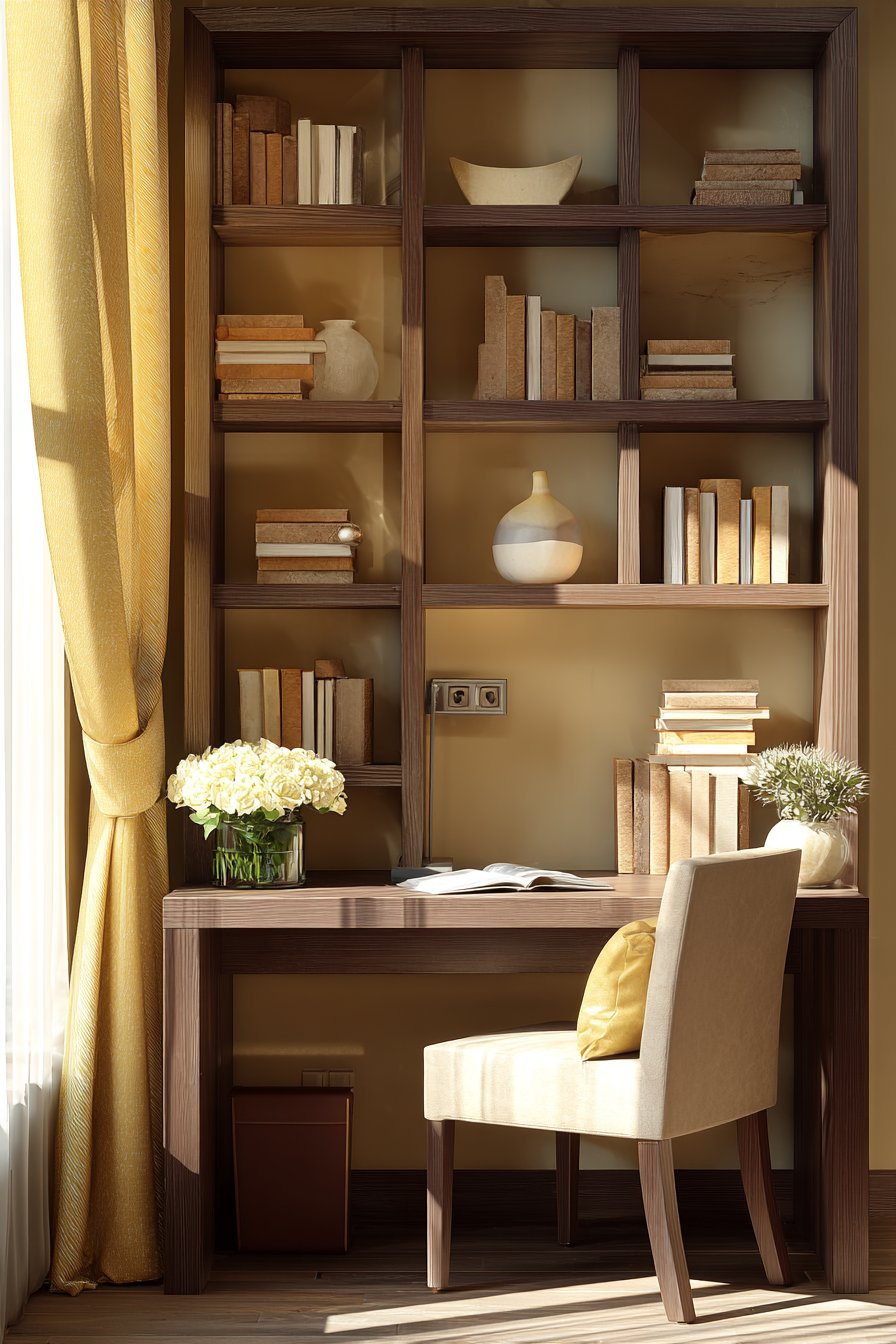
11. Floor-to-Ceiling Bookcases with Library Ladder Charm
Extensive book collections deserve proper housing, and these floor-to-ceiling built-in bookcases in honey-toned wood provide both practical storage and architectural beauty. The custom cabinetry features adjustable shelving that accommodates books of various heights, from standard paperbacks to oversized coffee table books. The honey tone of the wood—achieved through oak or maple with a natural or light stain—brings warmth and golden undertones that glow when natural light streams across the surface. The wood grain provides subtle visual interest across the expanse of shelving without becoming distracting.
The shelving styling demonstrates the art of curated display, with books arranged both vertically in traditional fashion and stacked horizontally for variety. Interspersed among the books are beige ceramic pieces—vases, bowls, and sculptural objects—that provide visual breathing room and break up long runs of book spines. Woven baskets in natural brown fibers sit on lower shelves, providing closed storage for less attractive necessities while maintaining the natural material story. The baskets’ varied weaves and organic brown tones add textural richness while serving essential organizational functions.
A rolling library ladder in aged bronze finish adds both functional access to high shelves and charming character reminiscent of traditional libraries and bookshops. The ladder’s metal construction with its warm bronze patina introduces an industrial element that contrasts beautifully with the honey-toned wood and provides a focal point of mechanical interest. The ladder glides smoothly on a ceiling-mounted track, making upper shelves easily accessible while folding neatly to the side when not in use. Against beige wall backing visible between shelves, the entire installation creates a sophisticated home library feel within the living space.
Key Design Tips: Install floor-to-ceiling bookcases in honey-toned wood to create extensive storage with warm, glowing presence. Use adjustable shelving to accommodate various book sizes and allow future flexibility. Mix vertical and horizontal book arrangements to create visual variety and accommodate different book dimensions. Display beige ceramics between books to provide visual breathing room and add decorative interest. Incorporate woven baskets on lower shelves for closed storage that maintains the natural material aesthetic. Add a rolling library ladder in bronze or aged metal for functional access and traditional library charm. Paint or finish backing boards in beige or cream to create clean backdrop for displayed items. Ensure proper lighting with sconces or integrated LED strips to make book titles readable and create ambiance.
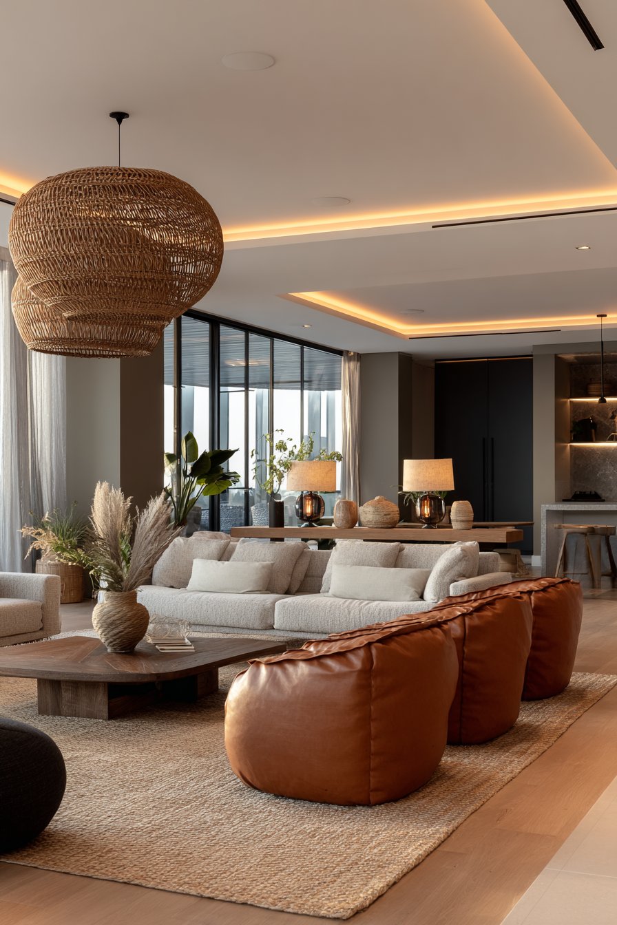
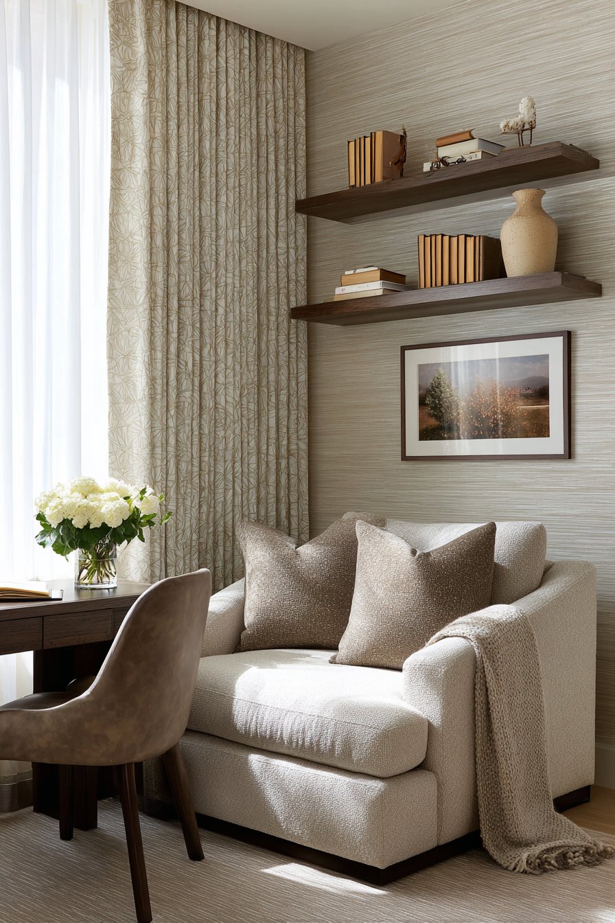
12. Multi-Layered Lighting Design with Natural Materials
Successful lighting design layers multiple sources to create flexibility and atmosphere, and this living room demonstrates this principle through careful selection and placement. The statement pendant light, constructed from woven rattan in natural brown, hangs from the ceiling as both functional illumination and sculptural artwork. The rattan’s open weave allows light to filter through, creating beautiful shadow patterns on ceiling and walls while the warm brown tone of the natural fiber reinforces the room’s earth-toned palette. The pendant’s organic, handcrafted quality introduces an artisanal element that feels approachable and warm.
On side tables flanking a tan leather seating arrangement sit pairs of table lamps with beige linen shades. The lamp bases might feature ceramic in neutral tones, turned wood in medium brown, or even natural materials like stone or driftwood. The beige linen shades diffuse light softly, creating warm pools of illumination perfect for reading or creating intimate ambiance during evening hours. The lamps’ placement on either side of the seating creates balanced illumination and visual symmetry. Recessed ceiling lights provide general ambient lighting, controlled by dimmer switches to allow adjustment based on time of day and desired mood.
The interplay of these three lighting types—pendant, table lamps, and recessed—creates layers that can be adjusted for various activities and times of day. Morning might find only recessed lights on at low levels to supplement natural daylight. Afternoon reading might call for table lamps while the pendant remains off. Evening entertaining could illuminate all three at medium levels for warm, welcoming ambiance. The beige area rug beneath grounds the furniture arrangement and provides textural interest underfoot, its neutral tone ensuring it complements rather than competes with the layered lighting design.
Key Design Tips: Install a statement pendant in woven rattan or natural materials to serve as both functional light and sculptural focal point. Use table lamps with beige linen shades on side tables to provide adjustable task and ambient lighting. Install recessed ceiling lights on dimmer switches for flexible ambient illumination. Layer three types of lighting (ambient, task, and accent) for maximum flexibility and atmosphere. Choose lamp bases in natural materials or ceramic in neutral tones to maintain the color palette. Position table lamps symmetrically for balanced illumination and visual harmony. Use warm-toned LED bulbs (2700K-3000K) to enhance brown and beige hues. Consider the room in evening with only artificial light to ensure adequate illumination for all activities. Install three-way switches to control different lighting zones independently.
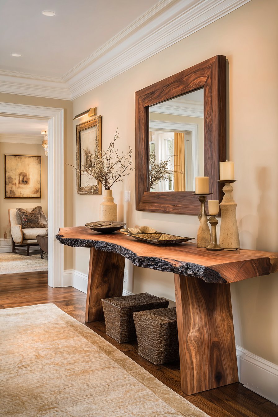
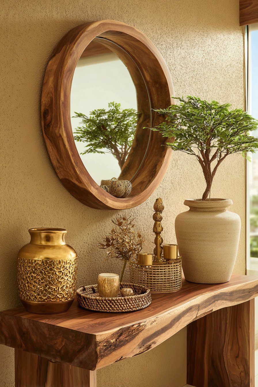
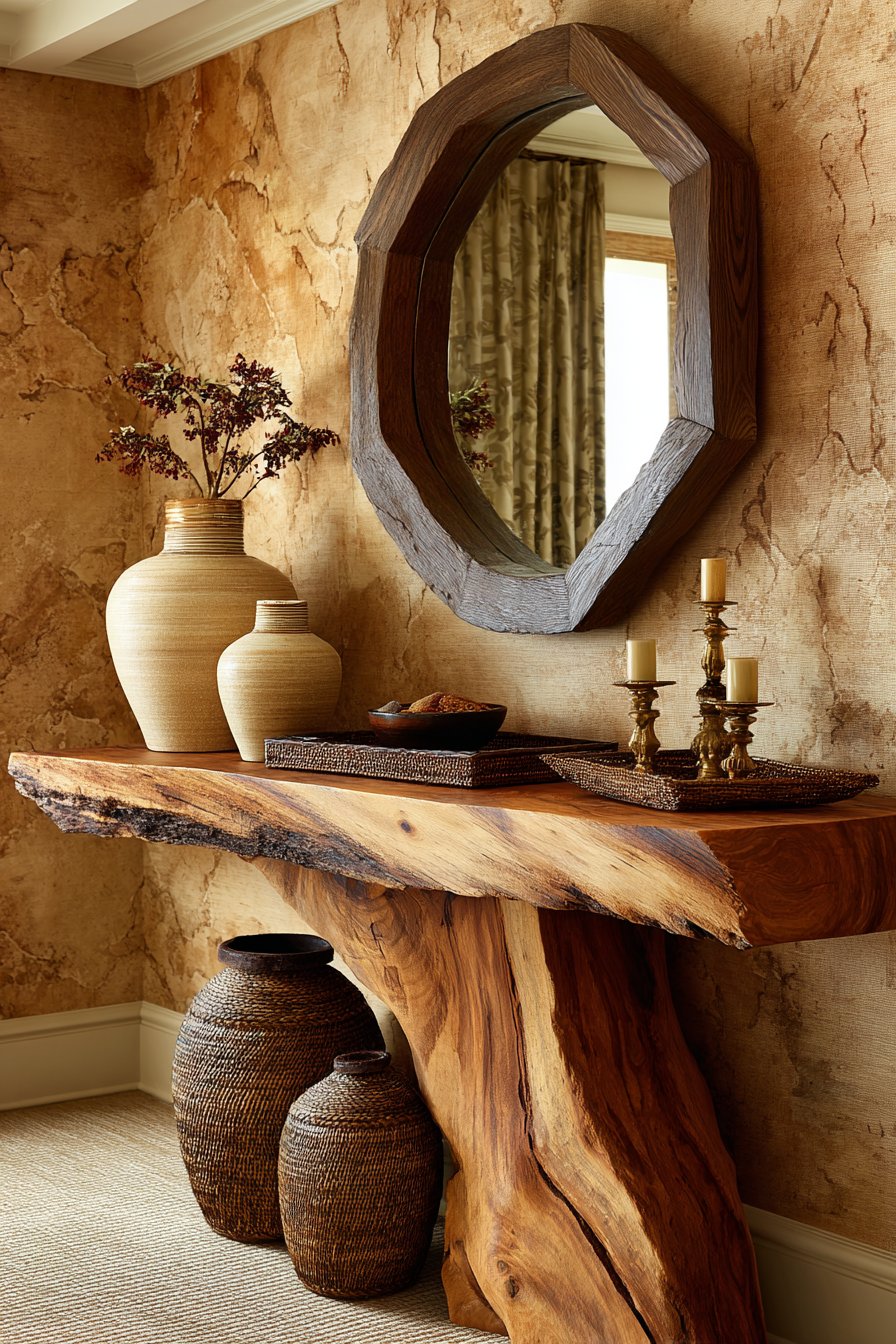
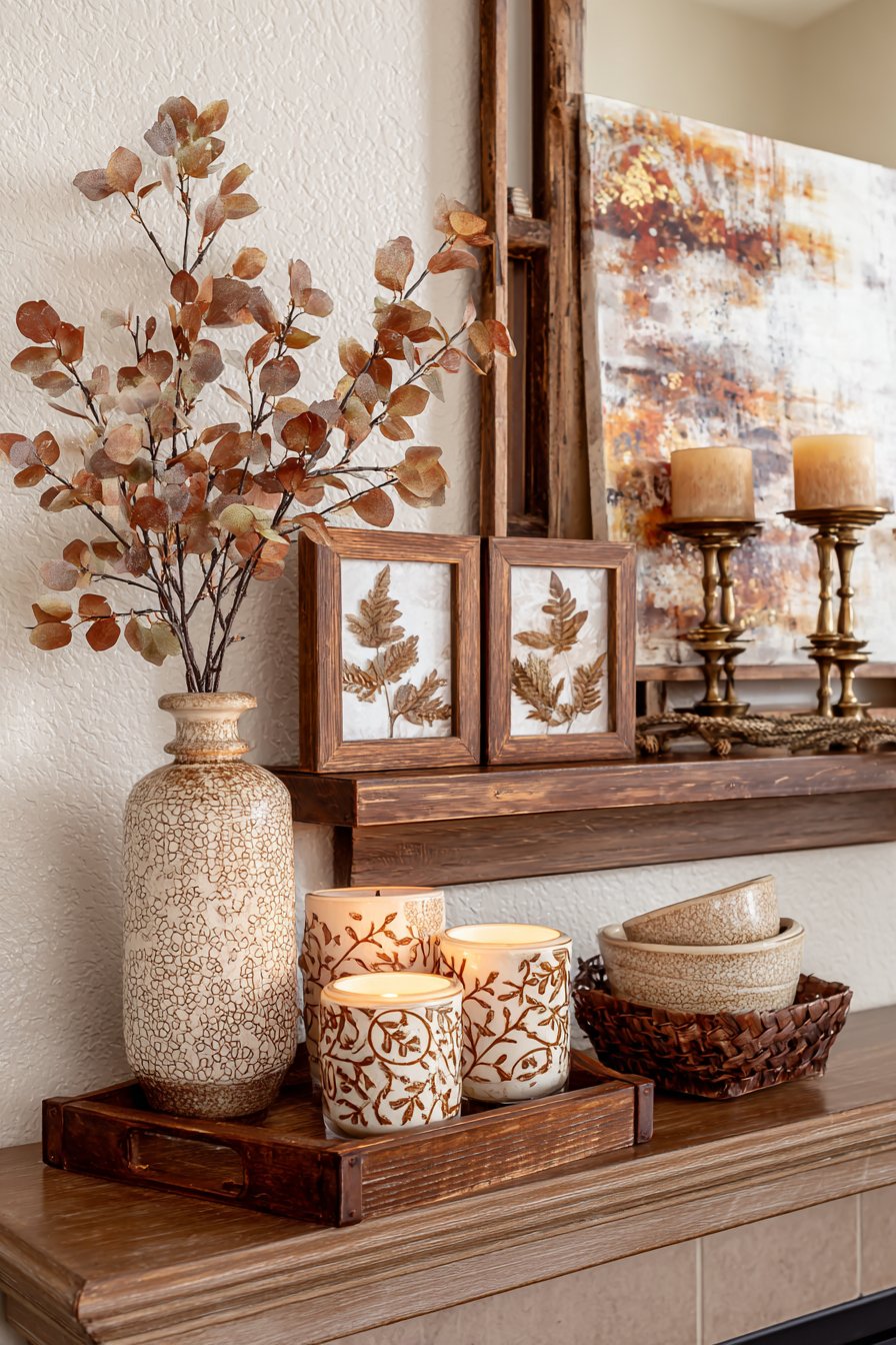
13. Live-Edge Console Styling as Artistic Vignette
Console tables provide opportunities for creative styling that can transform a functional piece into an artistic vignette. This live-edge walnut console, with its natural edge preserved and beautiful grain patterns visible, serves as both furniture and sculpture. Positioned against a beige painted wall, the deep brown wood creates striking contrast while its organic form softens the geometric lines of the room. The live edge—where the natural contour of the tree remains visible—adds authenticity and connection to nature, making each piece truly one-of-a-kind.
The styling upon this console demonstrates the art of curated display through careful selection and thoughtful arrangement. Ceramic vases in cream and beige tones vary in height and form, creating visual rhythm across the table’s length. A woven tray in natural brown serves as a corralling device for smaller objects while its handcrafted texture adds another layer of interest. Brass candlesticks in varying heights introduce vertical elements and metallic warmth that catches and reflects light beautifully. The arrangement follows the principle of odd-numbered groupings and varied heights, creating balance without perfect symmetry.
Above the console hangs a large mirror with a substantial brown wooden frame, its presence serving multiple purposes. Functionally, the mirror reflects light from windows opposite, effectively doubling the natural illumination and making the space feel larger and brighter. Aesthetically, the mirror’s brown frame echoes the walnut console below while providing visual weight appropriate to the console’s size. The mirror’s placement at proper height above the console creates correct proportion and allows the entire vignette to read as a cohesive unit. Natural sidelight from adjacent windows emphasizes the textures of ceramic, wood grain, woven materials, and brass, making the entire display come alive with dimensional interest.
Key Design Tips: Choose live-edge wood furniture in walnut or other dark brown woods to add organic sculptural quality and unique character. Style consoles with odd-numbered groupings of objects in varying heights to create visual interest and rhythm. Display ceramic vases in cream and beige tones to maintain the neutral palette while adding curves and organic forms. Incorporate woven trays in natural brown for corralling smaller objects while adding handcrafted texture. Add brass candlesticks in varying heights for vertical interest and warm metallic accents. Hang mirrors with brown wooden frames above consoles to reflect light and create visual depth. Position consoles near windows where natural sidelight can emphasize displayed textures. Edit ruthlessly—leave adequate negative space around objects to allow each piece to be appreciated. Change seasonal displays to keep the vignette fresh and interesting throughout the year.
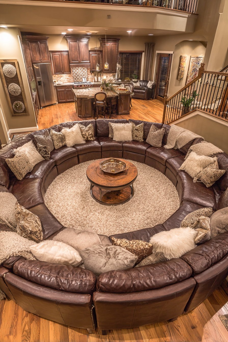
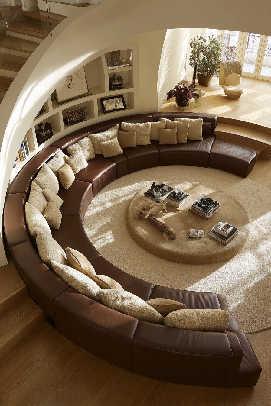
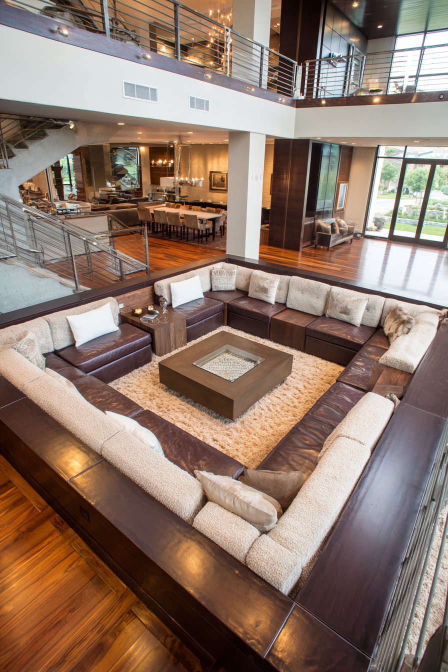
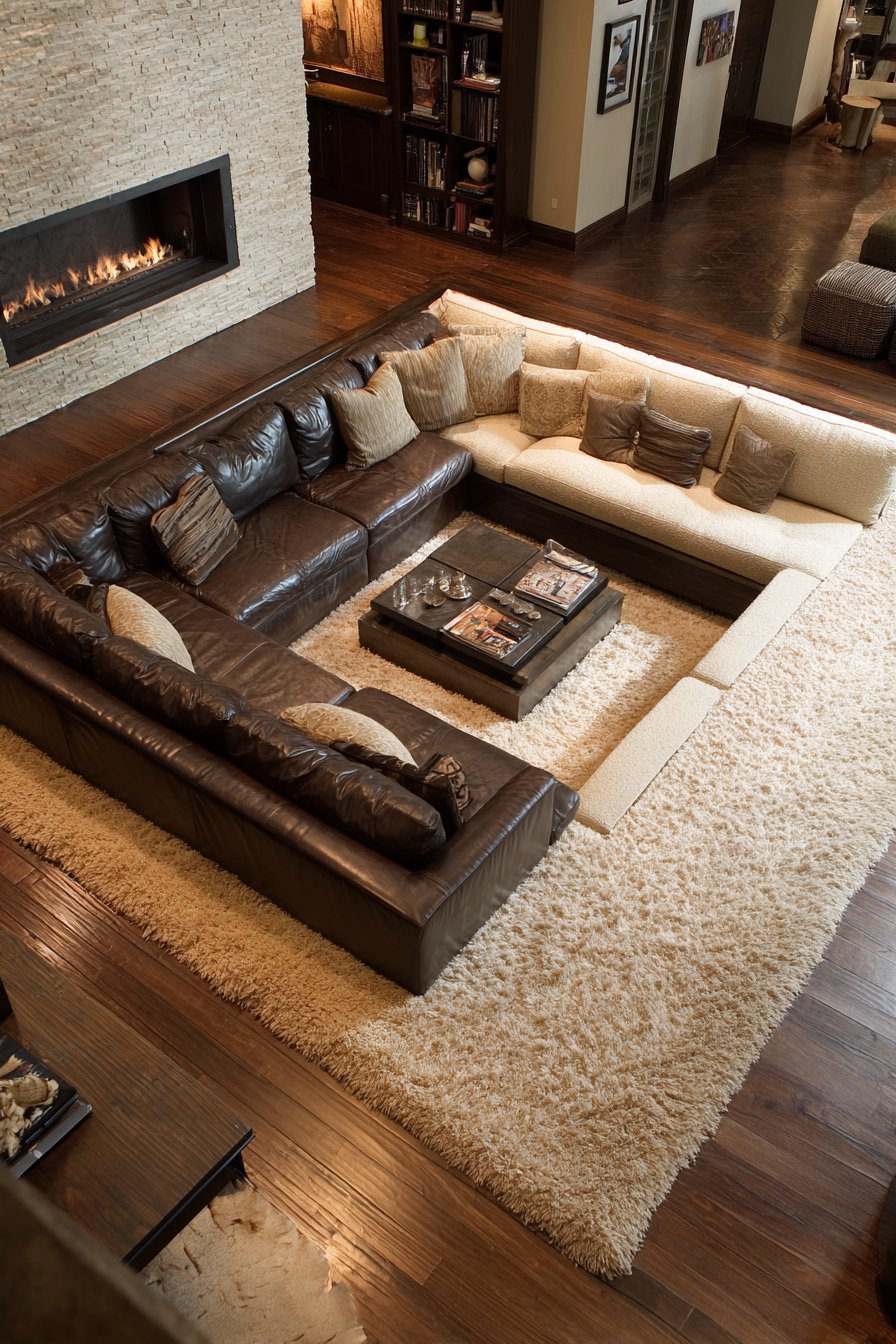
14. Sunken Conversation Pit with Mixed Upholstery
The conversation pit represents a return to 1970s design innovation, reinterpreted for contemporary living with thoughtful material selection and updated proportions. This sunken seating area features built-in benches upholstered in rich brown leather along two sides, the leather’s durability and easy maintenance making it ideal for high-traffic seating. Opposite these leather sections sit cushioned seats in beige bouclé—a textured fabric with distinctive loops that create visual and tactile interest. The contrast between smooth leather and nubby bouclé adds dimensional quality while maintaining the brown and beige palette.
The surrounding floor, constructed from natural oak hardwood in a medium honey tone, flows seamlessly to the edge of the sunken area before stepping down. This wood flooring extends the warm brown tones throughout the space while its natural grain patterns add organic detail. Within the conversation pit itself, a plush area rug in caramel and cream tones defines the seating zone, its soft pile providing comfort underfoot when stepping into the lowered space. The rug’s neutral geometric pattern or solid color adds warmth without competing with the upholstery materials.
The sunken design creates natural intimacy and defines the conversation area without physical barriers like walls or even furniture backs. When seated in this arrangement, occupants’ eye levels are similar, promoting equal engagement and comfortable conversation. The lowered position also provides acoustic benefits, containing conversation within the pit and reducing echo. Wide-angle views from an elevated perspective—such as someone standing in the adjacent kitchen—reveal the pit’s unique architectural quality and demonstrate how it creates distinct zones within an open floor plan. Natural overhead lighting creates inviting shadows that emphasize the pit’s dimensional quality and warm material palette.
Key Design Tips: Create conversation pits with mixed upholstery—brown leather for durability and beige bouclé for textural contrast. Ensure proper depth (typically 12-18 inches below main floor) for comfort without requiring awkward stepping. Use natural oak hardwood surrounding the pit to extend warm brown tones throughout the space. Define the pit interior with plush rugs in caramel and cream tones for comfort and zone definition. Include adequate cushioning and back support even for built-in seating. Position the pit to take advantage of natural light from windows or skylights. Consider heating elements beneath or within the pit for comfort during cold weather. Ensure code compliance regarding railings and steps if required in your jurisdiction. Use the elevation change to hide storage beneath the pit platform.
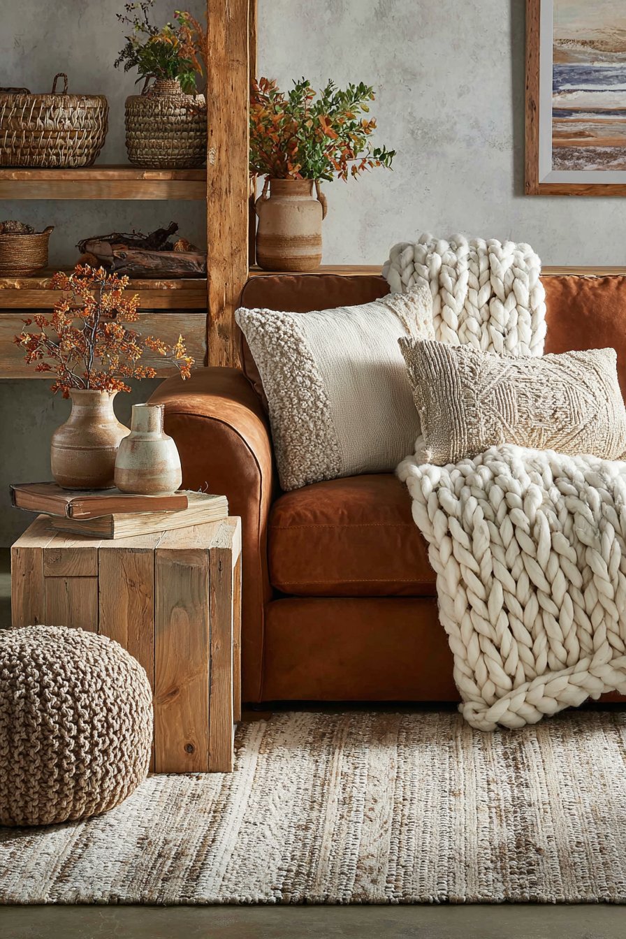
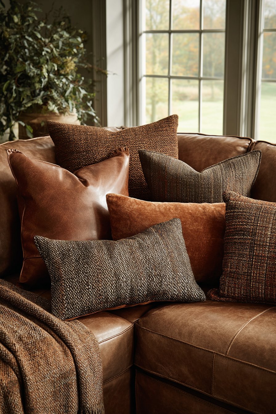
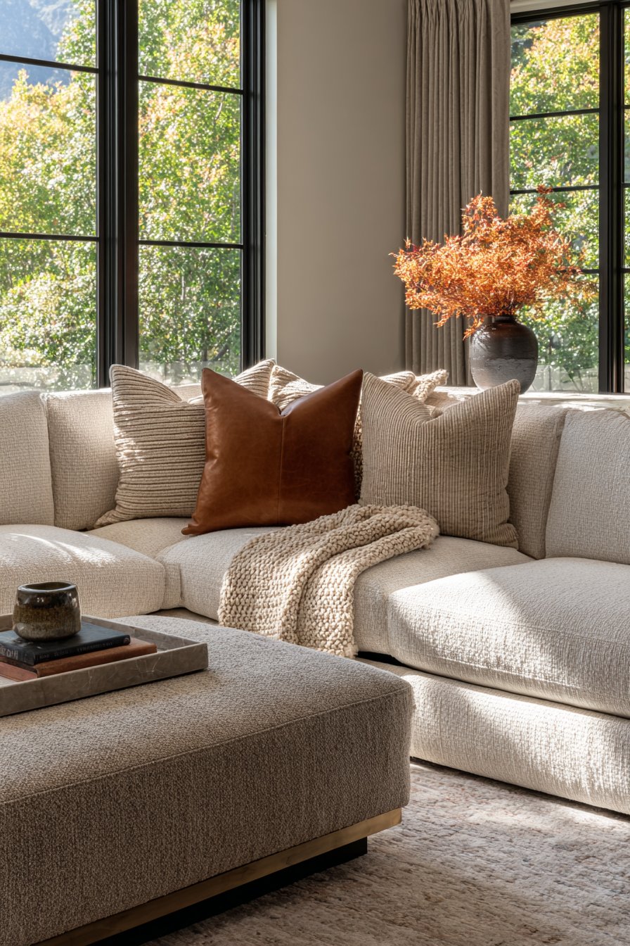
15. Textile Layering Masterclass in Earth Tones
The art of textile layering creates spaces that feel collected, comfortable, and visually rich. This living room demonstrates sophisticated textile mixing through a beige performance fabric sectional that serves as the neutral foundation. Upon this base, styling begins with brown leather pillows—their smooth surface and slight sheen contrasting beautifully with the matte fabric sectional. These might be genuine leather or high-quality faux alternatives in cognac or tobacco brown, adding richness and subtle formality.
Chunky knit throws in oatmeal introduce substantial texture and cozy comfort, their handcrafted appearance and visible stitching adding artisanal quality. The thick, irregular knit creates three-dimensional texture that invites touch and provides actual warmth during cooler months. These throws drape casually over sectional arms or fold across seat backs, their neutral cream tone bridging the brown leather and beige upholstery beautifully. Velvet cushions in cognac add luxurious softness and visual weight, their dense pile and slight sheen catching light differently than surrounding materials.
Close examination reveals the magic in this layering—each textile contributes unique textural quality. The smooth performance fabric provides durable foundation, leather adds refined richness, chunky knit introduces cozy handcrafted warmth, and velvet contributes luxurious depth. The color palette remains strictly within the brown and beige family, but the textural variety ensures the arrangement never appears monotonous. Natural window light creates subtle highlights and shadows across these varied surfaces, emphasizing the dimensional quality and making the textile display feel alive and engaging. This approach transforms basic seating into a tactile experience that invites touching, sitting, and relaxing.
Key Design Tips: Start with performance fabric upholstery in beige as a durable, neutral foundation for layering. Add leather pillows in brown tones for refined richness and smooth textural contrast. Incorporate chunky knit throws in oatmeal or cream for cozy, artisanal texture and actual warmth. Include velvet cushions in cognac for luxurious pile and light-catching depth. Mix smooth, nubby, and plush textures to create dimensional interest across the seating area. Maintain strict adherence to brown and beige color family while varying textures extensively. Position textiles to catch natural light, which emphasizes surface variations and creates subtle shadows. Allow casual draping rather than overly styled arrangements for approachable comfort. Change textile layers seasonally—lighter linens in summer, heavier knits in winter. Choose machine-washable options where possible for practical maintenance.
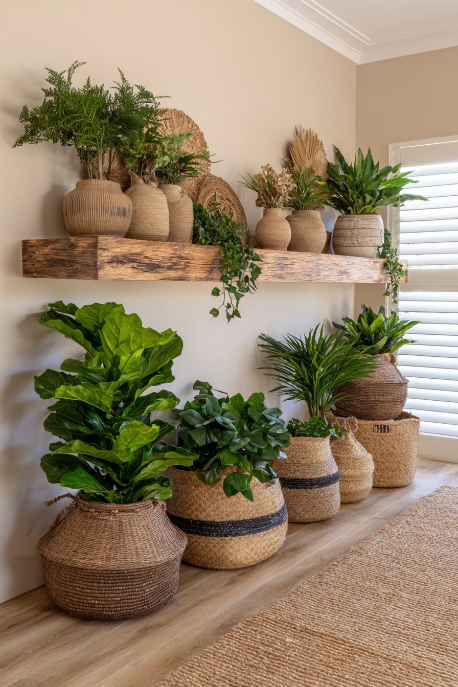
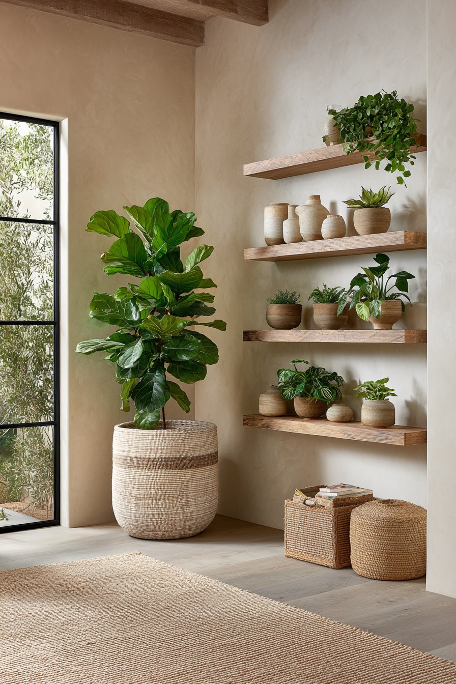
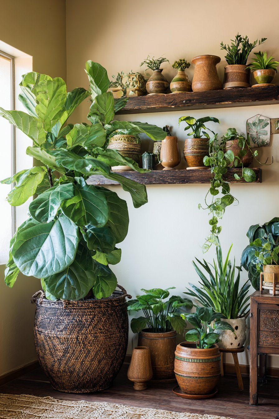
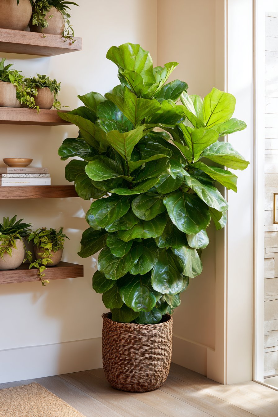
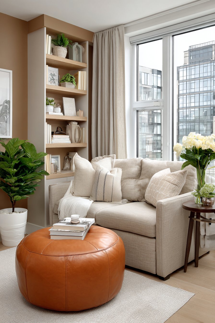
16. Botanical Display in Natural Containers
Plants bring life, color, and air-purifying benefits to any interior, and this botanical display demonstrates how to incorporate greenery while maintaining the brown and beige aesthetic through thoughtful container selection. A large fiddle leaf fig, potted in a brown woven basket planter, serves as the room’s living sculpture. The basket’s natural fiber construction in deep brown tones adds organic texture while its substantial size accommodates the fig’s root system. The woven pattern creates visual interest, and the basket’s handles provide practical portability for occasional repositioning.
Scattered throughout the space, potted palms in beige ceramic vessels add vertical greenery at various heights. The ceramic containers might feature smooth glazes in cream or matte finishes in sand tones, their simple cylindrical or slightly tapered forms allowing the plants to be the stars. These containers’ neutral tones ensure they blend seamlessly with the room’s brown and beige palette while providing necessary weight and stability for top-heavy plants. Trailing pothos cascade from floating walnut shelves, their heart-shaped leaves creating living curtains that soften the shelving’s geometric lines.
The plant styling follows the principle of varied heights, forms, and leaf sizes to create visual interest. The tall fiddle leaf fig provides vertical drama, medium-height palms fill middle zones, and trailing pothos add movement and soften edges. All plants are positioned to receive appropriate natural light—the fiddle leaf fig near bright indirect light from the window, shade-tolerant pothos in slightly dimmer areas. A natural jute rug beneath the main plant display defines the botanical zone while its earthy tan tone connects with the brown basket containers. The combination of living green foliage and natural brown and beige containers creates a harmonious display that feels organic and intentional.
Key Design Tips: Use brown woven basket planters for large floor plants to add natural texture while maintaining the earth-tone palette. Choose beige ceramic vessels in simple forms for medium plants to provide clean, neutral containers. Display trailing plants on floating shelves in walnut or brown woods to create living softness. Group plants at varied heights to create visual interest and fill different spatial zones. Position plants according to light requirements—bright indirect for fiddles, lower light for pothos. Define plant display areas with jute rugs in natural tan tones to ground the botanical grouping. Consider plant scale relative to containers—overly large pots overwhelm small plants, insufficient pots destabilize large specimens. Include humidity-loving plants in brown and beige bathrooms where they’ll thrive in natural steam. Rotate plants periodically for even growth and to prevent one-sided leaning toward light sources.
17. Small Space Solutions in Coordinated Neutrals
Limited square footage demands thoughtful furniture selection and strategic placement, and this compact living room demonstrates how brown and beige can maximize small spaces. A streamlined loveseat in beige linen provides comfortable seating without the visual bulk of larger sectionals. Its compact proportions and raised legs create visible floor space beneath, making the room feel more open and allowing for easier cleaning. The simple lines and neutral upholstery ensure the piece doesn’t dominate the limited space.
Nesting coffee tables in graduated brown wood tones provide flexible surface area that can be expanded when needed or tucked away to open floor space. The largest table, in medium walnut, accommodates daily needs. When guests arrive, the smaller tables in lighter oak and honey maple can be pulled out to provide additional surface area throughout the seating zone. When not in use, they nest completely beneath the largest table, their varying heights creating an attractive graduated display. This flexibility proves invaluable in small spaces where furniture must adapt to changing needs.
Wall-mounted shelving in light oak provides essential storage and display without consuming floor space. Floating shelves create the illusion of more square footage by keeping the floor visible beneath while providing necessary storage for books, decorative objects, and daily items. A multi-functional ottoman in tan leather serves triple duty as footrest, occasional seating, and hidden storage with a lift-up top. The ottoman’s compact size and neutral tone ensure it integrates seamlessly while its functionality proves essential in the space-challenged room. Professional photography captures the efficient furniture placement and cohesive brown and beige color scheme that makes the compact area feel intentional rather than cramped, with natural daylight streaming through windows to enhance the sense of openness.
Key Design Tips: Choose loveseats or apartment-sized sofas in beige to provide seating without overwhelming small spaces. Select furniture with raised legs to create visible floor space and enhance the sense of openness. Use nesting tables in graduated brown wood tones for flexible surface area that can expand or contract as needed. Install floating shelves in light wood to provide storage without consuming floor space. Incorporate multi-functional furniture like storage ottomans in tan leather for maximum utility in limited square footage. Maintain strict adherence to neutral palette to create visual continuity and prevent color competition. Use mirrors strategically to reflect light and create the illusion of more space. Keep window treatments minimal—sheer beige panels or simple Roman shades rather than heavy drapes. Edit accessories ruthlessly to prevent cluttered appearance in small quarters. Choose furniture with similar visual weight to create cohesive flow rather than jarring contrasts.
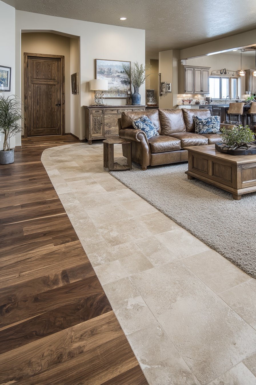
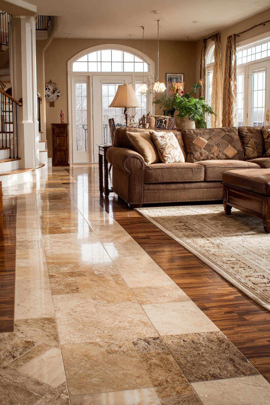
18. Seamless Flooring Transitions in Natural Materials
Flooring transitions between spaces can either disrupt or enhance flow, and this living room demonstrates thoughtful material selection that creates harmony. The main seating area features dark brown hardwood flooring in wide planks, the rich color adding warmth and visual weight while the wider boards make the space feel more expansive. The wood’s natural grain variations and slight color differences between planks create organic interest while the dark tone grounds the furniture arrangement and provides dramatic contrast with beige walls.
Near the entrance, the flooring transitions to beige natural stone tile—perhaps limestone, travertine, or slate—chosen for its durability in high-traffic areas and resistance to moisture from tracked-in weather. The stone’s neutral beige tone relates closely to the wall color, creating visual continuity while its cool surface and hard-wearing properties suit the entry zone perfectly. The tiles might feature subtle variations in tone and texture, adding natural character while maintaining the overall beige impression.
Bridging these two flooring materials, an area rug in variegated beige and taupe creates a transition zone that helps the two distinct floors read as intentional design rather than disconnected materials. The rug’s neutral tones pull colors from both the dark wood and light stone, creating visual connection. Its placement partially covers the wood and extends slightly onto the stone, literally bridging the material change. Wide-angle photography captures the thoughtful material selection and flow between spaces, with balanced natural lighting showing authentic texture and color variation in both the wood planks and stone tiles. The overall effect demonstrates how careful material selection in harmonious tones creates cohesive flow even when using distinctly different flooring types.
Key Design Tips: Use dark brown hardwood in wide planks for main living areas to create warmth and make spaces feel more expansive. Select beige natural stone tile for entries and high-traffic zones for durability and moisture resistance. Bridge flooring transitions with area rugs in variegated beige and taupe that pull colors from both materials. Ensure transition strips between different floor materials are clean and properly installed. Consider floor height consistency to prevent tripping hazards at transition points. Choose flooring materials with similar undertones—warm wood with warm stone, cool with cool. Extend area rugs partially onto both floor types to create visual connection. Consider maintenance requirements—stone may need periodic sealing, wood requires refinishing eventually. Use furniture placement to help define zones with different flooring materials. Plan flooring transitions to occur at natural architectural divisions like doorways or room boundaries rather than mid-space.
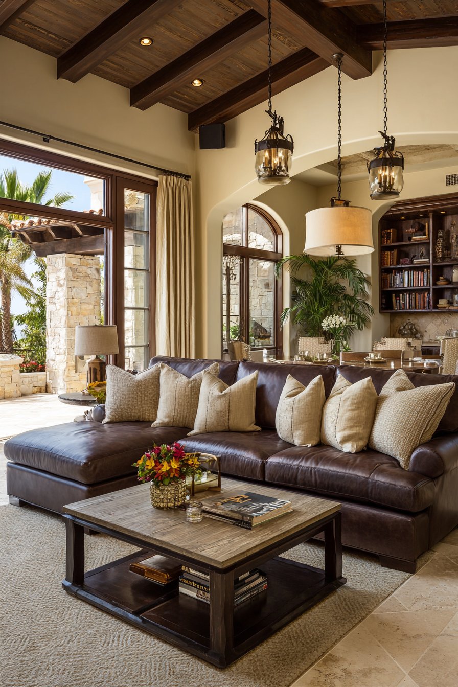
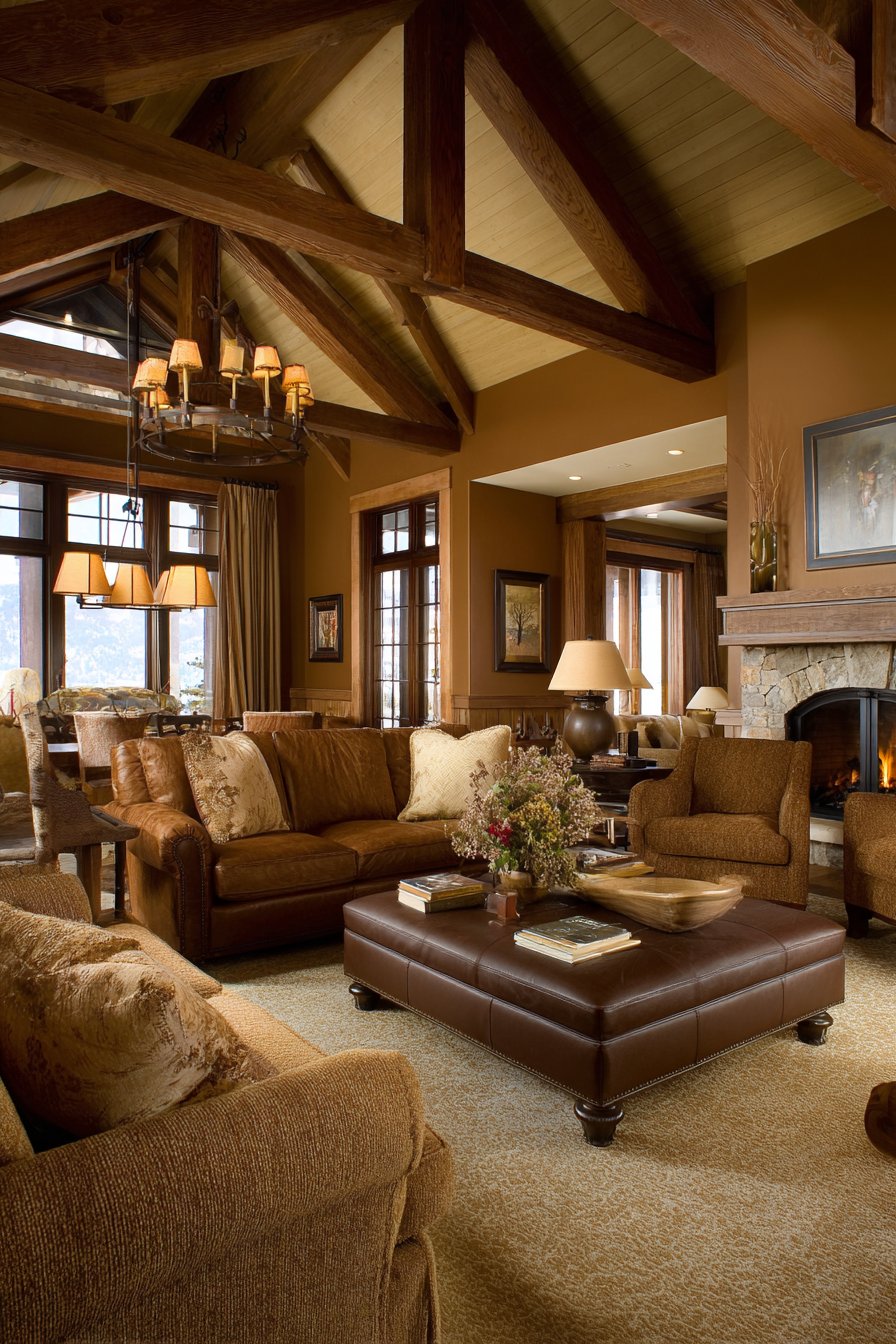
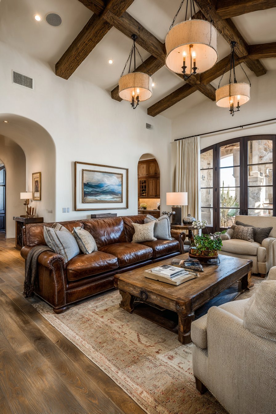
19. Architectural Ceiling Features in Warm Wood
Looking upward reveals often-overlooked design opportunities, and this living room’s ceiling design creates dramatic impact through exposed wooden beams in rich brown stain. The substantial beams, perhaps reclaimed timber or new wood aged with stain, span the ceiling at regular intervals, adding architectural interest and emphasizing the room’s dimensions. The deep brown stain—possibly walnut, chestnut, or custom-mixed dark brown—creates striking contrast against the beige painted ceiling between beams while adding visual weight that grounds the overhead plane.
Hanging from the beam structure, pendant lights with beige fabric shades provide ambient and task illumination while reinforcing the room’s color palette. The pendants might hang at varying heights to accommodate the beam positions while creating visual interest. Their beige shades diffuse light softly, preventing harsh glare while the warm light they emit enhances the brown beams and creates cozy evening ambiance. The fixtures themselves—whether modern minimal forms or more traditional profiles—hang from discrete mounting hardware that appears intentionally placed relative to beam structure.
Below this architectural ceiling treatment, brown leather furniture echoes the beam color, creating vertical design relationship between floor and ceiling planes. This connection prevents the ceiling beams from feeling disconnected from the rest of the space, instead integrating them into a cohesive brown and beige story that extends from floor through furniture to ceiling. Interior design photography captured with slight upward angle reveals the ceiling design’s impact and demonstrates the dimensional warmth of the brown and beige palette throughout vertical space. The beams’ shadows shift throughout the day as natural light angles change, creating ever-evolving patterns on the beige ceiling surface between them.
Key Design Tips: Install or expose ceiling beams in rich brown stains to add architectural drama and visual interest overhead. Paint ceiling surfaces between beams in beige tones to create contrast while maintaining the neutral palette. Hang pendant lights with beige fabric shades from beam structure for functional lighting that reinforces the color story. Choose leather furniture in brown tones that echo beam color to create vertical design continuity. Consider beam spacing relative to room proportions—closer spacing in smaller rooms, wider in larger spaces. Ensure beams are properly supported and installed to code, especially if adding to existing construction. Use beams to define zones in open floor plans by running them perpendicular to natural space divisions. Add LED strip lighting along beam tops to create dramatic uplighting on beige ceilings. Consider acoustic benefits of beam installation in reducing echo in high-ceilinged spaces. Stain beams to match existing woodwork or furniture for cohesive appearance, or choose contrasting tones for more dramatic effect.
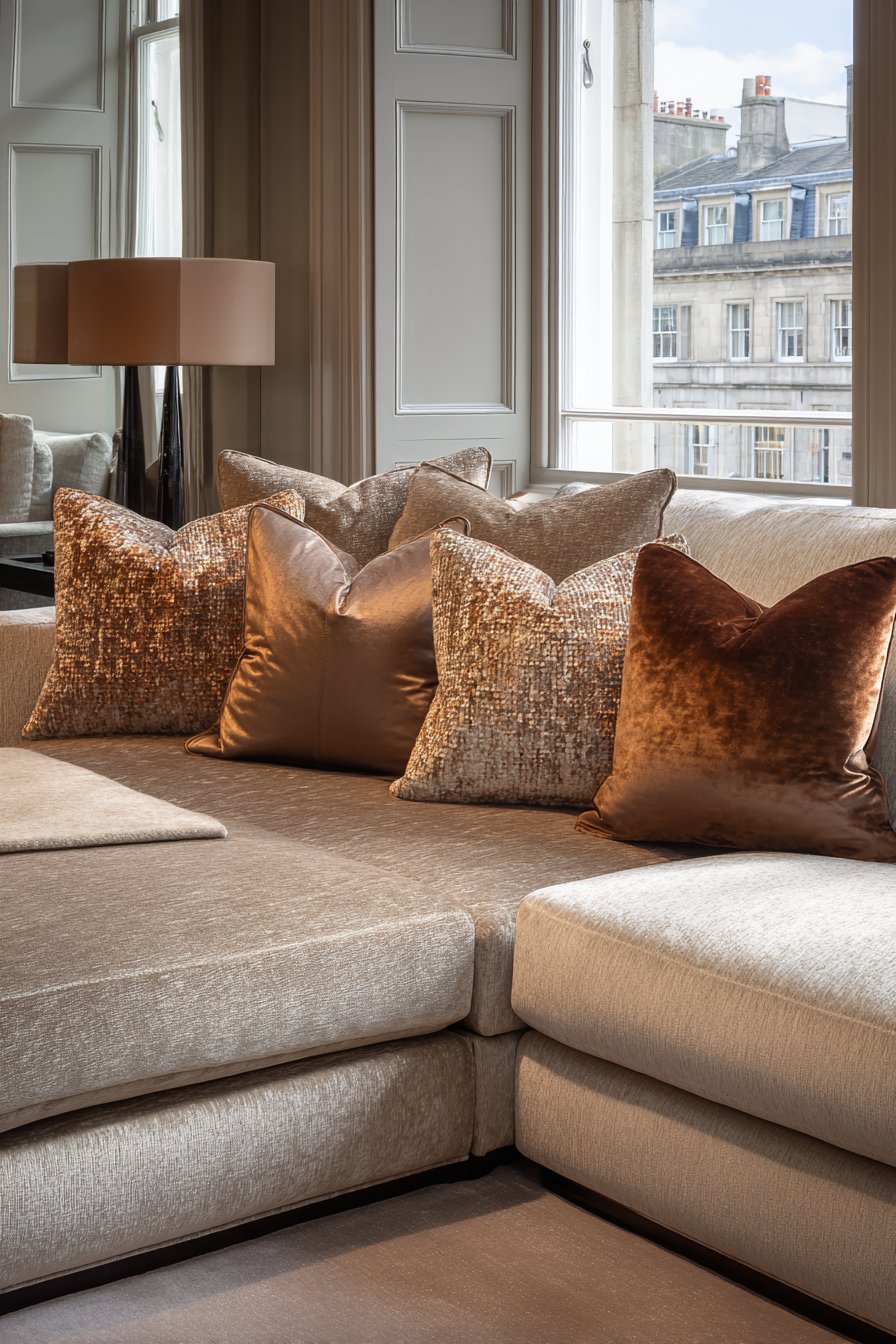
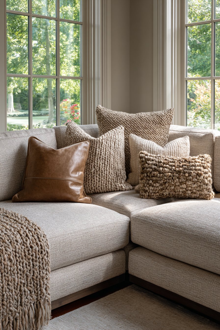
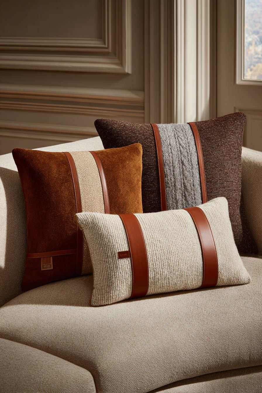
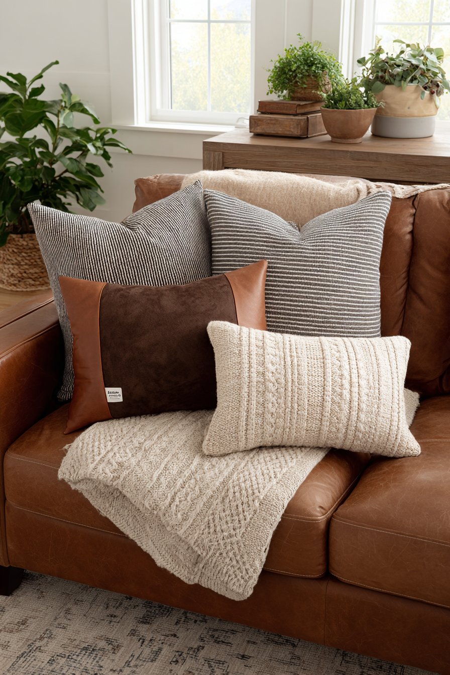
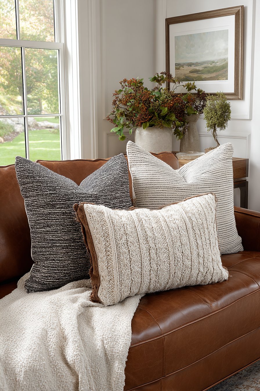
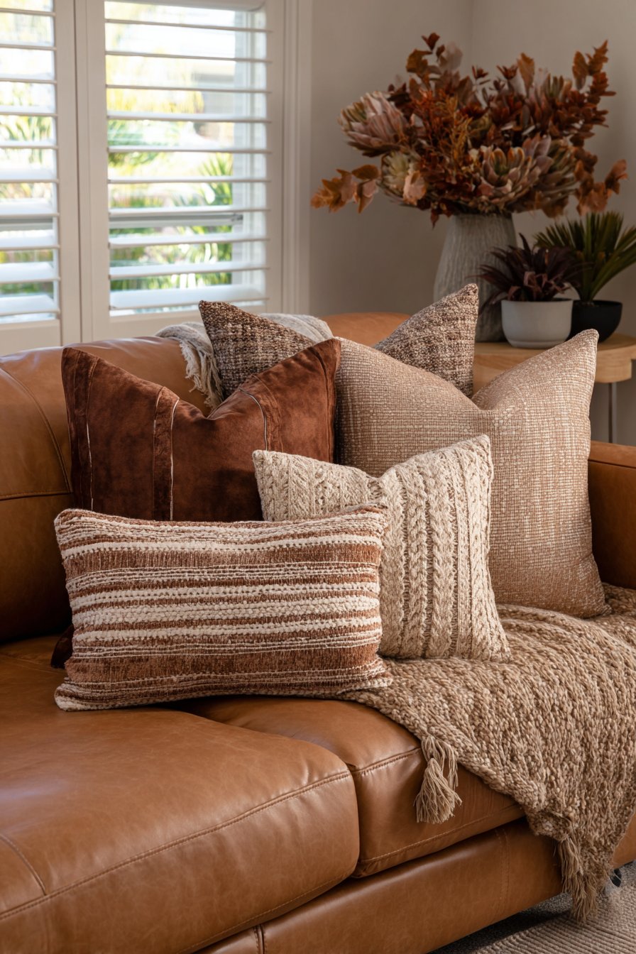
20. Pillow Styling as Textural Art Form
The humble throw pillow becomes an opportunity for artistry when approached with attention to texture, color variation, and arrangement. This beige sofa serves as the canvas for a carefully curated pillow display that demonstrates sophisticated styling within the brown and beige palette. A brown suede pillow anchors one end, its matte finish and soft nap providing visual weight and tactile appeal. The suede’s natural characteristics—slight color variations, directional nap, and leather-like appearance without sheen—add organic richness.
Next in the arrangement sits a beige linen pillow with subtle stripes woven into the fabric. The stripes add just enough pattern to create interest without disrupting the neutral scheme, their tonal quality ensuring they blend rather than contrast sharply. The linen’s slightly nubby texture and natural wrinkles add authenticity—these pillows look lived-with rather than impossibly pristine. A cognac leather accent pillow introduces refined luxury, its smooth surface and slight sheen catching light differently than surrounding fabrics. The leather might feature minimal topstitching or simple piping detail that emphasizes quality construction.
Completing the arrangement, an oatmeal cable knit pillow adds substantial three-dimensional texture. The visible cables and chunky stitching create shadows and depth, while the neutral cream tone bridges all the brown variations represented. Each pillow shows realistic fabric characteristics—the suede’s directional nap, the linen’s natural wrinkles, the leather’s subtle grain, the knit’s dimensional stitching—creating a display that feels authentic and approachable rather than catalog-perfect. Detail-focused interior photography with natural sidelight emphasizes these layered textiles and tonal variations, revealing how careful attention to texture creates interest within a strictly neutral palette.
Key Design Tips: Mix pillow textures extensively—suede, linen, leather, and cable knit create varied tactile experiences. Maintain color discipline within brown and beige family while varying tones from cognac to oatmeal. Include one pillow with subtle pattern like tonal stripes to add interest without color competition. Choose varying sizes—start with largest in back, graduate to smaller in front for dimensional display. Allow natural wrinkles and realistic fabric characteristics rather than overly styled perfection. Position pillows at slight angles rather than rigidly straight for casual, lived-in appeal. Include one textured pillow with cable knit or similar dimensional pattern for visual focal point. Change pillow arrangements seasonally—lighter linens in summer, heavier velvets and knits in winter. Select removable covers for easy washing and seasonal changes. Consider pillow density—mix firmer and softer fills for varied comfort and better form retention.
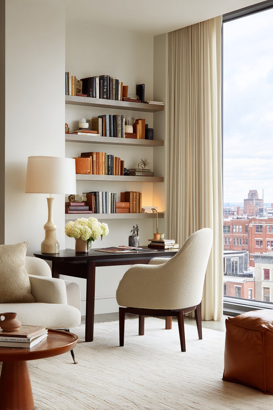
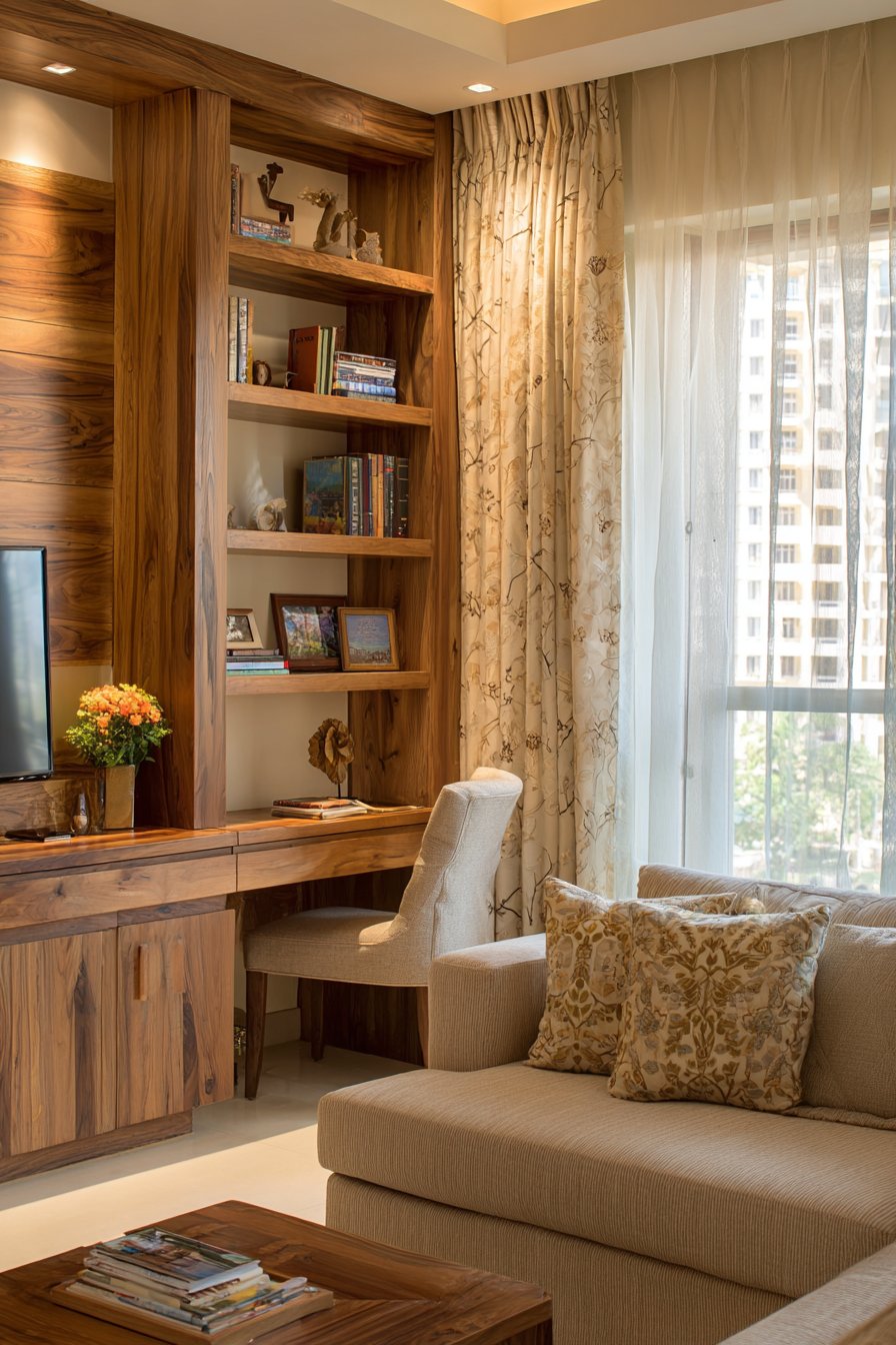
21. Integrated Workspace in Living Area Harmony
The rise of remote work demands thoughtful workspace integration within living areas, and this corner solution demonstrates how to create functional office space while maintaining living room aesthetics. A compact desk in walnut brown features clean lines and simple construction, its medium-sized surface providing adequate workspace for laptop, notebook, and task lamp without overwhelming the corner. The walnut’s rich brown tone and visible grain create warmth while the desk’s modest proportions ensure it reads as occasional workspace rather than dominating office furniture.
The beige upholstered task chair provides ergonomic support with style, its neutral tone ensuring it blends with the living room’s brown and beige palette rather than screaming “office chair.” The upholstery might feature performance fabric for stain resistance and easy cleaning, while the chair’s design balances comfort and aesthetic appeal. Above the desk, floating shelves in light oak provide storage for office supplies, reference books, and decorative objects. The shelving’s open design prevents the workspace from feeling enclosed while its light wood tone creates subtle contrast with the darker desk.
Desk accessories maintain the color story through leather desk pad in brown, ceramic pen holders in beige, and brass desk lamp. These carefully selected items ensure the workspace feels cohesive with the surrounding living area rather than jarringly different. Wide-angle interior photography shows the seamless incorporation of functional workspace into the living area, with natural window light illuminating the brown and beige work zone. When not in use for work tasks, the desk can easily transition to display surface or writing desk, making it a flexible element in the multi-functional space. The key to this integration lies in material and color coordination—by maintaining the room’s brown and beige palette and choosing furnishings with similar aesthetic to surrounding pieces, the workspace feels intentional rather than awkwardly inserted.
Key Design Tips: Choose compact desks in walnut or brown wood tones that provide adequate workspace without overwhelming living areas. Select task chairs in beige upholstery to blend with the living room palette while providing ergonomic support. Install floating shelves in light oak above workspace for storage that doesn’t visually enclose the area. Coordinate desk accessories in brown leather, beige ceramic, and brass to maintain the color story. Position workspace near windows to maximize natural light for both task illumination and mood enhancement. Use desk lamps with beige shades or brass bases to provide task lighting while reinforcing the aesthetic. Keep the desk surface edited and organized to prevent workspace clutter from disrupting living area calm. Choose a desk with drawers or add desktop organizers to contain office supplies out of sight. Consider a desk with cable management features to hide technology wires. Position workspace in a corner or against a wall to define its zone while keeping main living areas open and flowing.
Why These Brown and Beige Living Room Ideas Represent the Best in Contemporary Design
The twenty-one designs presented in this article represent the pinnacle of brown and beige living room design for numerous compelling reasons. First and foremost, these ideas demonstrate how a neutral palette can achieve remarkable depth and sophistication through expert manipulation of texture, material, and tone. By incorporating elements ranging from smooth leather and soft linen to chunky knits and natural stone, these designs prove that brown and beige living rooms need never appear flat or monotonous. The strategic layering of materials creates dimensional interest that engages the eye and invites touch, transforming what might seem like simple neutral spaces into rich, sensory experiences.
These designs also excel in their practical application of timeless principles to contemporary living. Each idea addresses real-world needs—from integrated workspaces and extensive storage solutions to multi-functional furniture and flexible layouts—while maintaining aesthetic integrity. The brown and beige palette provides the perfect backdrop for these practical considerations, as its neutral nature allows functional elements to integrate seamlessly without creating visual discord. Whether accommodating large family gatherings, supporting remote work, or maximizing limited square footage, these living room ideas demonstrate how thoughtful design solves problems while creating beauty.
The versatility demonstrated across these brown and beige living room concepts ensures relevance for diverse homeowners and design preferences. Traditional enthusiasts will appreciate the classic elegance of exposed ceiling beams, gallery walls with mixed wood frames, and leather upholstery. Contemporary design lovers will gravitate toward horizontal wood slat walls, streamlined sectionals, and minimalist console styling. Those seeking organic, natural aesthetics will connect with botanical displays, live-edge furniture, and natural stone installations. This range proves that brown and beige serves as a universal foundation capable of supporting virtually any design direction while maintaining cohesion through color discipline.
The emphasis on natural materials throughout these designs aligns perfectly with current sustainable design movements and timeless principles of quality construction. Wood furniture in various species and finishes, natural stone installations, leather upholstery, linen textiles, jute rugs, and ceramic accessories all bring organic beauty and durability that synthetic alternatives cannot match. These materials age gracefully, developing patina and character over time rather than simply wearing out. By investing in brown and beige living rooms built around natural materials, homeowners create spaces with longevity that transcends fleeting trends.
Lighting considerations receive appropriate attention across these designs, recognizing that brown and beige living rooms require thoughtful illumination to prevent appearing dark or cave-like. The incorporation of multiple light sources—natural daylight through properly dressed windows, ambient overhead lighting, task lamps for specific activities, and accent lighting to highlight architectural features—ensures these spaces feel warm and welcoming at all hours. The interplay between light and the varied brown and beige surfaces creates ever-changing ambiance as daylight moves and artificial sources are adjusted, making the rooms feel alive and dynamic.
The architectural elements featured throughout—from built-in shelving and fireplace surrounds to exposed beams and conversation pits—demonstrate how brown and beige can enhance rather than compete with strong architectural statements. The neutral palette allows these features to become focal points while the warm tones prevent them from feeling cold or austere. This relationship between color and architecture proves particularly valuable in homes with distinctive architectural character, where colorful palettes might clash with existing features.
These brown and beige living room ideas also excel in their accessibility and achievability for real homeowners. While each design demonstrates professional-level styling and attention to detail, none requires impossible budgets or unattainable materials. The emphasis on natural materials like wood, stone, and natural fibers means investments in quality pieces that will serve beautifully for decades. The neutral palette ensures that individual elements purchased over time will coordinate successfully, allowing homeowners to build their dream living rooms gradually without worrying that new additions will clash with existing pieces.
The psychology of color supports brown and beige as optimal living room choices, with these earth tones promoting feelings of stability, warmth, and comfort. Unlike energizing brights or stark whites, brown and beige create environments that encourage relaxation and genuine connection—exactly what living rooms should provide. The organic associations of these colors—soil, sand, wood, stone—connect inhabitants with nature even in urban settings, satisfying the biophilic needs that contemporary research increasingly recognizes as essential to human wellbeing.
Finally, these designs demonstrate remarkable longevity in an age of rapidly changing trends. While specific furniture styles and accessories may evolve, the fundamental beauty of brown and beige combinations remains constant across decades and even centuries of design history. Homeowners investing in these living room ideas can feel confident that their spaces will remain sophisticated and relevant long after trendier color schemes have fallen from favor. The addition of carefully selected accent colors through easily changed elements like pillows, throws, and accessories allows for seasonal refreshment without requiring complete redesign.
Conclusion
The journey through these twenty-one brown and beige living room ideas reveals the remarkable potential of neutral palettes when approached with creativity, attention to detail, and understanding of fundamental design principles. Far from being safe or boring choices, brown and beige emerge as sophisticated foundations capable of supporting diverse design visions while maintaining cohesion and harmony. The key lies in thoughtful manipulation of texture, careful selection of materials, strategic lighting design, and intentional incorporation of tonal variations within the broader brown and beige family.
Whether you’re drawn to the luxury of layered leather and velvet, the organic warmth of natural wood and stone, the clean lines of contemporary minimalism, or the collected charm of eclectic styling, these ideas demonstrate how brown and beige can serve your vision. The practical considerations addressed—from small space solutions and integrated workspaces to extensive storage and multi-functional furniture—ensure these designs support real life rather than existing merely as beautiful but impractical fantasies.
As you contemplate bringing these brown and beige living room ideas into your own home, remember that successful implementation requires patience and intentionality. Begin with quality foundational pieces in your chosen brown and beige tones, then layer thoughtfully over time, always considering how new additions will interact with existing elements. Pay attention to natural light in your specific space and adjust material selections accordingly—rooms flooded with sunlight can handle deeper browns, while dimmer spaces benefit from emphasizing lighter beiges and incorporating multiple light sources.
Don’t fear embracing the full spectrum of brown and beige, from pale cream and sand through honey and caramel to deep chocolate and espresso. The interplay of these varied tones creates the dimensional interest that prevents neutral rooms from appearing flat. Similarly, commit to incorporating diverse textures—smooth, nubby, chunky, sleek, matte, and lustrous—as these variations engage the eye and invite touch in ways that color alone cannot achieve.
Most importantly, approach your brown and beige living room as an evolving creation rather than a project with a fixed endpoint. As seasons change, family needs shift, and your personal style develops, your living room should adapt accordingly. The beauty of building on a neutral foundation lies in its flexibility—you can refresh and reimagine endlessly without starting from scratch. Embrace this journey of creating a living space that truly reflects your personality while providing the comfort, functionality, and beauty that make a house feel like home.